
The Data-Driven Community Meetup holds monthly webinars on business analytics and big data. Webinars are held on the second Wednesday of the month at noon (12:00 PM) central time via Zoom Webinars and will cover topics related to enterprise data management. Our goal with each webinar is to provide meaningful insights and actionable takeaways to simplify analytics so you can make better decisions.
We cover topics such as data strategy, data management, data warehousing, BI modernization, embedded analytics, and cloud migration and strategy. Learn how to build reporting solutions that drive your business demand based on your needs.
About the Topic
This recorded session explores advanced techniques for creating customized and complex charts that go well beyond the basics covered by Tableau’s “Show Me” feature. Our data experts will guide you through the process of enhancing your visualizations, including using Tableau’s advanced calculation functions, integrating with external scripts, and providing design tips to make your data not just seen but understood.
What we covered:
- Techniques to surpass the conventional chart types and embrace a broader visualization spectrum.
- How to leverage Tableau’s powerful analytics capabilities to create impactful, decision-driving visuals.
- Tips for enhancing aesthetic appeal and functionality in your dashboards.
This article includes a recording, transcript, and written overview of the Tableau Advanced Visualizations presentation.
Presentation Video
Summarized Presentation
In the “Tableau Advanced Visualizations” presentation, Jared and Stuart covered a range of techniques to enhance data visualization in Tableau. The session began with Jared introducing the concept of using separate color legends for different measures in a table, allowing for a clearer interpretation of profit, sales, and quantity data. He then demonstrated the creation of rounded bar charts to give dashboards a modern look and discussed stacked bar charts for displaying parts of a whole distribution within a category.
The session also highlighted the utility of calendar charts for visualizing data trends over specific periods and explored the powerful capabilities of map views in Tableau. Jared and Stuart explained how to create detailed map views by layering city-level data on top of state maps, making these maps valuable tools for strategic analysis and planning.
Sparklines were introduced as compact line graphs that provide quick insights into data trends, ideal for dashboard integration without the clutter of axes and grid lines. Jared then explained dual axis and shared axis charts, which allow multiple measures to be displayed on the same chart for comparative analysis.
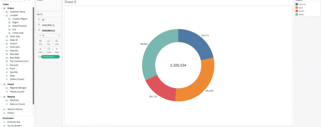
The discussion on donut charts showcased their visual appeal and the additional steps required to create them in Tableau. Jared provided a detailed walkthrough of converting a pie chart into a donut chart, emphasizing the added value of including labels and total sales figures in the chart’s center.
Finally, the session touched on the upcoming Viz Extensions, which promise to simplify the creation of complex visualizations like donut charts and Sankey diagrams. The Viz in Tooltips feature was demonstrated, adding interactivity to charts by allowing users to hover over different regions to see detailed maps and additional data.
Overall, the presentation provided comprehensive insights and practical techniques for advanced data visualization in Tableau, equipping users with the tools to create more engaging and informative dashboards.
Session Outline
- Separate Color Legends
- Rounded Bar Chart
- Stacked Bar Chart
- Calendar Chart
- Map Views
- Sparklines
- Dual Axis & Shared Axis
- Donut Charts
- Viz Extensions
Separate Color Legends
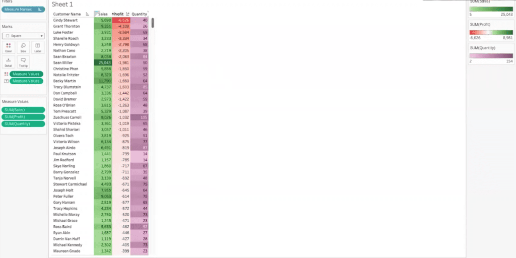
The session began with Jared introducing the concept of using separate color legends for different measures in a table. Jared demonstrated how to display profit, sales, and quantity for individual customers. By dragging the measure values to color and using separate legends, each measure was visually differentiated with its own color spectrum, making it easier to interpret the data at a glance.
Rounded Bar Chart
Next, Jared showcased the creation of a rounded bar chart to add a sleek and modern look to dashboards. Using a combination of measure values, line graphs, and path functions, he illustrated how to transform standard bar charts into rounded bar charts, providing a more polished visual appearance.
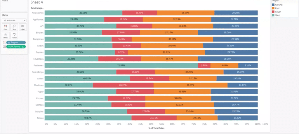
Stacked Bar Chart
Jared then discussed stacked bar charts, effectively displaying parts of a whole distribution within a category. By converting sales data into a percent of the total and using a table calculation, the stacked bar chart allows for an easy comparison of sales distribution across different regions and subcategories.
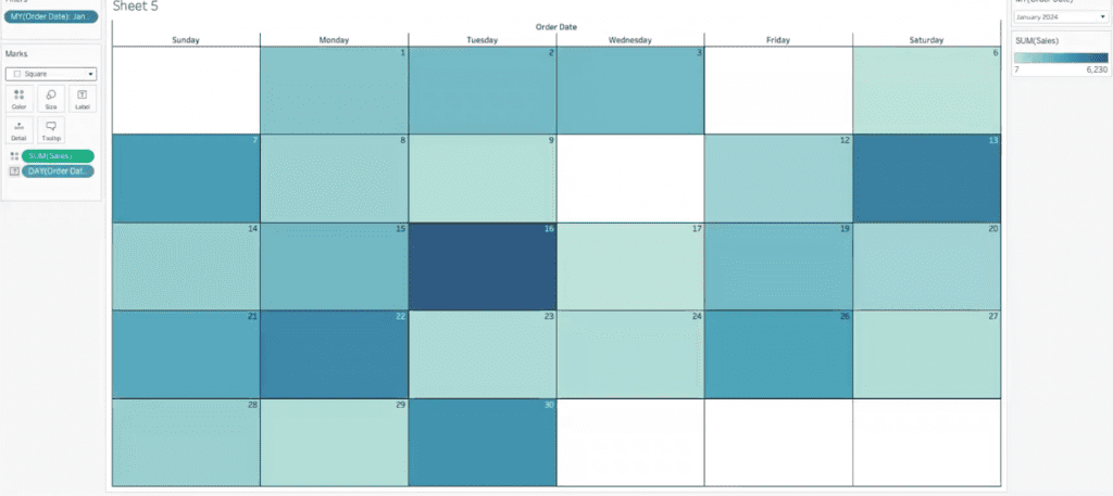
Calendar Chart
The calendar chart was another highlight, offering a visual method to display data trends over a specific period. Jared demonstrated building a calendar view using order dates, weekdays, and sales data to identify high and low sales days within a month visually. This approach is particularly useful for appointment schedules or service tickets.
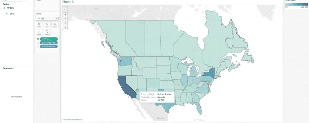
Map Views
Jared and Stuart explored the powerful capabilities of map views in Tableau. Jared began by demonstrating a simple filled map view that visualizes sales data by state. He explained how to start with a state view, set it to a filled map, and drag sales to the color shelf. This basic setup provides a clear visual representation of sales data across different states, making identifying high and low sales areas easier.
To add more detail, Jared introduced the concept of layering city-level profit data on top of the state map. By adding a marks layer and dropping profit onto the city card, users can visualize profit data by city. Jared adjusted the opacity to 70% and increased the size of the marks to enhance visibility. This approach allows users to see detailed profit information within each state, providing a more granular view of the data.
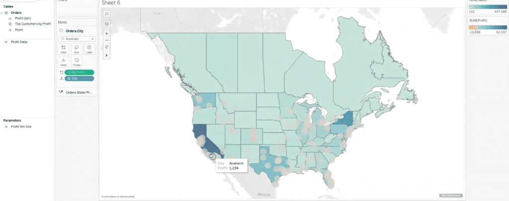
Next, Jared discussed using the state map as a background to analyze sales data by region. By adding regions to the view, users can see cities within regional boundaries. He also demonstrated including country data to show Canadian cities for a broader context. By dragging sales to the color shelf and adding borders for clarity, the map becomes a powerful tool for regional analysis. Adjusting the opacity slightly fades the background, helping to highlight the sales data more effectively.
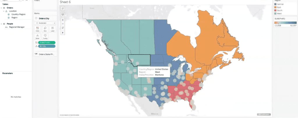
Jared emphasized the practical applications of these map views for strategic analysis and planning. By identifying clusters of cities with high sales within each region, sales managers can better understand their territories’ performance. This visualization helps discuss regional performance and highlights areas with low sales potential for improvement, such as Kansas, Nebraska, and Missouri. The map provides a clear visual representation of sales clusters, aiding in strategic decision-making.
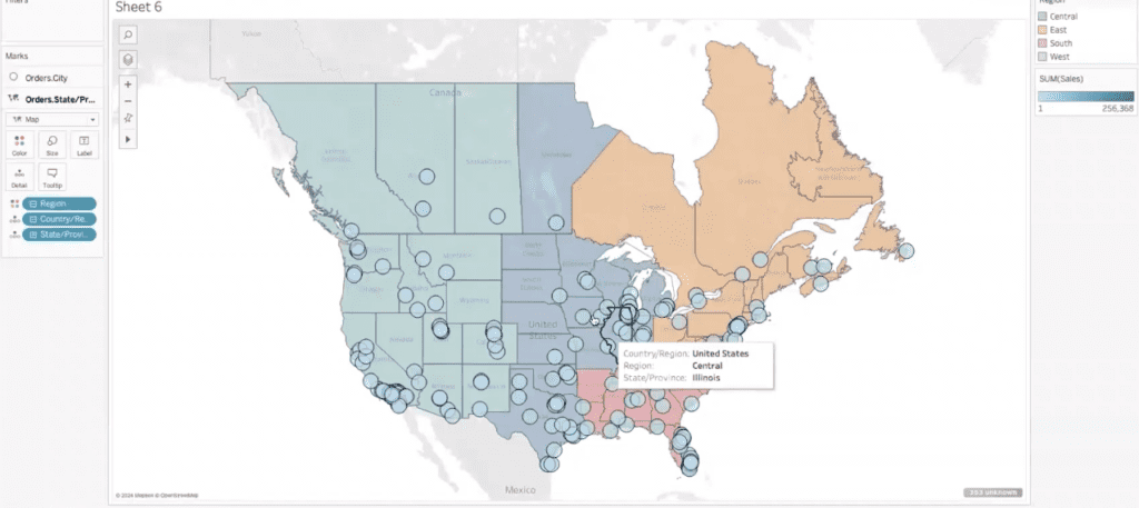
Stuart added that these map views can also serve as motivational tools for sales teams. Displaying the map on a screen in the office, updated daily to show current sales data, can foster friendly competition among sales team members. Jared shared that, in his experience, having such a visual scoreboard drives motivation and engagement as team members strive to have their numbers displayed prominently.
Sparklines
Sparklines are compact line graphs that quickly visualize data trends without the clutter of axes, numbers, or grid lines. This makes them ideal for quickly understanding the overall direction and scale of the data.
To create a sparkline, Jared started with the order date displayed as a continuous month, splitting the data by region and plotting sales. By removing distracting elements such as headers, grid lines, and zero lines, the focus remained solely on the trend lines. Jared noted that sparklines are often placed on the side or top of a dashboard to provide an immediate sense of data trends. For example, the South region displayed a significant spike and consistent performance, while the East showed more variability but an overall upward trend. The West and Central regions demonstrated steady upward trends, especially the West.
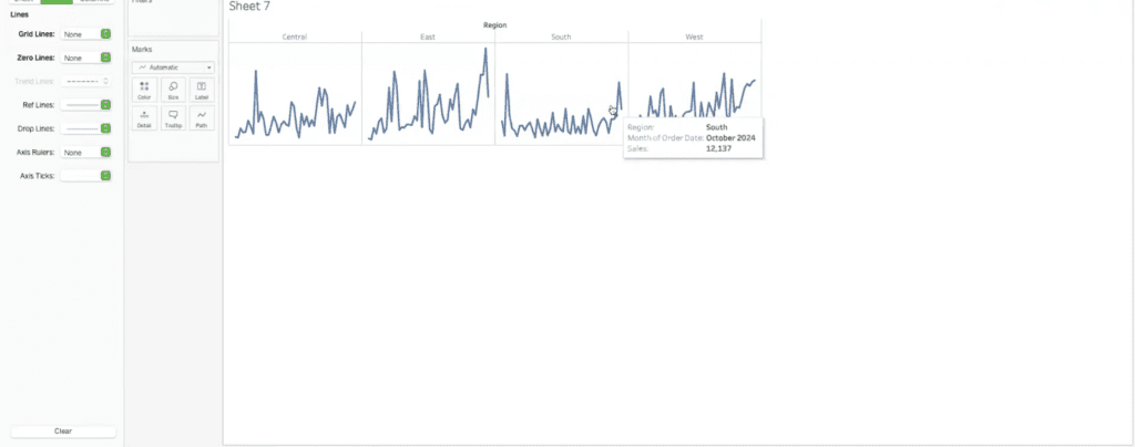
Stuart suggested adding trend lines to sparklines, which Jared confirmed would not clutter the visualization. Adding a trend line highlights the general direction of the data, providing more context without overwhelming the viewer. This simple yet effective method allows users to quickly grasp how the data is performing over time.
Dual Axis and Shared Axis
Dual-axis and shared-axis charts are a step beyond basic visualizations in Tableau, allowing multiple measures to be displayed on the same chart for comparative analysis. To demonstrate, he created a dual-axis chart by plotting sales on one axis and profit on the other. By right-clicking and selecting “dual axis,” both measures appeared on the same graph. Synchronizing the axes ensured that both measures used the same scale, making it easier to compare the two.
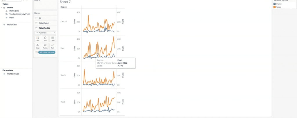
Next, Jared demonstrated a shared axis chart. By dragging profit onto the same axis as sales, the chart displayed both measures using measure values and names. This setup allows for multiple measures to be added to a single axis. However, as Jared noted, adding too many measures can complicate the chart.
To address measures on different scales, such as quantity, Jared used a dual axis with a shared axis. This allowed sales and profit to share one axis, while quantity had its own axis. To differentiate the lines visually, Jared suggested using different line patterns and colors. For example, making the quantity line dashed and gray separated it from the sales and profit lines.
Stuart and Jared discussed the practical applications of these chart types, particularly in client engagements where a comprehensive view of multiple metrics is required. These advanced visualizations provide a deeper level of analysis, enabling users to see relationships and trends across different data sets on a single, cohesive chart.
Donut Charts
The discussion then moved to donut charts, with Jared and Stuart highlighting their visual appeal and the additional steps required to create them in Tableau. Jared began by noting that, unlike pie charts, donut charts are not a default option in Tableau, necessitating some creative workarounds.
To create a donut chart, Jared explained the initial steps of building a pie chart. He started by using sales data and categorizing it by region. This was achieved by dragging the sales measure to the angle shelf and the region dimension to the color shelf, resulting in a basic pie chart. While this pie chart was functional, Jared aimed to enhance its visual interest by converting it into a donut chart.
The process of creating a donut chart involves some additional steps. Jared added two calculations, each with a constant value, to the rows shelf. This allowed him to create a dual axis, stacking one pie chart on top of the other. The key to creating the donut effect is adjusting the size of the bottom pie chart and changing its color to white, effectively creating the appearance of a hole in the middle.
This method can be a bit cumbersome and requires fine-tuning the size slider to get the desired look. Despite these challenges, the result is a visually appealing donut chart that can display additional information. The chart becomes cleaner and more focused by hiding unnecessary headers and grid lines.
To add further value, Jared demonstrated how to include labels showing the sum of sales for each region. Additionally, placing the total sales figure in the donut’s center provides a quick and easy way to see overall performance. This approach leverages the donut chart’s visual appeal while maintaining its functionality.
Jared noted that creating donut charts in Tableau requires extra steps, but the visual and informational benefits make it worthwhile. This method, though not straightforward, allows users to present data in a more engaging and insightful manner.
Viz Extensions
The upcoming Viz Extensions promise to simplify the creation of complex visualizations like donut charts. Tableau is currently testing a beta version for these extensions, including donut charts and other complex visualizations such as Sankey diagrams. These extensions would make creating advanced visuals directly within Tableau much easier without resorting to complicated workarounds.
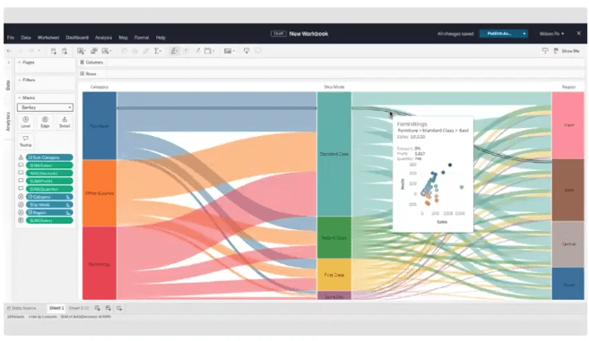
Sankey charts, which are currently very difficult to build in Tableau, would become much simpler with these extensions. The efforts of companies like Infotopics, which develop various extensions and apps for Tableau, enhance its functionality with features like dynamic PowerPoints and additional visualization types.
As the session wrapped up, Jared took the opportunity to demonstrate the Viz in Tooltips feature, adding another layer of interactivity to the donut chart. By editing the tooltip and inserting additional sheets, users can hover over different regions of the donut chart to see detailed maps showing sales by region.
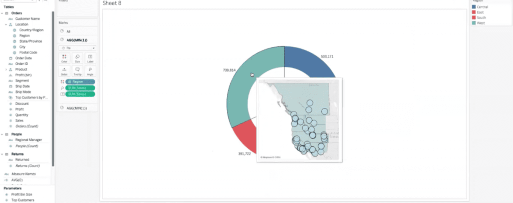
This feature provides a deeper level of insight without cluttering the main visualization.
Transcript
>> STUART: Welcome, everyone, another data-driven session. We’ve got a lot of people on, which is great. We do this once a month. As many of you know, Jared’s usually our featured speaker. We have brought in some other folks, but I want to make this point that every session that we have, all those sessions land on our YouTube channel, the XeoMatrix YouTube, just as a refresher. If you want to go back and listen to them, this is a good one today. You can certainly follow along, but go to YouTube, check them out. They’ll be there recorded. You guys have met me many times through these data-driven events, you’ve met Jared. He’ll be giving the presentation today. We’re going to talk about advanced visualizations. I’ll go through a little bit of a summary on all the stuff we’ll talk about here in a second. Just a quick meeting format. Everyone does have the ability to come off of mute. We want to make this interactive. If you have a question, feel free to come off of mute, ask a question. If you would rather use the chat window, you can do that too. I’ll keep an eye on the chat. If you’re not asking a question, if you could stay on mute, that would be amazing for Jared’s flow. That would be awesome.
Let’s get into a very quick, overview of Jared and myself. I’ve been in the Tableau community 10 years. Used to work at Tableau. Jared’s been, you’ve been in the ecosystem, Jared. Is this number correct? Is it eight years, nine years?
>> JARED: What is it now? It’s 2024. It’s actually coming up on nine years, so we’ll roll that over soon.
>> STUART: Okay. Yes, we will. We’ll update that. Jared’s one of our lead consultants. Day-to-day, he’s working with customers and he is phenomenal in the product. Really excited for his presentation on advanced visualization. To give you a preview of what we’re going to talk about, we picked what we thought were the most practical visualizations that you can use in Tableau that can level up what you’re building in reports.
Now there’s more out there. There’s a caveat. There’s more visualizations out there. If anyone has seen Tableau Public, there’s a lot of very technical visualizations that you can get to, but we kind of picked ones that are easier to bite off that can give your dashboards a bit more flair, level up reporting that you’re doing. Quick overview on what we’re going to cover. It really ranges from things like rounded bar charts, donut charts, heat maps, using separate color legends, and then some advanced mapping.
We’ll also talk a minute about Viz Extensions in Tableau. If anyone tuned in to Tableau Conference this year, whether you were there or listened to it live or the recorded version, they are in beta. They’re going to release something called Viz Extensions. We’ll show a little bit about what that looks like, but ultimately, you can bring in extensions that– you can bring in other chart types that aren’t natively as easy to do in the Tableau product. We’ll touch on that a little bit as we go. Jared, did I miss anything here? I think that covers it. We’ll get out of PowerPoint.
>> JARED: [chuckles] No, that was a great intro. Yes, we can dive on into some visualizations.
>> STUART: Live demo. That’s our next slide. I will be keeping an eye on the chat. I’ll stop share. Jared, we’ll let you get teed up here.
>> JARED: All right.
>> STUART: I think we have record attendance today. Thanks, everyone for hopping on. This is awesome.
>> JARED: That’s fantastic. Stuart, feel free as we’re going through these, feel free to speak up. For y’all who are on the outside of this, Stuart gives me a ton of credit by having me stand up here and go through these demos. These ideas of things that we share are all brainstormed from our whole team. We’re collecting ideas and demos from people and then I just get to come up here and kind of walk through them and show y’all how to do them. It really is a big-brain trust effort to get this here. Some of this stuff, Stuart was recommending ways of doing it that I actually like better than the ways that I was doing it. We’ll call that out as we go through it because there’s some really slick tricks in here.
>> JARED: The first place that we want to start is really simple, just using separate color legends for measures in a table. If we wanted to look at, for example, profit sales and quantity for individual customers, we’re using our trustee sample superstore data that comes with all of the Tableau software that you have. If you ever want to try and replicate this, you can add a data source and just pull in the sample superstore down at the bottom, and you’ll be using the same data that we use for these demos.
>> STUART: Yes. Follow along if you want. You’re going to go, I think, slowly enough, Jared, that people can follow along.
>> JARED: I’m going to try to because I’ll get out of breath if I go too quick.
>> STUART: [chuckles] Right.
>> JARED: We talked about looking at profit. We’re going to pull profit out. We talked about looking at quantity, so we’ll drop quantity right on top, and that’s going to give us the measure values with the measure names at the top. Then we’ll bring out sales as well. Once we have sales, we can drop it here or we can drop it right down here in the measure values box. This gives us a little bit more control over where it lands in terms of the order.
This is great. Now we can see our sales, our profit, and our quantity ordered all in one table, but we’re not getting a lot of those immediate takeaways because we have to actually read all of the numbers. If we drag our measure values up to color, and I’m just holding what I think would be the equivalent on a PC of control to duplicate that as opposed to dragging the whole thing up and removing it from text, on a Mac, it’s going to be the command key. Then we have measured–
>> STUART: Nice shortcut. Nice shortcut. I use that a lot.
>> JARED: Try to call those out as we do them too so that people aren’t just like, “Whoa, how did that thing double?”
>> STUART: [chuckles] Right. Good point.
>> JARED: We take measure values. We duplicate that from text to color and then I’m going to change these marks to squares just to get more of that filled table. You can do this with continuous measures. This is nice. It’s fine, but sales, profit, and quantity aren’t really on the same scale. Sales is always going to be a positive number. Profit could be positive or negative and quantity is going to be multiples lower than sales or profit because it’s the individual number of items and not the actual dollars.
If we want to see these visually independently, we come over here to the measure values color pill and we can use separate legends. What that’s going to do is it’s going to split that legend out into three different color legends. It’s already gone through and done some work to figure out what it thinks we need. It’s measuring sales and quantity on a single color spectrum, but it’s already got profit on this orange-to-blue diverging color.
We can mess with these a little bit if we want. We can change sales to a green spectrum. Maybe profit, we take the red, green, white. This is an option, not necessarily considered visual best practices because a lot of folks are red-green colorblind, which is part of why Tableau defaults to that blue and orange. We have the option now of using different colors on each of these three measures to kind of see them independently.
Now, even though 81 and 73 are way lower than 14,400, we can still see the differentiation in quantity versus sales versus profit using separate legends there. Tableau, not huge on throwing everything in text tables, but they still give you some really nice options for formatting text tables if you so choose.
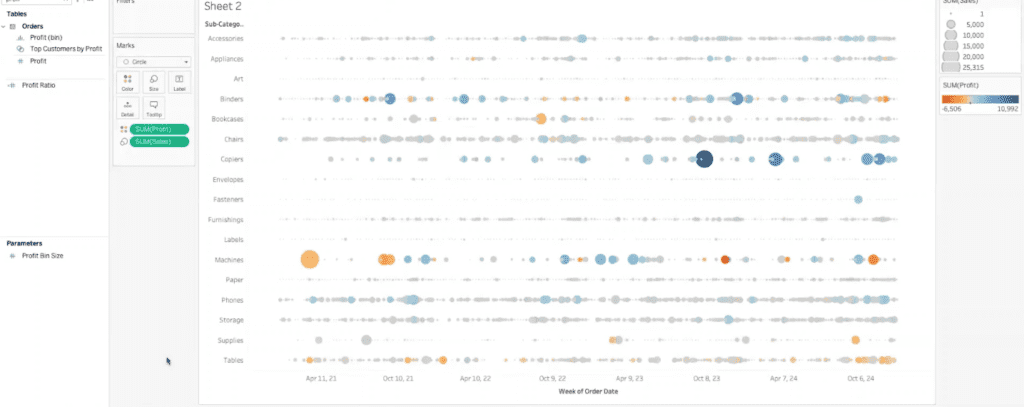
All right, so that’s a really, really easy appetizer to this conversation. This next one is going to be a pretty cool visual way to find trends in data. We’re going to look at a time series of sales over time by subcategory. If we want to start with subcategory in our rows shelf, and then for our time, let’s take the order date, and maybe we want to see this by week. Per week across all of our data, we want to see sales.
What I’m going to do here is I’m going to drop sales on size, and then change this to a circle. What that does is it gives us these dots with the sum of sales on size. If we increase that size a little bit, you can start to kind of see where the trends are in the data really quickly visually. There’s no numbers here. We’re not seeing, necessarily, what the scale is, but you can start to pick out something like copiers is a lot more inconsistent.
You’ve got a big range between the biggest sales and the lowest sales, and there’s these big gaps in the middle, or something like chairs is a lot more consistent. There’s always chairs being sold. The range and the size of sales is a little bit different. Art is not as big of sales but it’s still pretty consistent. You can really easily start to pick out where those big outliers are in your data, and what those trends and seasonal rises and falls might be across different subcategories, different years, things like that. It’s really quick and easy to pull something like this together.
>> STUART: Seems like this one’s great if you have more granular data, like at a day level, week level. I guess it could be valuable to year or month level but to your point, you really do see some trends.
>> JARED: If we went to like month, you still see some of it. You still see furnishings pretty consistent. Chairs, you start to actually see a little bit more variability month to month, but you still have that really choppy series in copiers. There’s a lot of flexibility with this. This is probably one of the more visually abstract examples that we’re going to go through today, but if you can get your end users used to looking at something like this, it’s actually a really nice way to pick out those outliers and those trends.
>> STUART: I guess you could even layer in other measures on color if you do like a profit or something.
>> JARED: Yes, so if we threw profit on color, now we can start to look at some of those outliers and say, “Well, there’s a big order here, but we didn’t even make money on that.” Do we want orders like that? Do we want more of that if we’re losing money? Copiers is a little bit more consistently profitable, even if the sales are inconsistent. Then you get stuff like binders all over the place. You’ve got blue, you’ve got orange. There’s no rhyme or reason to it.
>> STUART: We’ve done a session on zone visibility, that could be interesting where you have a view like this and then another view that’s maybe not as abstract that someone can look at and pick out the same data points in a different way. Even seeing zone visibility, that session, that could be really interesting. I have a couple of views for people they can look at.
>> JARED: Definitely. This is also one that would play really well with visualizations in Tooltip, which we can get to if we have time towards the end. I think we’ve covered that on previous sessions too, but if you have a viz like this, you want people to be able to hover over and see the detail in a tooltip, that can be really useful to get that second level of analysis, that next question answered before they even have to go and ask it.
This is a fun one. This sort of dots over time.
The next one that we’re going to go over is way back on the business practical side, just adding a little bit of visual flavor to your dashboards. We’re going to be talking about rounded bar graphs. This is one that’s kind of funky to set up. If we want to see a rounded bar graph by subcategory, I’m going to start by pulling out sales and then I’m going to create this kind of ad hoc calculation that’s just an average, or a min, or a max of one. I’m going to drop that on top so that I have my measure values and my measures down here. This is the foundation of what we’re doing and I’ll explain why once we see the graph.
From here, I’m going to actually take the measure values and drag it up to columns and then the measure names, once I change this to a line graph, I’m going to drop measure names on path. This is where it gets kind of funky, but if we increase the size, you can start to see now we actually have these rounded lines or these rounded bars instead of a regular squared bar graph or something like that.
The reason that this works is that what we’re doing is we’re actually plotting a path along the measure names from the average zero, which is this point here to our sum of sales for any given subcategory, which is out here on the end. This whole bar in the middle is really just a path that Tableau is drawing with this path function from the zero line to wherever our sales end up for that subcategory but it gives this kind of a more sleek, modern look to a bar graph that could really come in handy and just help make your dashboards look a little bit more polished and professional.
Does that make sense? It’s a real funky one, but you can always go back to this recording and look back over how to do it.
>> STUART: I love the look of it. It’s cool and I’ve wrestled a little bit, just a forewarning, like some of the formatting, if you add labels can get interesting because you have two measures, that kind of dummy measure and then sales in this case. It’s really neat to play around with and it can certainly be valuable at times.
>> JARED: If you throw labels on, you end up with labels on both points. I wonder, you min-max by cell.
>> STUART: What if you go to text and you remove it? There are two– I’d have to go back and remember.
>> JARED: Now it’s going to bug me. [laughs]
>> STUART: I know, sorry. The formatting can be interesting, but there’s a way, there’s a way to remove– There you go.
>> JARED: Yes, you want to do line ends and then remove the label at the start of line and that’ll take off that average zero.
>> STUART: Cool, you solved it.
>> JARED: [laughs] Yes.
>> STUART: That’s good.
>> JARED: We’re getting off the deep end of things that don’t work out of the box and we’re getting into the place where you have to kind of tweak things a little bit more. Let’s go back even further into the realm of sanity. We’ll just talk about stacked bars real quick. This is one that’s really helpful if you want to see parts of a whole distribution within a category. We use our trustee subcategory again and if we want to look at sales, we’ve got a bar, that’s great. If we want to see how those sales are broken out by region, we can do that, but this doesn’t really tell us how much of each subcategory is made up by each region relative to each other subcategory.
Right now we can see it really easily within labels or within binders, what that distribution looks like, but it’s hard to tell because of the difference in the size of the bars, what the distribution is amongst regions for paper versus phones. The bars are just such different sizes, it’s a little bit tough to tell. If we take this sum of sales and we make that a percent of total, and then compute that percent of total using table across instead of table down, it’s going to give us, for each subcategory, what the percent of sales from each region was.
If we bring this over label, now it becomes really easy to see. If we look at labels to machines or furnishings to fasteners, it’s easier to tell what is that actual distribution. Between 33.7 from the West region in art versus 22.7 for machines from the West region, it’s a little bit easier to tell that, okay, the West region is really driving a lot of the sales for fasteners, driving almost half the sales for tables.
If we look at something like East, East is one of four regions, but it’s driving over a third of the sales for bookcases and for copiers. It’s a lot easier to start pulling those trends and those data points out of a view like this. It’s just a couple of steps beyond what Tableau gives us out of the box. We just have to run that quick table calc and tell it how to calculate it and then we have that data right in front of us.
Any questions on that? It’s one that we see a lot of.
>> STUART: I agree. Nathan said it’s a great chart. This is really like a business practical chart right here. Another way to think about it and look at it, and same, zone visibility. You could have a view where it’s not broken at percent total and then a view you flip to that goes here and giving people options.
>> JARED: Definitely. You can have a view that starts just like this, just sales by subcategory, and then have some zone visibility flip to this view. Super easy. Awesome. The next view that we want to go through is another one that I actually think is really business practical, but we don’t see a ton of. It’s a fun one. We’re going to build out a calendar in Tableau and then view some of our metrics on that calendar.
This is another one that has a lot of setup behind it, but bear with me for a moment. We’ll get this rocking and rolling. We’re going to start with the week of the order date and then we’re going to grab the weekday. I’m going to go ahead and type this in as a date part. Weekday of the order date. That’s going to give us that Sunday through Saturday view and then I want to filter this to a particular month. Let’s just take like last month, May of 2024. Awesome.
I’m going to hide the week and after hiding the week, let’s pull out sales so we can see that. I’ll make this bigger. Let’s go ahead and add the day of order for date onto text so that we can actually see. Change this back to a square so we get that nice fill. I’m going to align that number in the upper right. We’re starting to see this calendar take shape.
For better formatting, I’m going to go ahead and add in some lines like we would expect to see. We’re going to get some nice, dark row dividers in there. We’ll take some column dividers as well. Make sure it’s just on the blackest black and a solid line. Now, it looks just like a page out of a calendar, and for every date that we have data, we can see what those sales look like. We can see where those hotspots are. May 19th was a really high sales day. The 20th and the 14th, the 8th and the 1st. Fridays are really light. We had three Fridays where we didn’t even have, I guess, four Fridays, because May had 31 days. Four out of our Fridays, we had no sales. It’s $1,300 on Friday the 3rd.
This is a fun view. If you have something that, if you’re dealing with things like appointment schedules or service tickets, seeing some of that data displayed over a calendar like this by month can be really nice. I want to say, I’m going to go off-script here, if we drop the month of order date in pages, what is that going to do? That’s going to show all of that. I wanted to say that there was a way to do this to where it would show us just that month still. Right now, it’s going to show everything here. I’m sure there’s a way to do it. Stuart, you know if-
>> STUART: Or you could hit the play button and just flip through months.
>> JARED: Yes. I know you can do it with parameters. I thought pages would be a quicker way to get to it. I wonder if we–
>> STUART: That’s interesting though.
>> JARED: It’s just kind of like flipping down through– Ah, okay. Well, maybe we’ll drop that as a YouTube short if we can figure that one out. We’ll be hanging out at the end of this because I know we can do it with parameters where you could just flip through calendar pages. I was hoping that pages would give us a way to do that because pages is also something that’s kind of criminally underutilized. There’s not a ton of use cases for it, but it’s a great feature when you can get it.
Even still, if we show this filter and we just change this to a single value dropdown, this will still let you flip through. We can go from May to April, April to March and this will still give your end users the ability to see from month to month what that calendar view looks like. There we go. We brought it around and saved it. It’s going to keep me up now trying to figure out if pages [inaudible] that too.
>> STUART: Me too.
>> JARED: Keep an eye out for the supplementary video if we can get to that.
>> STUART: That’s cool. Good chart. Good chart.
>> JARED: Yes, it’s a fun one. Let’s talk maps. Maps are also something that we don’t come across as much as I would expect to, but you can drive so much data with map views. If we start with a state view, I want to do this as a maps so that it’s filled. That’s great. Drop like sales on color. This is neat. This is nice. It tells us by state what our sales are.
If we wanted to add some additional detail here and look at this by city as well, we can add a marks layer to actually drop something on top and we could look at profit by city. If we drop this on the city card, now we’re actually seeing that profit by city. Most of it is not at the two extremes, so it just ends up in kind of that gray middle. We can drop this to like 70% opacity, increase the size a little bit and we start to– Oh, slider’s always so funky.
We can start to pick out a little bit more of where like there’s some dark orange, there’s some blue down here. This is kind of neat. The other thing that we could do with this is use the first layer on state as sort of a background map. Maybe on this one, we want to see this by region. Now we can see where those cities are within our region breakout. I’m actually going to drop country on here too, because I know we have some Canada ones.
Then we can start to see where those cities are and now maybe we want to drop sales on this view. We can start to see where some of those different sales hotspots are. Let me add a little bit of a border to that. Just to add some clarity, start to see where those overlaps are a little bit better. We can drop the opacity on this as well so that it fades into the background just a bit. That lets us see, great, okay, now we know where these clusters of cities are that we have sales and then also which region they’re in.
If we have regional sales managers, we can start to meet with them and say, “Hey, you’ve got a whole bunch of stuff here in your central region, in the Midwest Great Lakes area, but we’re not really doing a whole lot in Kansas, Nebraska, even Missouri. There’s some good pockets of cities out there where we could probably be driving some sales.” Now we have a really clear way visually of pointing out where are those big groups of cities where we’re driving sales, which region are they in, using those two different layers on the map.
>> STUART: That’s a really great point about the analysis that you can do and the planning we could do. That’s cool.
>> JARED: This is one that, if you’re managing a sales team and you have regional managers, you could have this up on a screen in the office all day and just have it pop daily sales. You can see where are the sales coming from each day and just have that scoreboard up. I know when I’ve worked with sales teams in the past, having that visual scoreboard drives so much friendly competition and people are just like, “I need to be the one that has the numbers on the scoreboard.” Stuff like that.
Those are some of the most fun Tableau engagements is where you can have a dashboard that’s just up displaying data all the time for people to consume. Man, we’re going all over the place today.
>> STUART: We are. That’s how I ordered it. I was like, there’s no rhyme or reason, but let’s just get through as many as we can.
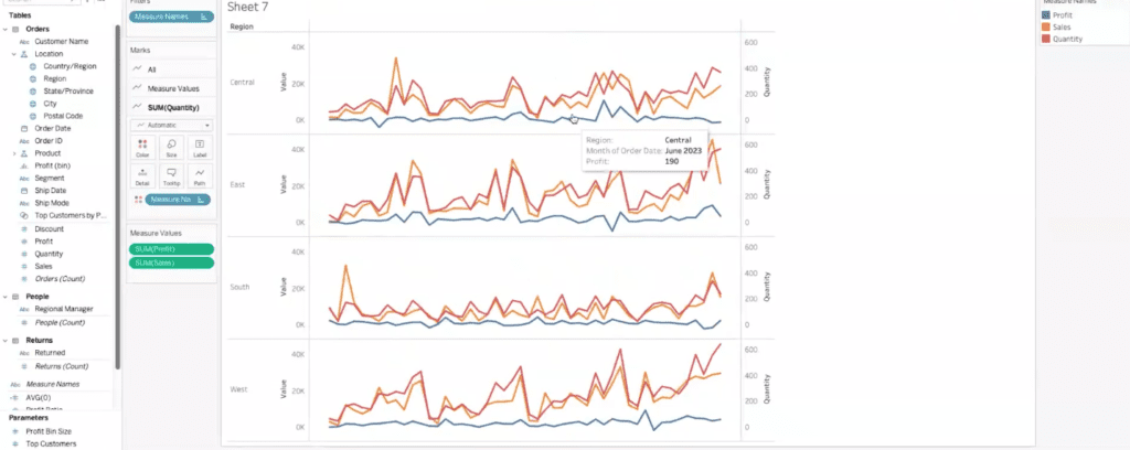
>> JARED: I’m looking down the script and I’m like, oh man, we’re going from maps to sparklines. We’re going to talk sparklines here. Sparklines, at their base, they’re just line graphs, but it’s these really nice compact line graphs that let you get a sense of scale and trend over time super quickly. They don’t take a ton of time to digest. We’re not going to include axes, numbers, grid lines, nothing. It’s just how are things trending?
What that looks like is if we want to start with order date, we’ll maybe do that by month as a continuous month, and then if we want to split this out by region and look at the sales, we can get this– we can get a nice line graph, that’s great, but we want to take anything that would be distracting out of this. We’re going to take off this header. We’re going to take off this header. We’re going to take off these, the grid lines, the zero lines. We don’t want any of that. All we want is this simple line. This is something that we might put over on the left side of a dashboard just to see that trend over time, either the left or maybe along the top of a dashboard just so that we can see what that trend is.
Okay, South had a big spike. They’ve been pretty consistent though and then they’ve got another spike and maybe they’re starting to trend up. We can see East has a lot of inconsistency, but an overall upward trend. West and Central have a much more consistent upward trend, especially in the West. We can tell all of that without needing to know what are the exact numbers, how many sales exactly in dollars and cents. That’s not the point here. We’re just trying to get that first initial takeaway of how are we trending? How are we doing? We can see that with this without getting distracted by all the other marks and points and numbers.
>> STUART: I suppose it wouldn’t look too cluttered even with a trend line on here.
>> JARED: Totally.
>> STUART: Maybe you can format some.
>> JARED: If we were just throwing a trend line, you can see those more clearly just boom. Upward trends, this is pretty flat. It’s an upward trend, but obviously the line is much higher and lower compared to something like the West, a lot more consistency. Something like that gets you a ton of takeaways just right away. That’s a fun one.
We’re going to stay on this sheet and we’re going to talk dual axis and shared axis. I’m actually going to back this up a couple of steps. I’m going to show the header here again. For something like a dual axis, this is something that’s super common. We see this a lot, probably on the more basic side of advanced visualizations. It’s just like one step beyond what Tableau gives you out of the box. If we’ve got sales here on this axis, and we want to grab profit and see that too, we can do that. If we right-click here, we can click on dual axis and actually see those both in the same cell now.
We see the sales and we see the profit. If you want to make it so that there’s less confusion, you can also synchronize those axes so that now they’re both using the same scale. They’re both going up to a little over 40K and that lets you see how those numbers compare to each other on a dual axis.
Now, the flip side of that is if we want to put them on a shared access. If we do that, we’re going to have sales out and then take profit and we’re going to drop it right on top of the sales axis. You can see there’s like those two rulers in green under my cursor. That’s telling us that we’re going to put these on a shared access and that changes from sales to value.
Now we see that we’re actually using measure values and measure names with profit and sales as our measure names.
>> STUART: You could add more measure values then, that is to say?
>> JARED: You could add more measure values.
>> STUART: At the risk of it being overly confusing.
>> JARED: Totally.
>> STUART: [inaudible]
>> JARED: If we wanted to drop quantity in, we could and get that in there as a third measure value, but kind of like we talked about on the use separate legends example, quantity is on sort of a different scale, because it’s not in dollars and cents, it’s in individual units. What we could do is drop quantity on as a dual axis with a shared axis. Now, we see our sales, our profit, and our quantity and they’re all on the same sheet, which looks a little bit funky and busy. There’s certainly ways to get around that, but it’s an option.
You can have multiple measures on one axis as measure values, and then a separate one on a dual axis as well, so showing sales and profit on one and then quantity on a second access.
>> STUART: I guess you could, in theory, format the quantity line and make it sort of be there, but your more important measures are in front but still have it be referenceable.
>> JARED: Yes. If you did something like make quantity a dashed line, that very visually separates it from sales and profit. [inaudible] It’s supposed to be something different. You can make it a different line pattern out of funky ones.
>> STUART: Different color, you can control the measure color, I would think-
>> JARED: Maybe we make that–
>> STUART: -with gray or something.
>> JARED: Yes, like gray even, just to, again, separate it. I really don’t like that line pattern.
>> STUART: That’s [inaudible].
>> JARED: You’ve got some options within dual axis and shared axis to really do some kind of funky things.
>> STUART: I took you a different direction there. Dual axis, shared axis, then we did a combination. That is cool.
>> JARED: We’ve done this on client engagements where we have to have, this is the closest you can probably get to a triple-axis chart. There’s a couple of other BI tools that allow for three or four axes and then they just don’t display the scale for some of them, which is awful from an actual user experience standpoint. Here, we can easily see that we have the scale on the left for our sales and profit and the scale on the right for quantity. At least we can tell what’s going on with each of them.
>> STUART: That’s cool.
>> JARED: That’s a funky one.
>> STUART: Where are you taking this next, Jared?
>> JARED: We’re talking donuts.
>> STUART: Okay, donut charts. Yes.
>> JARED: Let’s talk donuts, and then we’ll use that as a nice segue into Viz Extensions.
>> STUART: Okay.
>> JARED: The donut charts in Tableau are not something that’s available out of the box. We’ve got pies. We could build out, if we take sales, and then we take region, we can drop region on color. We can change this to a pie and then put sales on angle. Great, we’ve got a pie chart. That’s nice. We’ll take a pie. If we wanted to, again, just kind of make this a little bit more visually interesting, we can make this into a donut chart with some really hacky workarounds.
Again, bear with me while I do some jumping through hoops in the back end. I’m going to put a min 1 in rows, and I’m going to put a second one in rows. Then I’m going to do what we talked about before and make this a dual axis. I’m going to take this bottom pie chart and slap it right on top of the pie chart above it. Now we’ve got both pie charts in one. Let me go ahead and make the size a little bit bigger here, just so that it’s a little bit nicer visually.
The other thing that it’s done is it’s put measure names and region on color. I don’t really want measure names there. I just want my four regions on color. What we see here is still a pie, and what we want to do, and this is the thing that I can never remember, however many times I do a donut, is which one of these we want to make the whole. I did this not 30 minutes ago, just to prep for this call, and I couldn’t remember. Couldn’t tell you.
>> STUART: I think it’s the bottom one.
>> JARED: Let’s try that. We’ll see.
>> STUART: [inaudible]
>> JARED: If we take the bottom one, and we take out the color on region, and we take out the sum of sales and we’re going to make this size a little bit smaller. It is the bottom. Now this size slider never gives you exactly what you want the first time. You just have to kind of click around. That’s not too bad.
>> STUART: Yes.
>> JARED: If we use that size and then change this to white, now all of a sudden we’ve got a donut chart instead of a pie. Is it actually a donut chart? No, it’s a pie chart with a white circle on top of it that looks like a hole but even this lets us do some kind of fun things. If we go ahead and hide these min 1 headers, just because they’re not doing anything for us, and they’re kind of ugly, we can go ahead and hide the grid lines for the rows to get rid of that line across the middle.
Now if we want to start adding some information to this, maybe we take sum of sales and drop that on labels. That’s great. Now we can see what our number is for sales. In the hole, we can actually do the same thing. We can take sales, and because we’re not splitting this middle pie into any slices, that’s going to give us our total, which is kind of a nice way to be able to see, okay, here’s for each of my regions what that number is, but then also I have that grand total right in the middle, quick and easy.
Donut charts are a little bit clunky out of the box. It’s not something that there’s just a click and it’s done. It’s not like in the Show Me menu. I’m led to understand, Stuart, that that functionality is coming, that there’s a beta going on right now for Viz Extensions for donuts and for stuff like Sankeys as well. Do you want to talk a little bit about that?
>> STUART: I definitely can. You’re sharing, Jared, do you want to pop in this link real quick? We don’t have access to the beta yet, but let me put this in the chat window. Give me one sec. I don’t know if you want to click on this. We touched on it a little bit earlier. Tableau’s making an effort to make the more complex visuals readily available inside a Tableau workbook. Jared, if you scroll down, this is in beta, so you can go test this.
Imagine you’re in your workbook, you just add an extension and you can bring that in. I think if you scroll down, Jared, it’ll show the actual Sankey. Bring that in.
>> JARED: Oh, yes.
>> STUART: You have an extension and that should be available for donut charts, hopefully many more. That is coming. It’s not GA, it’s not generally available right now, but it’s coming. That’ll be really interesting. Sankey charts are incredibly difficult to build in Tableau out of the box, so that’ll simplify that chart. I hope they will simplify the donut chart if that’s way too hacky and hopefully many more that they’ll add.
>> JARED: I’ve built–
>> STUART: I will say– Go ahead, sorry, Jared.
>> STUART: I’ve had to build a Sankey chart like that once and that was enough to not do it again, ever. It was awful. Tableau’s made a big effort to add extensions. I don’t know if people on the call have heard about this, but there are companies out there that actually build apps on top of Tableau. One of them that comes to mind that we work with a lot, it’s called Infotopics, and they have all these different extensions that really hit areas of Tableau that Tableau’s not necessarily focused on.
They have some really cool stuff. They have dynamic PowerPoints that they can do. They have a Show Me More gallery where you can do crazy tree diagram. What are some of the stuff, Jared? It’s like they have some really neat visuals that they can do. There are companies out there that are doing this and you can implement that and configure it with your Tableau deployment, something to keep an eye on.
Jared, we’ve got right about 13, 12 minutes. Are there questions from the group? Questions from anyone? I see a lot of great comments. I think this is a good session, Jared.
>> JARED: Oh, nice.
>> STUART: If anyone wants to come off mute or use the chat window, ask a question. Has anyone signed up for the beta? Sorry, go ahead, Jared.
>> JARED: I was just going to say, while we’re waiting on some questions and while you’re chatting with the audience, I’ll set up Viz and Tooltips on this donut because I did promise that we’d show that too.
>> STUART: Let’s show that. That’s a great feature. Let’s show it.
>> JARED: I want to see where– Our map was on sheet 6. If we want to add some additional detail into our donut chart, this is where we do Viz in Tooltips is you just come in and edit the Tooltip, come to the Insert menu, and you can insert your sheets. If I want to see that map by region here, I can just hover over and it’s going to actually zoom in and show me just that region and all those states. You can start to see where those sales are coming from. A really neat feature to have that next level of detail.
>> STUART: Yes, and save realestate too, right?
>> JARED: Yes.
>> STUART: Where you could have another view of that, but it’s really handy in that scenario.
>> JARED: We could do the same thing with, what was it, sheet 3? That has the rounded bars on it that we built.
>> STUART: Yes. The view is too large to show. You would edit the height and width, I’m guessing.
>> JARED: We can make this max 500 width and height, see if that’ll do it. Yes, that gets us the whole view. If you ever run into that error, you can just go into your Tooltip menu and just edit that max width and max height. It starts to give you a little bit of a second-level analysis view.
>> STUART: That’s really cool. Okay, we had a question come in. Not sure if this is the data set for this, but is it possible to build out a flight map to track deliveries? That’s a great question. No, not the right data set, but that is a phenomenal question. It is possible. Totally possible.
>> JARED: [inaudible] There’s a guy who works with Tableau that we partner with to do trainings for state and local government. There’s probably a handful of people on this call who know us from those training sessions. I know he’s done a demo before displaying flight paths from different airports. You could easily do the same for deliveries if you wanted to see from your distribution warehouses or wherever you know that things are getting shipped out from to your customers. You e kind of path tool on the lines with map.
It’s a bit of a funky workaround, but I’m sure if you search on Tableau–
>> STUART: I got it right here. Yeah. There’s one, I just found it on public, that geospatial curve. I think you can dowcould build that out with that samnload it, it looks like.
>> JARED: That’s where I was going to go, is I was going to say, if you can download these, the Tableau workbook, you can dig into exactly how they made this. This is using airport codes as geographic fields, it looks like, but if you had Latin long for your customer addresses, or if you wanted to just do it by city and state, you could totally do that.
>> STUART: Jared, there’s some good tutorials out there, definitely, you can deconstruct. It is a bit more complicated, fair to say, Jared, this type of visual, but maybe they’ll make that simpler with Viz Extensions because that’s a great use case that comes up a lot.
>> JARED: I want to say this uses like sines or cosines or something like that. There’s some funky math to get the curve paths, but a straight path would be a little bit easier.
>> STUART: It looks like Xavier linked a YouTube video to a good article. Pascal, I agree, Andy Kriebel is fantastic on YouTube, and we have always loved what he does. Definitely check out Andy Kriebel and Tableau Tim. Someone asked about the recorded session. We’ve done a number of these recorded sessions. This will be out there in the next few days. You can go back and watch some of these tips. We’ve also done, Jared’s led a session on parameters. We’ve done just general tips and tricks to get you faster in the product. We’ve done advanced dashboarding was one of them, calculations, so there’s lots of good content out there. Like and subscribe.
[laughter]
>> JARED: There’s some cool stuff on the data side too, right?
>> STUART: Yes.
>> JARED: Like we’ve talked about what? Matillion and, or Fivetran or something-
>> STUART: Data lakes.
>> JARED: -like that. Yes, data lakes and–
>> STUART: Migrating to cloud.
>> JARED: Cloud migrations for sure, seeing a lot of that because that was one of the things I was noticing with that beta is it’s only available in the web editor on cloud. If you’re on server, I don’t think you can get access to that. You can on Tableau, probably. It debuted as a beta first on public.
>> STUART: Cool. If there are no more questions, start out a little bit early.
>> ATTENDEE: I have a quick question if you don’t mind.
>> STUART: Yes, please. If you have any, could you share any tips or fun things you’ve noticed when using like rank and rank dense?
>> JARED: Oh, yes. Ranks are kind of funky.
>> ATTENDEE: I was using it recently and was very, struggling pretty significantly and tried to, I guess, do some of the, what is it, fix like some level of details around it.
>> JARED: Oh yeah, and you’ll have some trouble using ranks with level of detail because that’s a table calc and a fixed calc and the same thing, or table calc and level of detail. Ranks are one of those things that we use infrequently enough. I recommend anybody go ahead and use this guide over here just to remember. If we want to just rank these by sum of the sales and we’ll let that be– let’s do that descending. Pretty sure that’s how we’re going to want to do that.
Then if we bring that out and just make that discreet, that starts to look a little bit better. I don’t know if we’ll have any people with the exact same– Okay, so we do. We have some people who are tied towards the bottom and a rank dense, I think, would give us those ties as, or maybe there are pennies differences on these.
>> STUART: Probably.
>> JARED: I thought we were going to get a good– Dang.
>> STUART: It’s got decimals in it.
>> JARED: Let me do this. Let me just make it round. There we go, okay.
>> STUART: Yes, let’s go.
>> JARED: Rank dense, that’s actually interesting that made those, I guess because it’s summing the floored sales. We’re really making this more complicated than it needs to be here but the rank dense will give you grouped numbers. If you have two things that are tied in the ranking, it’s going to rank them that way and there’s other options as well. All of which to say, I don’t know if this is really answering your question because it sounds like you might be more in the deep end.
>> ATTENDEE: It’s largely confirming that it’s not just me because I’ve been really throwing my head at it.
>> JARED: Okay. This is giving us 777 and then these two are both 779, so kind of saying there is no 778 because we have two people tied here. No, to talk a little bit more about ranks, because they’re by nature table calculations, you’re going to be limited on what else you can do with them. They don’t really exist outside of the table that they’re in because they’re calculated within the table.
That said, if you’re using Tableau Prep, you can actually run those rank calculations in Tableau Prep and then calculate off of that field as though it’s any other measure or dimension, which can be useful as long as you don’t need that rank to be modified by the level of detail in the view. If you just wanted to rank people by first order date, you could totally do that in Prep and then that’s no longer a table calc, it’s just a native field in your data source and you could run calculations off of it using fixed calcs, whatever.
That opens up a little bit more flexibility and a little bit more complexity, something that we’ve done before, but we had a client who was trying to basically build a model in Tableau to determine score investments, investment opportunities. We ran a bunch of ranking calcs in prep and then brought them all together in a data model to build an overall score for those potential investments. That was a really head-spinning project, but it’s technically doable in Tableau. If you want to do something like that and you get stuck, I hate to say it, but feel free to reach out. We can probably–
>> ATTENDEE: Absolutely. It’s great. The issue ultimately was I had some additional aggregations within the view and the rank was being tied to something else. With those additional numbers being showed, it was counting them when I didn’t want it to. You don’t want it to be stuck at the higher view. This has been really appreciative and verifying the frustrations.
>> STUART: Awesome.
>> JARED: Your frustrations are 100% valid and it’s not something you’re doing wrong.
>> ATTENDEE: Thank you.
>> JARED: You’re right on point.
>> STUART: All right, we’re close enough to time. I want to leave people with this. If you have ideas for what you want really Jared to present on and I’ll help with the orchestration of that, we are all open to ideas. We want to make this about y’all as we plan out the rest of the year. Email us, I’ll put my email in here. If you have ideas, let us know and we will incorporate that as best we can into the future sessions.
With that, Jared, thank you. That was fantastic. We’ll have that up on YouTube as promptly as we can. We’ll see you middle of the month in July. I hope everyone enjoys the beginning of summer here. Thanks for all the kind messages too, guys. We appreciate that. All right, Jared, thanks again. We’ll talk soon everyone.
>> JARED: Thanks, everybody.
>> STUART: Take care.