Tableau is renowned for its intuitive interface and ability to transform raw data into actionable insights. When working with fields like sales or profit, default formatting in Tableau often doesn’t align with the specific requirements of your analysis. For example, sales data may default to a plain number format, but you might want it displayed as currency. While you can adjust formatting on a single sheet, the changes don’t carry over to other sheets within the workbook. This limitation can lead to repetitive formatting tasks.
A key feature that often goes underutilized is the ability to apply default formatting to fields. This feature saves time and ensures consistency across your Tableau workbooks, especially when dealing with recurring data formats.
In this guide, we’ll explore how to apply default formatting to fields, enabling you to streamline your workflows and maintain polished, professional visualizations.
Tutorial Video
Step-by-Step Guide to Applying Default Formatting in Tableau
You can apply default formatting in Tableau to a single field or multiple fields simultaneously in your workbooks.
To save even more time, you can format multiple fields simultaneously. However, if you need to only format one field, you can only choose that one field.
In this example, we’ll format “Profit,” “Sales,” and “Discount.”
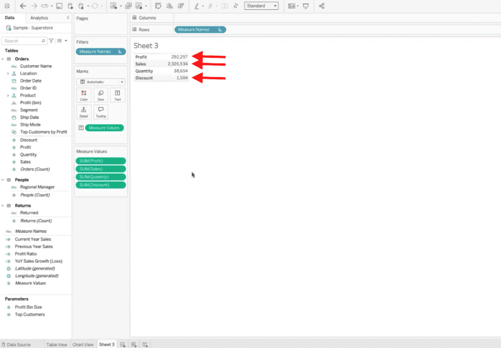
Use Ctrl (Windows) or Command (Mac) to select multiple fields (e.g., Sales, Profit, Discount).
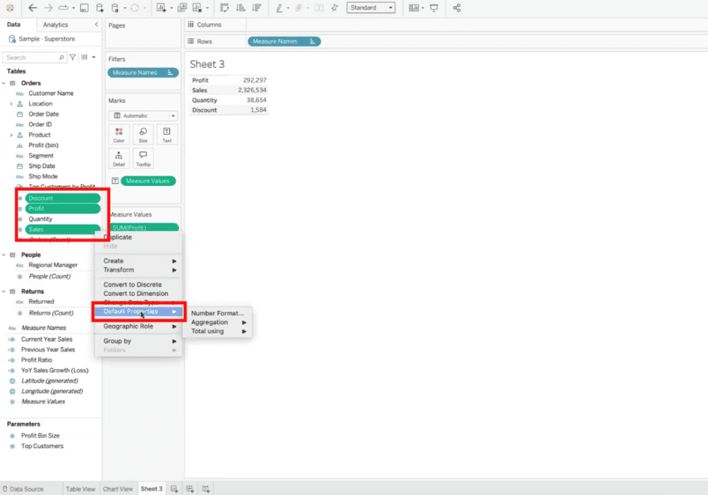
Right-click and navigate to Default Properties > Number Format.
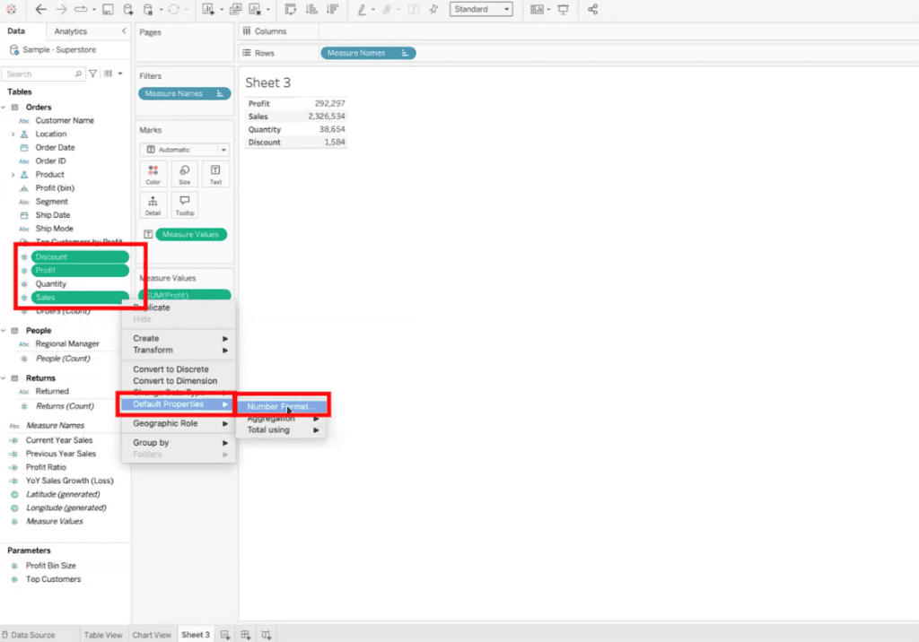
Apply a consistent format, such as Currency, to all selected fields.
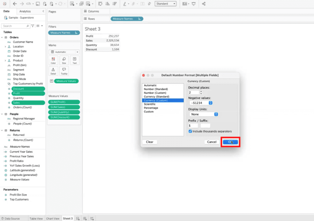
Once set, this formatting will automatically apply whenever the field is used in any sheet or dashboard.
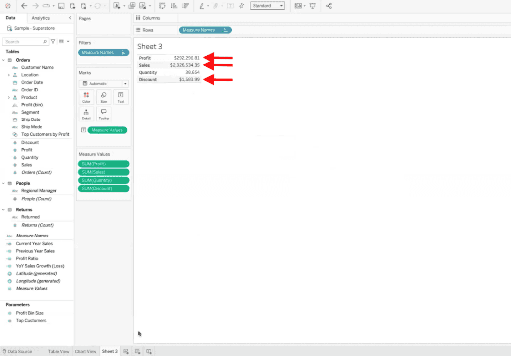
This method is particularly useful for maintaining uniformity in financial datasets.
Advanced Techniques for Default Formatting in Tableau
Adding Custom Indicators
For fields like Year-over-Year Sales Growth, you may want to use custom symbols (e.g., triangles for deltas). Here’s how:
Create a calculated field for the metric. In this example, we are using YoY Sales Growth (Loss).
Apply default formatting through Default Properties > Number Format.
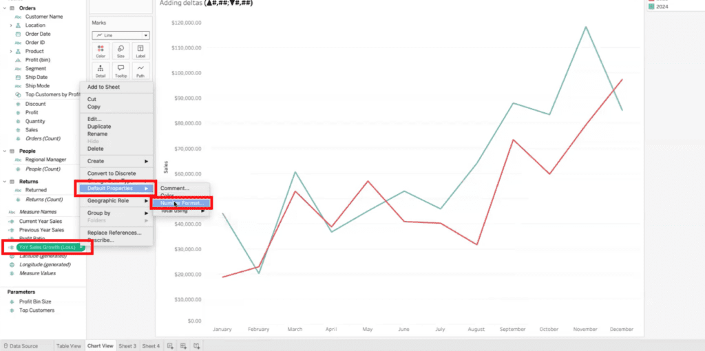
Use the custom format option to add symbols, such as:
▲ 0.0%; ▼ -0.0%. The symbols we are using for these specific examples are:
▲ #. ##%; ▼#. ##%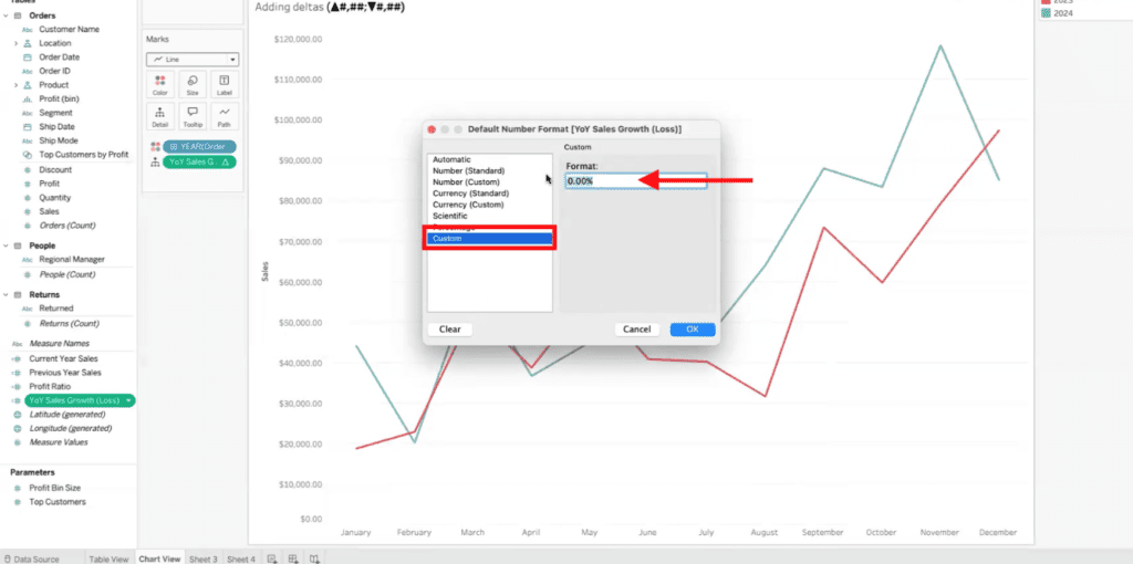
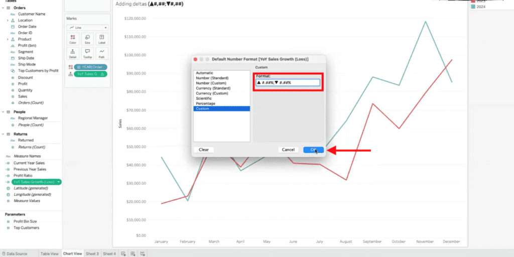
This displays positive changes with an upward triangle and negative changes with a downward triangle, enhancing readability.
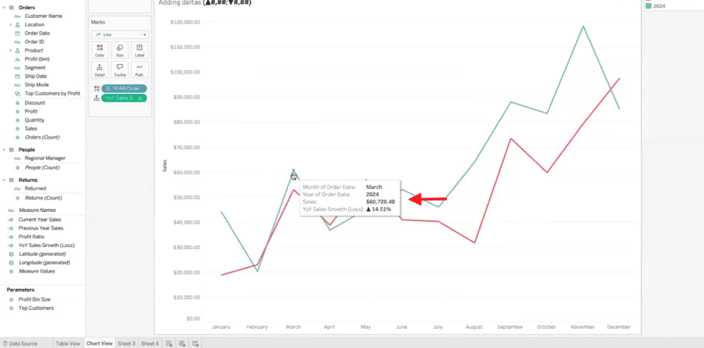
Formatting Heatmaps
Heatmaps are a powerful way to visualize data by using color to represent values within a table. In this section, we’ll walk through how to apply default formatting to heatmaps in Tableau, ensuring consistent and visually engaging displays across multiple sheets or dashboards.
Start by changing your table visualization into a heatmap. Drag your data fields (e.g., “Measure Values”) into the Columns or Rows shelf.
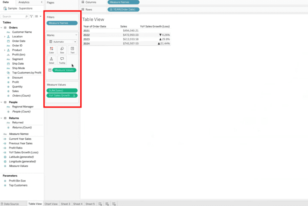
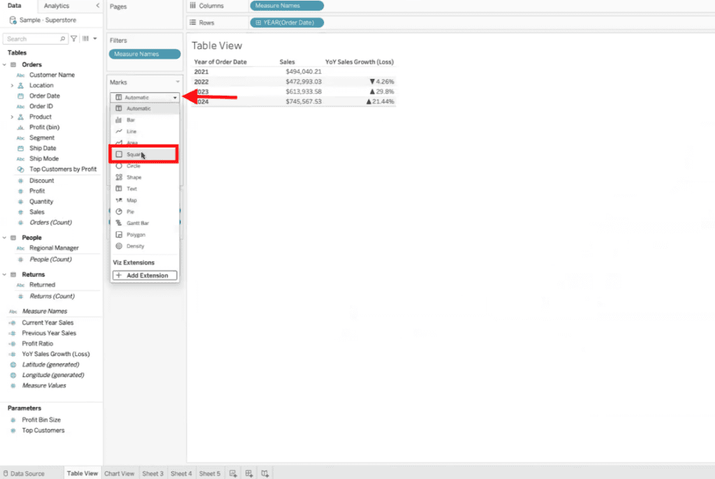
Change the Mark Type to “Square” from the Marks dropdown menu to create a heatmap structure.
Make sure the measure you’re using is set as a Continuous Value. Drag “Measure Value” to “Color.” This allows the entire cell to be filled with the chosen color gradient.
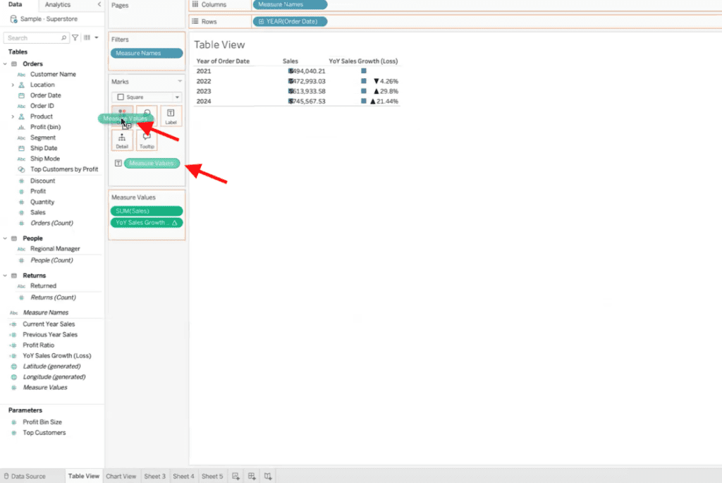
When working with multiple measures, use Separate Legends to compare values within the same column rather than across all columns. Right-click the Measure Values field on the Color shelf and select Use Separate Legends.
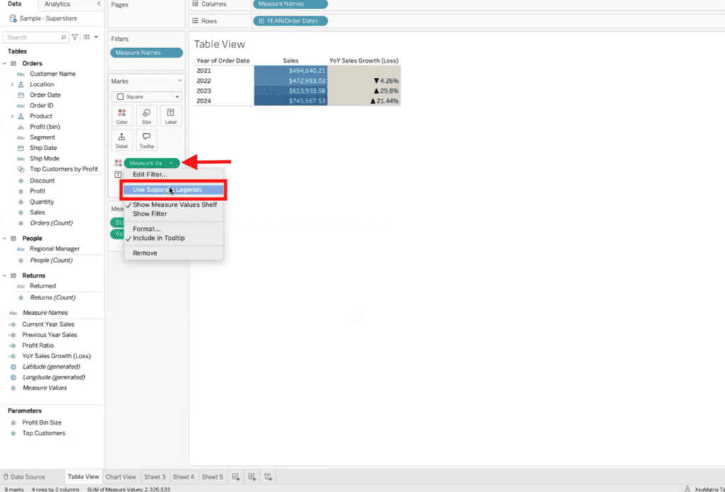
As shown below, this ensures that each measure’s scale is calculated independently, making comparisons more meaningful within a single column.
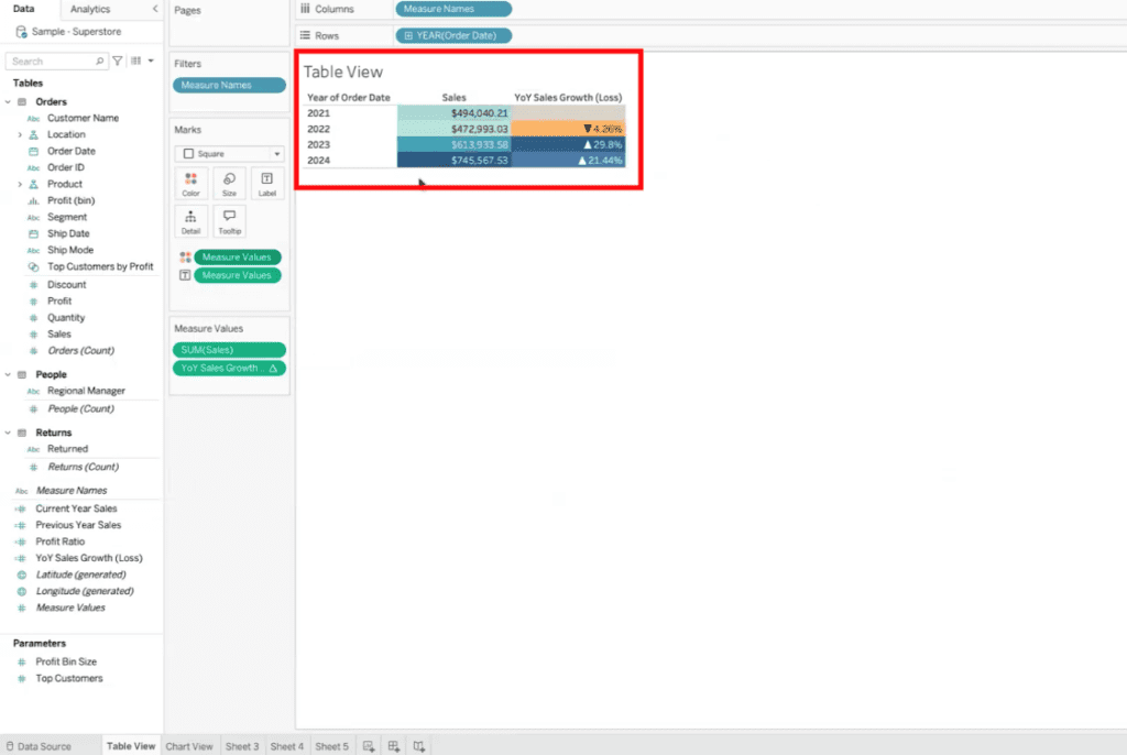
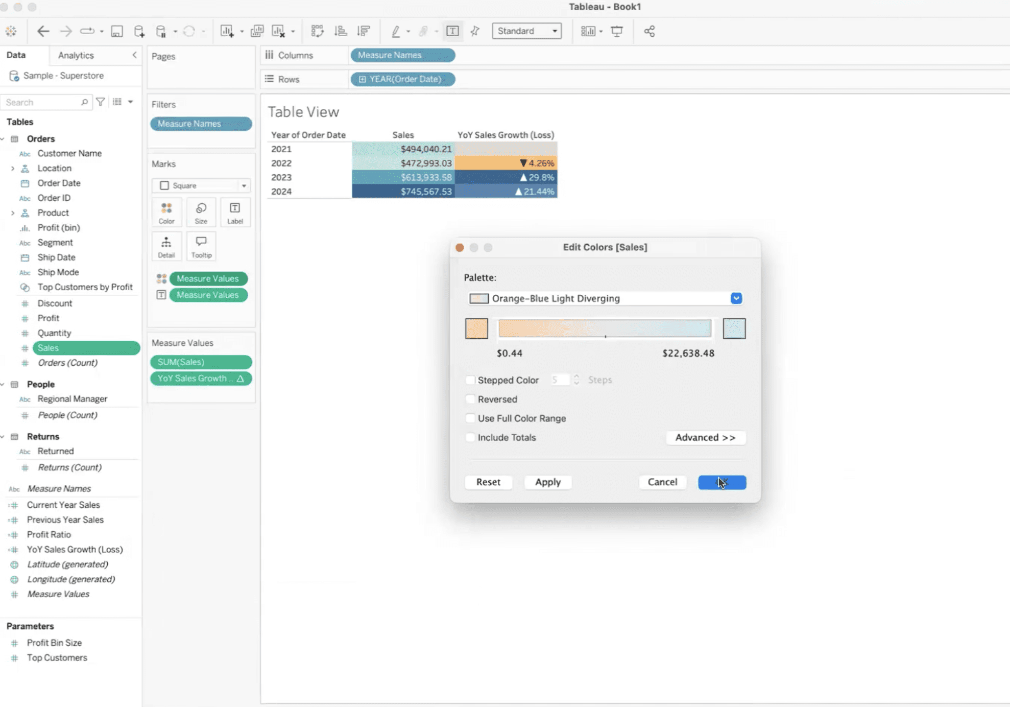
Set a default color palette for your measure. In the Data Pane, right-click the measure (e.g., “Sales”) and select Default Properties > Color.
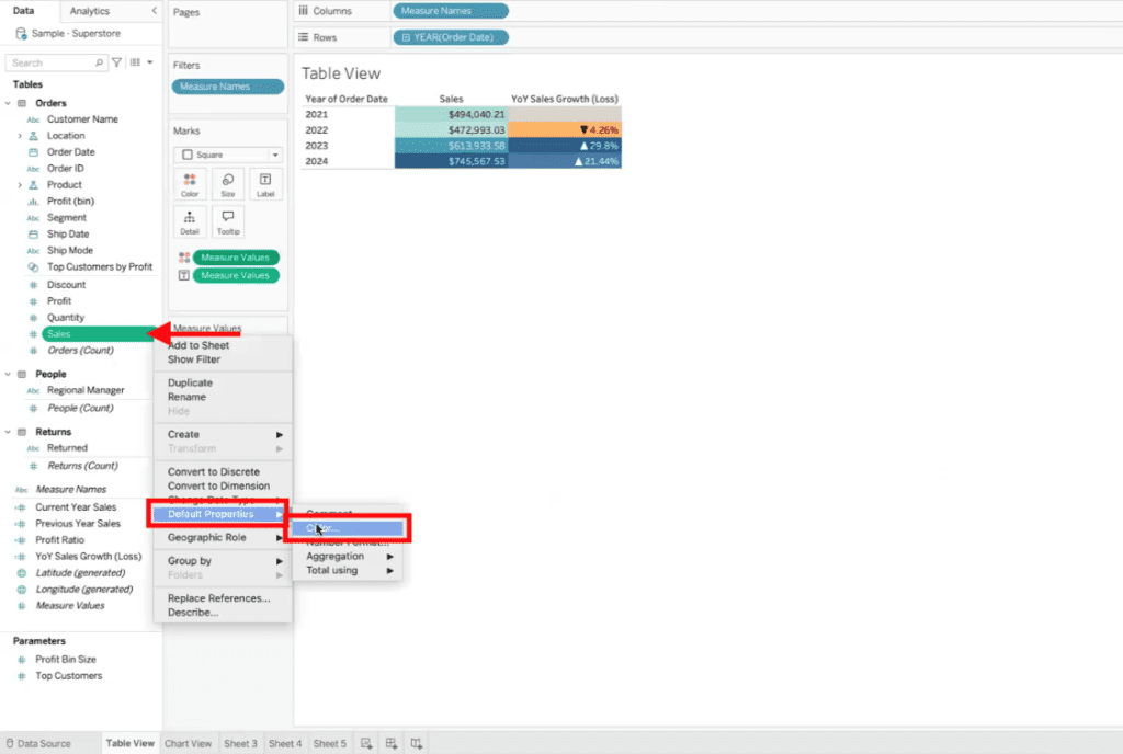
Choose a color palette, such as Orange-Blue Diverging, from the list of predefined options. Click OK to save your selection.
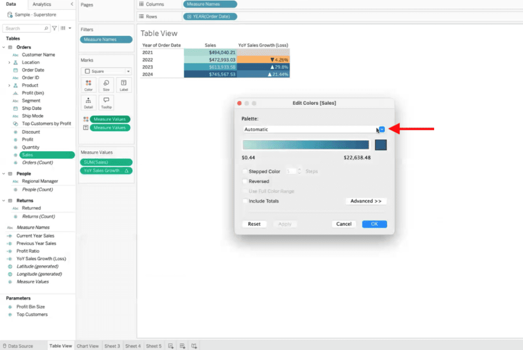
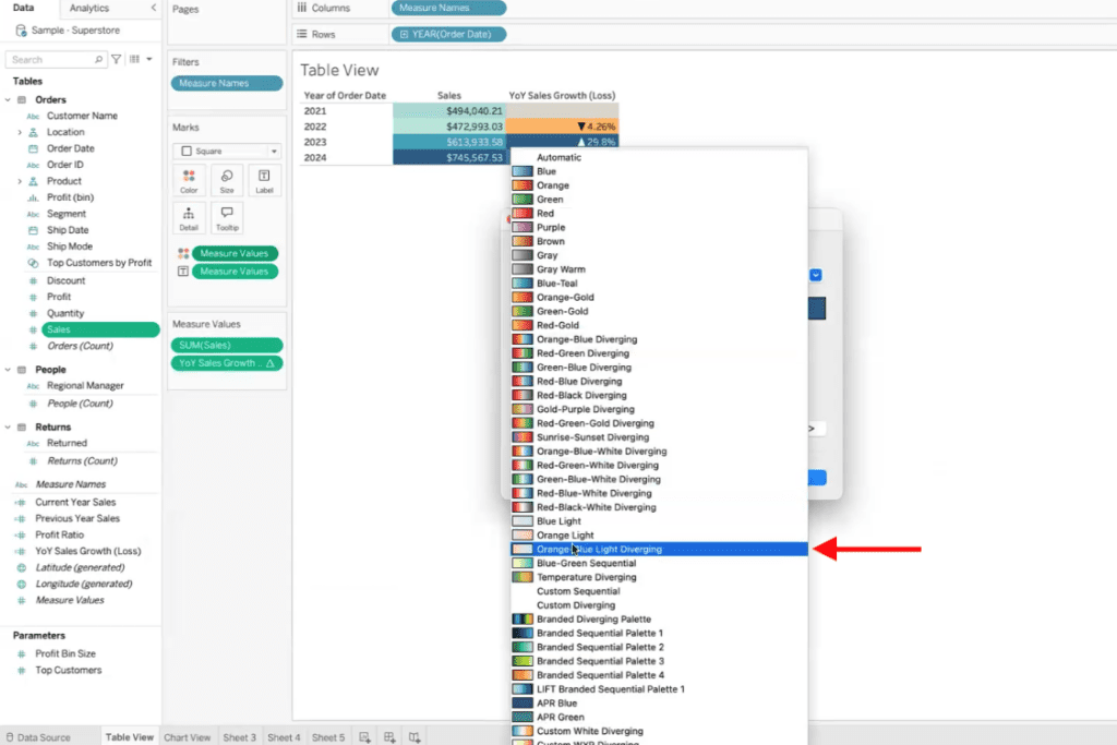
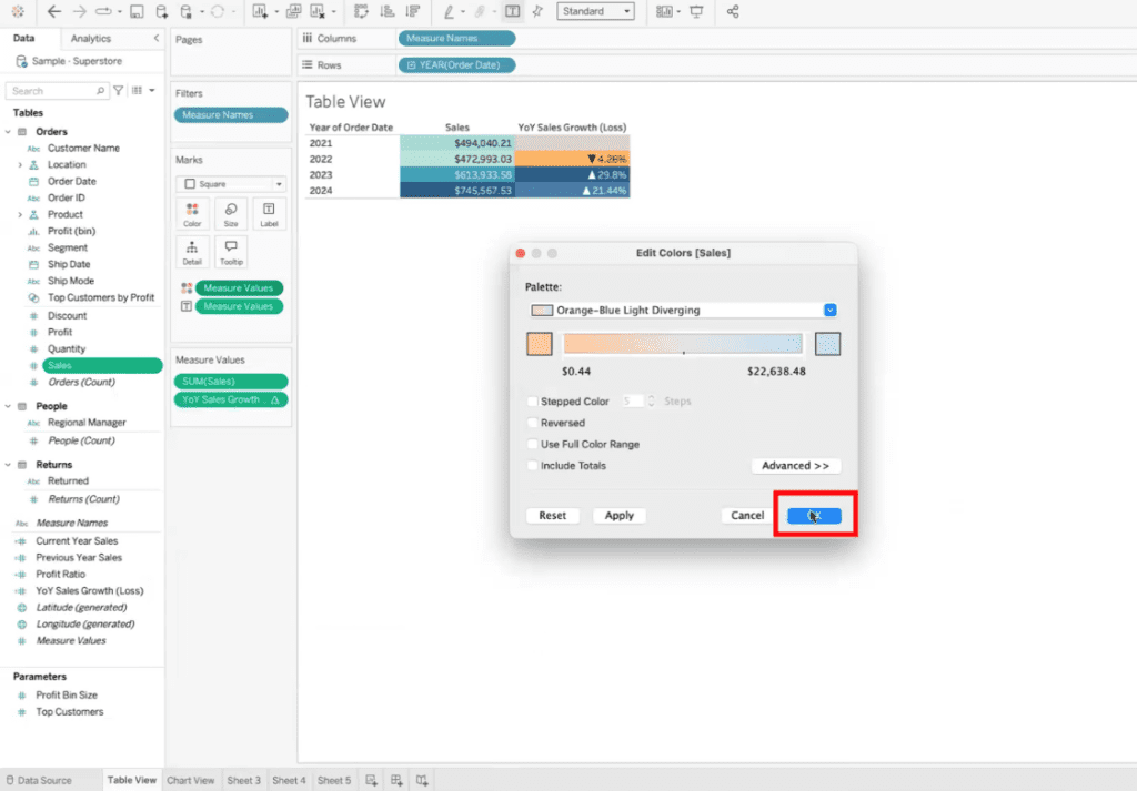
Bring your formatted measure (e.g., “Sales”) into another sheet or dashboard.
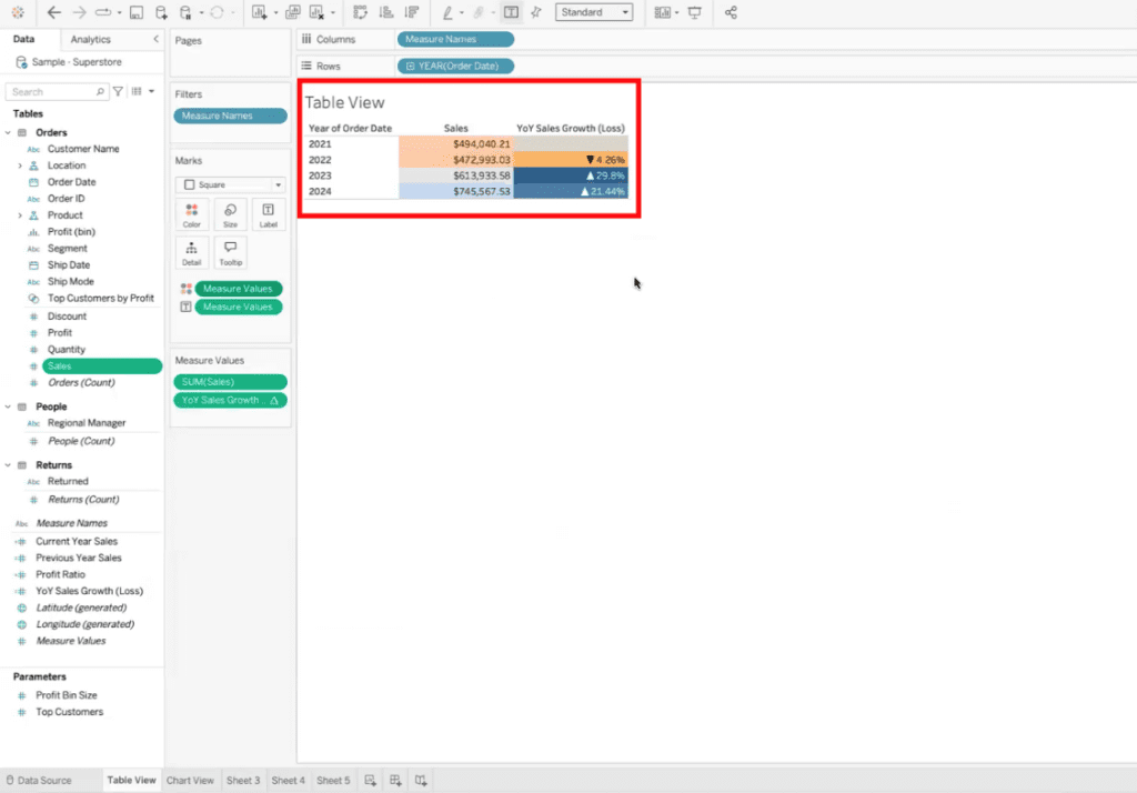
Verify that the heatmap automatically applies the default color formatting you set earlier. This confirms that the formatting is consistent and reusable across your workbook.
Why Default Formatting Matters
Default formatting not only saves time but also enforces consistency across your visualizations. Whether you’re working with financial data requiring precise formatting or creating dashboards for stakeholder presentations, default settings ensure your data looks professional and is easy to interpret.
Need Help with Tableau?
At XeoMatrix, we specialize in helping organizations maximize their Tableau capabilities. Whether you’re looking to streamline formatting, design advanced dashboards, or leverage Tableau’s full potential, our team is here to guide you.
Let us help you turn your data into actionable insights, one field at a time. Reach out to XeoMatrix today for tailored Tableau solutions designed to meet your unique business needs.
