The Data-Driven Community Meetup holds monthly webinars on business analytics and big data. Webinars are held on the second Wednesday of the month at noon (12:00 PM) central time via Zoom Webinars and will cover topics related to enterprise data management. Our goal with each webinar is to provide meaningful insights and actionable takeaways to simplify analytics so you can make better decisions.
We cover topics such as data strategy, data management, data warehousing, BI modernization, embedded analytics, and cloud migration and strategy. Learn how to build reporting solutions that drive your business demand based on your needs.
About the Topic
In this webinar, we explored alternatives to traditional filtering methods that enhance usability and create a smoother end-user experience. We demonstrated how to:
- How to implement dashboard action filtering for more intuitive navigation.
- The step-by-step process to create a filter reset button.
- Best practices for making filters more dynamic and user-friendly.
This article includes a recording, transcript, and written overview of the presentation on Filter Like a Pro: Smarter Tableau Filtering (On-Demand Webinar).
Smarter Tableau Filtering Presentation Video
Smarter Tableau Filtering Summarized Presentation
This session, led by Tableau expert Lauren Cristaldi from XeoMatrix, explored advanced Tableau mapping techniques. Topics covered include utilizing spatial files, creating custom map layers, performing spatial calculations, and building interactive visualizations like hexbin maps and dynamic gauges. Through practical demonstrations, attendees learn how to apply these techniques to solve real-world mapping challenges and enhance their Tableau dashboards.
Session Outline
- Understanding Tableau Filters
- Live Demonstrations: Smarter Filtering Strategies
- Best Practices & Takeaways
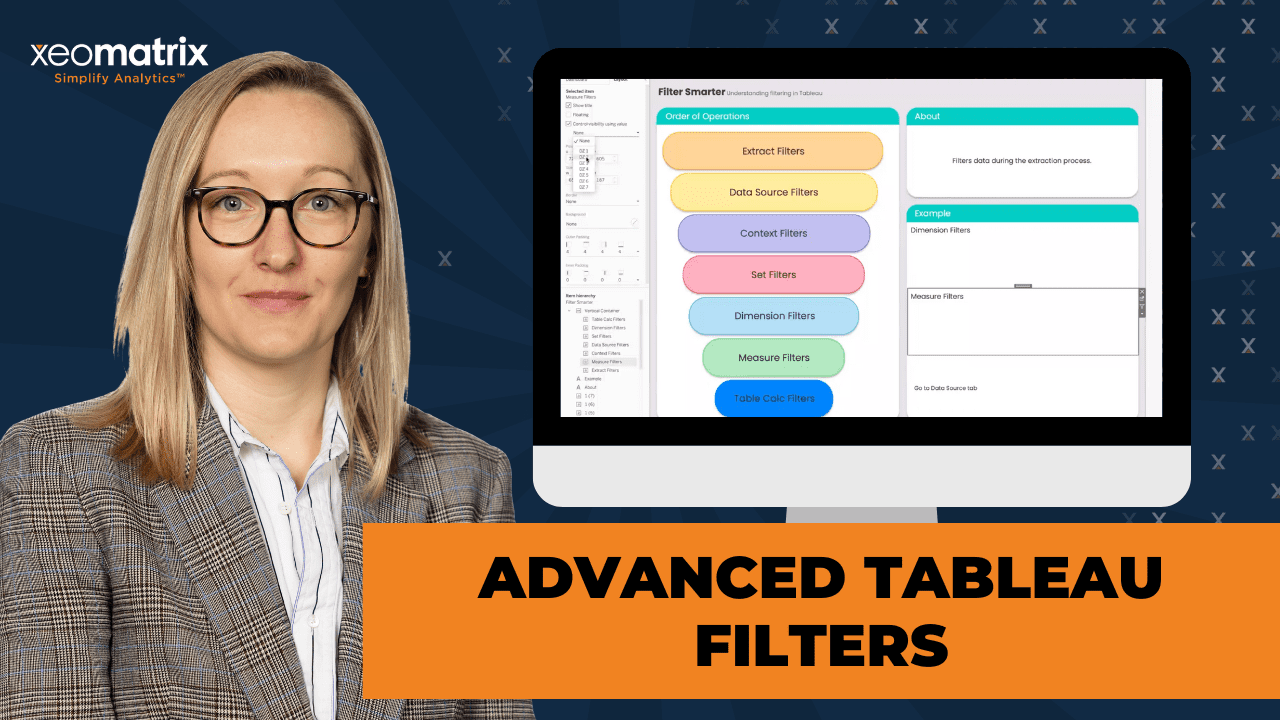
Understanding Tableau Filters
Lauren walked through the different types of filters and their hierarchy in Tableau, emphasizing their impact on performance and dashboard interactivity.
Extract Filters
Extract filters are applied at the data source level before any data is loaded into a Tableau worksheet. These filters help improve performance by reducing the dataset size upfront, ensuring that only the necessary data is included in the workbook. By applying extract filters, Tableau avoids loading unneeded data, which can significantly enhance processing speed, especially when working with large datasets.
For example, if an analyst only needs to analyze sales data for the ‘Consumer’ segment, applying an extract filter ensures that only relevant data is included before building any visualizations. This approach prevents unnecessary computations on extraneous data, making Tableau dashboards more efficient and responsive.
Data Source Filters
Data source filters are applied at the source level after extract filters. They ensure that a consistent filtering rule is maintained across all worksheets and dashboards that use the data source. Unlike extract filters, which permanently limit the dataset, data source filters offer flexibility while still reducing unnecessary data processing.
For instance, if an organization wants to filter customer names based on a specific segment and apply this rule consistently across multiple dashboards, a data source filter helps enforce this logic. This ensures that every sheet referencing the data source automatically applies the filter without requiring additional setup.
Context Filters
Context filters play a crucial role in controlling the order of filter execution, helping optimize performance. By adding a filter to the context, Tableau ensures that it is processed before other filters, effectively narrowing down the dataset before additional filters are applied. This is particularly useful when dealing with ranking calculations or top N filters.
A common use case for context filters is refining a ‘Top 10 Products by Sales’ filter to apply within a specific customer segment. Without using context, Tableau would determine the top 10 products first and then apply the segment filter, potentially leading to an inaccurate result. By setting the segment filter as a context filter, the dataset is first narrowed to the desired segment before determining the top 10 products.
Set Filters
Set filters allow users to create subsets of data based on specific conditions and apply them before dimension filters. These filters are particularly useful for defining groups dynamically and controlling how they interact with other filters in the dashboard.
For example, if an analyst wants to track the top 10 products by sales while also segmenting customers, creating a dynamic set filter ensures that the top 10 list is updated based on user interactions. This approach provides greater control over filtering logic and allows for more advanced data segmentation in Tableau dashboards.
Index-Based Filtering
Index-based filtering utilizes table calculations, specifically the INDEX function, to rank and filter data based on a defined order. This type of filtering is applied last in the filter hierarchy, ensuring that all other filters have been processed before it takes effect.
A key advantage of index-based filtering is its ability to create dynamic rankings. For instance, instead of using a static ‘Top N’ filter, an analyst can apply an index calculation to rank products dynamically based on sales. This method provides greater flexibility in analyzing ranked data and allows users to adjust rankings interactively within a dashboard.
Measure Filters
Measure filters operate on aggregated values and are applied after dimension filters but before table calculations. These filters allow users to specify thresholds for numerical values, helping to refine the dataset based on key performance metrics.
For example, an analyst might want to display only products with total sales above $1,000. By applying a measure filter, only products meeting this sales threshold will be included in the analysis, ensuring that low-performing items do not clutter the dashboard. This approach is particularly useful in financial and sales reporting, where users often need to focus on specific value ranges.
Action Filters
Action filters provide an interactive way to refine data within dashboards. Unlike traditional drop-down filters, action filters allow users to filter data by selecting values directly within a visualization. This method enhances performance because Tableau only processes selections that are already loaded in the view, rather than recalculating an entire filter list.
For instance, clicking on a state within a map visualization can dynamically filter a bar chart showing category sales for that specific state. This technique provides a more intuitive and efficient user experience while reducing the computational load on the dashboard.
Live Demonstrations: Smarter Filtering Strategies
Lauren showcased several examples demonstrating how to apply filters effectively within Tableau dashboards, emphasizing performance optimization and user interactivity.
Dashboard Action Filters
Lauren demonstrated the power of action filters, which allow users to interactively filter data within dashboards. Instead of relying on traditional drop-down menus, users can click on a specific visualization element—such as a state on a map—to dynamically filter other charts and tables within the dashboard. This method not only improves user engagement but also enhances performance by reducing unnecessary filter computations.
The demonstration included a heat map and a bar chart where selecting a state dynamically updated the sales categories displayed in the bar chart. This approach is particularly effective in dashboards with large datasets, as it eliminates the need for preloaded filter lists and speeds up query execution.
Using Dynamic Zone Visibility for Interactive Dashboards
Another key demonstration focused on Dynamic Zone Visibility, a feature that enables sheets to appear or disappear based on user selections. By leveraging parameters and dashboard actions, Lauren showcased how users could switch between different filter demonstrations dynamically without cluttering the dashboard with unnecessary visualizations.
For example, selecting “Extract Filters” would make a sheet displaying extract filter techniques visible, while choosing “Context Filters” would replace it with an explanation of context filtering. This approach allows for a more streamlined dashboard experience, ensuring users only see relevant information based on their interactions.
Building an Optimized Filtering System
To address performance optimization, Lauren walked through best practices for structuring an effective filtering system. She highlighted the importance of using containers to organize filters efficiently and demonstrated how applying filters across selected worksheets—rather than the entire data source—improves responsiveness.
The session also covered the impact of using ‘Only Relevant Values’ in filter drop-downs, explaining how it can slow down performance when dealing with large datasets. Instead, Lauren recommended leveraging dashboard action filters as an alternative, allowing Tableau to dynamically adjust visible options based on selections within the dashboard. This technique ensures a balance between flexibility and performance optimization.
Best Practices & Takeaways
- Minimize the number of filters: Too many filters slow down performance; avoid excessive string filters.
- Use Extract Filters and Data Source Filters: They help pre-filter data, improving efficiency.
- Context Filters for controlled execution: Use them to ensure specific filters are applied before others.
- Use Index instead of ‘Top N’ filters: Provides more control over sorting and ranking logic.
- Action Filters over Drop-downs: More performant and provide a smoother user experience.
- Use Dynamic Zone Visibility: Reduces dashboard clutter and enhances user interactivity.
- Be mindful of ‘Only Relevant Values‘: Can slow down dashboards; consider action filters instead.
Transcript
>> STUART TINSLEY: Welcome, everyone. Excited to have you on this session. Today, we’re going to talk about smart tableau filtering. Lauren, what do you have for us? What are we getting into today?
>> LAUREN CRISTALDI: I was thinking we’ll go through the order of operations of the different filters, the benefits in terms of performance of different filters, and we’ll make them come to life.
>> STUART: That’s great. That sounds good. Awesome. A reminder that every month, we do a data-driven community event, middle of the month. Lauren, I don’t even know how many we’ve done. It’s probably been maybe 15 or 20, but excited to keep this rolling. Tell your friends, tell your coworkers if they want to join. Featured speakers, I’ll be the MC. Lauren, you’ll be taking the screen and giving us a presentation today. I’ll have new headshots that we update, by the way. We got new headshots as a company, so we’ll put that in there in the new slides.
>> LAUREN: Thank you.
>> STUART: All right. Smarter filtering with Tableau. Just a reminder guys, virtual meeting here. You do have the option to come off mute if you have any questions. You can also use the chat window. We’ll open it up for Q&A at the very end, but if you’re not talking, if you could stay on mute, that’ll help Lauren tremendously. We’ve had really good success with that in these sessions, so thank you very much. Lauren, do you want to tell the folks on the call about your experience? We might have some new people on here.
>> LAUREN: Yes. I’m Lauren Cristaldi. I’m out of Charleston, South Carolina. I worked for the state of South Carolina for about four and a half years. I come from a state government background. I’ve been using Tableau for over seven years now. I love formatting.
>> STUART: You do love formatting. You had applied to the Iron Viz this year.
>> LAUREN: Yes. I always forget to plug that.
>> STUART: Well, I’ll put that in there for the next slide. I think folks know who I am. I lead the sales team at XeoMatrix, but I’ve been in Tableau for about 11 years, and I used to work there. I think we can get right to it, Lauren. Let’s jump right in. Smarter Tableau filtering.
>> LAUREN: That’s good.
>> STUART: We’re ready for a live demo. Let me stop sharing. Like always, guys, we have this session recorded. It’ll be up on our YouTube page. That YouTube channel is just XeoMatrix on YouTube, and every session is recorded. They’re also sent out via email after the session. Lauren, you can take it away.
>> LAUREN: Just to add to that, a lot of times I’ll publish these workbooks. If you want to go back and look at the workbook or see how I did anything, it’s either on the XeoMatrix Tableau public or sometimes it’ll be on my Tableau public or a different version of it. Because I know for me at least, I’ve found that it’s easier to learn by downloading a workbook that exists and try to reverse engineer it, but everybody’s different. Just sometimes that can help. Let’s jump into filtering.
With Tableau, you have a lot of filtering options, and it can be overwhelming. It’s like, well, what does this even mean, and which one should I use? Like for my data, do I have a lot of data? Do I have not that much data? Where is it coming from? How is this affecting the performance of my dashboard? Sometimes people fall into- they use too many filters, because they’re thinking that they want the users to have as much flexibility as possible. In reality, users don’t actually need that many filters, and it negatively impacts performance, especially string fields. Those are the least performant, because just how it computes, it takes forever compared to other filters.
To start off, we have extract filters. These are ones that are applied to your data source, so your extract. They’re different from data source filters, because if we go over here– I’m just connected to Superstore. If we created an extract, and then we said edit, this is where you’d apply these extract filters. If I only wanted to see- let’s see a certain segment, just consumer. Now, when I go and build a new sheet, before it even gets to the sheet, it’s already prefiltered.
This can be really the most performant, especially when you’re applying even more filters or if you have a lot of sheets, or let’s say those other segments have a ton of data and you don’t necessarily need them. It pre-filters everything out, so Tableau is not having to load as much data as it would normally. because usually, it’ll load all the data. Then you’re applying the filters. Then it’s trying to narrow down what you actually want, but it has to load everything first, if that makes sense. These can be really useful when you have large datasets with different dimensions or categories that you don’t necessarily need for the specific workbook that you’re creating.
I’m just going to go ahead and take that off. If you want to get rid of those filters, you go back to the Data Source tab, and we would just delete this and save the settings. Now, when we go back, all the segments are back. Those are our extract filters. Then we have Data Source filters. Towards the end, I’m going to show you some dynamic zone and how we can do different dashboard actions that are related to– Quick filters would be like your dashboard actions. That’s why this is just the Go to Data Source tab. Just had to throw that out there. There’s a plan.
Data Source filters would be the next in operation, because we’re applying that extract filter. That’s before you even create any worksheets or views. You’re just saying, “I want this subset of this data to load initially.” Now we have the Data Source filters, which if we go to new sheet, and let’s say we have customer name right now, but I only want to see– We can use segment again. I only want to see consumer, and maybe some of my other dashboards. I’ll want to see a different segment, or I want that flexibility to change this. We want this to apply everywhere. To do that, you say all using this Data Source, and that’s how we have that Data Source filter. Now we only have customers that fall into that segment.
Every time you create a new sheet or you have existing sheets, this Data Source filter will already be applied, which can be nice when you’re building a lot of sheets, and you don’t want to have to remember the exact– If you have a common filter across all of them, you don’t have to remember to apply that every time that you create a new sheet or go back to old sheets and have to apply that filter.
Next we have Context filters. The Context filters are cool because they help with that order. Basically any of these filters, if you add them to Context, they’re going to be applied before other filters are applied. If we create a sheet- and let me go ahead and take this segment off. We say, let’s look at all of our products or categories and product name. Let’s even take this off. Let’s just look at product names. I want to see the top 10 products by let’s say sales. Easy enough. If I were to go in now and drag this segment in, just say consumer and apply, now we only have nine rows, but we want the top 10.
With that order of operations, the segment would be a dimension filter, and that falls below a Context filter or set filter. That means it’s being applied after the top 10. The top 10 is technically a dimension filter, but it’s really like a set, because you’re creating a set essentially saying, “I just want the top 10 based on this criteria.” I just wanted to add in some sales, so it looked weird. If we have our product name in that top 10, and we want to see just in the consumer segment, I want a top 10, because I’m applying that extra filter. We’d add this to Context, and now you have all 10.
This can get annoying if you have a lot of different filters that you want. You don’t necessarily want them to be in Context, because let’s say you have a fixed calculation or a fixed LOD. If you have something in Context, those filters still get applied within that LOD even though you have it fixed. If you want to avoid doing that, we could either create a set, like product name. You can do it from here. Here’s all our products, and we can tell it, “I want a top 10 of sales.” We can also do that from the fields list as well. You just do create set. Select from list or do a top or another condition.
Now if we replace this with the product name set, which brings us to after Context filters, we have the set filters, but these are before the dimension filters. Now, if we remove this from Context, this is still showing us only nine. We’re making sure that we’re showing numbers in set. This is where it gets tricky, because if you go based off the order, these set filters should really happen before the dimension filter. Like I said, when you are using this kind of a set, you really need to add your other filters to Context to get that full top 10 relative to those other filters.
Something I really like to do though, instead of a top 10 or even using a set, I’ll create an index calculation. I just call it index and just the function index. Then okay. I’ll make that discrete. This will number our rows. I can remove this from Context. If we do edit table calculation, and specific dimensions, this just so that it’ll number it based on every single row. If we had multiple dimensions up here, you would select all of those. This is also another way to sort. Let’s say I want to sort by sales, some descending. Now we have all of these numbered. Well, I want the top 10 based on that sales some descending. We come over here to index. We’ll filter it, and I’ll just select 1 through 10.
Now we can have that filter that’s still being applied, but the index is applied after. You’re getting a true top 10 after you’ve filtered for consumer. I know I’m jumping around a lot, but that’s just filters guys. There’s an order, but there’s a lot of nuances to it. Technically, index is a table calculation. That’s applied last, which is why all of these other filters came before it. We’re getting that top 10 after everything else has been applied.
For a measure filter, let’s do the sum of sales. Let’s say I only want to see- do filter. I want to see values that are greater than 1,000. Since our top 10 is the descending sum of sales, that’s not really doing much right now, but if we go back in here, we edit that table calc, and we change this to ascending. We can remove this, because it needs to be set up again. Now we’ll filter this again. Just select those 10. Whereas before, when we were doing the ascending, it had values that were like one point something or very low in the hundreds. Now we’re making sure that this sum of sales is applied before we take that top 10 of the lowest, and we only want to see after that threshold of 1,000.
These are our basic filters and how they’re applied in this order. Are there any questions? I know it’s a lot.
>> [00:18:38] Speaker 3: I had one that I put in the chat. When you select a filter and apply to all using this data source, look at what actually is this. What’s the difference when you apply to worksheets all using this data source versus all using related data sources?
>> LAUREN: That’s a good question. With all using related data sources, basically it’s looking for, let’s say you had another data source that you were blending on, and you wanted that same one to apply to the blended data source, so we had customer name in both sources, and you’re filtering on customer name, then you’d say all using related data source. Both of those data sources and all the sheets connected to them would be- you have a single point of control. Does that make sense?
>> SPEAKER 3: Yes. They’d have to be blended in some way? They can’t just be separate data sources, maybe like a duplicate data model that might have a slightly different variable they join on?
>> LAUREN: You don’t actually have to blend it in a sheet, like have those fields blended. It just needs to know how to relate to that other data source. An icon over here will pop up and it’ll say, uses linking field, and that’s where you would link it, and just so it knows that that exists in both. That can get tricky though. I would recommend using parameters if you’re going to have multiple data sources that you want to filter across. I just find it to be more reliable. Since we’re going down the list, let’s see. The selected worksheets, this would be if you just want this to apply to certain worksheets. All the worksheets in your workbook would come up that are also connected to that data source. Any other questions?
>> STUART: I think that was the only one for now, Lauren.
>> LAUREN: Awesome. Now that we’ve gone through the order of operations and we’ve built out some of these examples, I think my favorite filter, if I had to choose one, would be the action filters. To set those up, and we’ll just make a sample dashboard with some different views. Let’s do- I like using map a lot. We bring out country. [pause 00:22:27] We’ll make this a map, and we can just focus on the US. Here’s our map. I’ll make this stand out a little bit more. We do background layers. I’ll take away the base. Now we have our different states. Let’s do a heat map. We have our map, and we can just make a simple bar chart. Just throw out category, sales, sales by category.
Now if we create a dashboard, now let’s use containers. Drop the map into the container. Put that sales category with it. There are a couple of ways to do this. We can simply say uses filter. Then select a state, and then now you have that dashboard action filter or quick filter. These are a lot more performant than having a list. If we had a list of the states, it would take longer for the views to load. I mean, depending on your dataset, it may not even be noticeable, but if you have a large dataset, it can definitely have an impact.
Then we can also filter the other way. Use this as filter. We’ll select furniture or office supplies. It’s just showing all of those states that are selling those categories. Also, if you, let’s say we made another sheet and we called it customer list, and I’ll just leave it like that for now. I want this to go next to these. For that, I’m going to put a vertical container in here, and just add that customer list in, put my sales category in that vertical container within the horizontal container. Same with the state. We can distribute these evenly too. Now that we added that new sheet, since we have this already applied, the new sheet will adopt it.
Now you can see all the customers in the different states, or that are buying within these categories. We could see just furniture in Illinois. If you select Illinois and then control or command, click furniture, that way you can select multiple filters at once. Now we can see just furniture in Illinois instead of having the drop-downs. If you prefer having those filters available though, if we add in, you have to make sure that, like say a filter is not already on the filter shelf in a sheet. As long as it exists, the field exists on the sheet, we can create a filter from it. If I do that drop-down and do filters, state or province, and I’m going to add a different container just for those filters. Pop that in there.
Let’s say I want one that’s also on category. We’ll do the same thing with the distribute evenly. Now, right now, these are only going to work on these sheets or where they’re coming from. TTo fix that, we do apply to worksheets on the worksheet from earlier. We can either do selected worksheets or one of the other options. I usually do selected worksheets and then just say, select all on dashboard. We’ll do that again over here. Then I usually, if the list is more than five, I’ll do a single value drop-down or a multiple values drop-down. If it’s less than five, like this one, and you want to see all of those at once, it’s cool having the radio buttons just to mix it up, but I’ll make that a multiple values.
See, now these are being applied everywhere. Another feature, so you can do only relevant values. This will make it so that filtered list, like let’s say one of the states where we didn’t have the furniture category. If we select that state, it’s going to only show the relevant values for that selection. It’s filtering the filter basically. The same for the list, for the states. Another option when you’re customizing, let’s say you don’t want the all value, you can remove that. It’ll just say multiple when you have everything selected. Or maybe you want the all value, but you don’t want every time the user unselects, everything is blank. You can do customize, show apply button.
Now you can make those changes. Hit apply, and the user’s never left with a blank screen. Any questions? I’m going to start talking about dynamic zone.
>> STUART: Lauren, I think we have a few questions. Let me see. What is the order of execution of the action filters? Is it the same level as of the dimension filters?
>> LAUREN: Good question. They’re basically a dimension filter, but it’s almost like they’re not having to load a whole list though. You’re just making a selection of something that’s already loaded and in the view, which is why they’re a little bit different from the dimension filters, but technically it’s within that order of operations. After all of your extract filters, data source filters, set filters, and context filters, that’s when these are applied.
>> STUART: It’s like a dimension filter in that order?
>> LAUREN: Yes.
>> STUART: Cool. Another one was, how do you get them to the map setting? Is it built into Tableau or was that already in the data set?
>> LAUREN: Oh, the map setting? The background layers?
>> STUART: Shawna, did you mean the background layers?
>> SHAWNA: Yes. I think that you dragged a couple variables from the data set on the worksheet, and that’s when the map appeared. I think it was just latitude and longitude. I don’t know if you had to do something else to set that map setting, because I see map settings quite a bit in Tableau, but I don’t do myself. I just want to make sure that I just don’t know how to really set that up, or if it was already in the data set, because I noticed that you just dragged it, but I don’t know if there was also a default setting of some sort.
>> LAUREN: That’s a good question. The latitude and longitude are auto-generated, unless you already have latitude and longitude in your data set, but you don’t necessarily need them. Over here, from Superstore, this is already baked in, but let’s say you had a data set that had an address or something, like with state, city, zip code. You create a hierarchy so that those relate to each other, and then you just make sure that they were coded as a geo field. To do that, if it doesn’t have this little globe, that means it’s not a geo field, and sometimes a good country or region or state will come in, and it won’t be already a geographic field.
You’d go to this geographic role, and you’d select from this list. Tableau uses Mapbox, so that’s how it’s able to get that spatial information.
>> SHAWNA: Thank you. This is great.
>> LAUREN: No problem. You just drag it in. You drop it. It’ll make this sample map because it recognizes that field type, and then from the marks card, if you want it to have a more filled-in look, you would just select Map. There’s a lot of different layers, so you can keep adding layers to the map, like for city. Those could be the circles, or they could also be map.
>> SHAWNA: Oh, wow. I’m excited about this. I would like to run some data at a county level and get some visuals, so I’m excited.
>> STUART: Oh, cool. Awesome. County is one of the out-of-the-box field types. Where is that? Yes, county. You don’t have to do anything crazy on the back end, which is always nice.
>> STUART: Well, there’s one more question, but why don’t we wait till the end, and we’ll get to it? It’s a good question. You keep going.
>> LAUREN: That works. Earlier I brought up how we can use Dynamic Zone with those dashboard actions, which is our dashboard. If we go to this one again, we go up to Dashboard, Actions, and see those have already been. Let me just do this sheet. Those ones that were generated from selecting on the sheet level, they’re showing up here. There’s a few different options with the actions. One of my favorites is using Dynamic Zone. Let’s say I want this sheet to pop up when I select Extract Filters, a different one when I select Data Source, like what’s going on up here, but this is all on a single sheet.
If I want to switch sheets by selecting another sheet or another value on another sheet, then I would- well, first, let’s go over here to that sheet I already have in there. I made those in this one. I always call my Dynamic Zone calcs just DZ because it’s easier, especially if you have a lot of calculations or a lot of fields. We need a parameter. That parameter is just going to look like- I was just making an integer because it’s easier. Depending on your data it could be a string as well. It’ll work all the same. I just do all values because we’re going to use an action to actually change the value. I’ve actually used this a lot for dates.
Let’s say you had a button and it said month to date, year to date, and then quarter to date. As long as you put in the sheet, what you want that new value to be to filter by when you’re changing that parameter. Like over here, I have the row. When we go up to Dashboard Actions, I used a change parameter. I’m usually good about naming them, but I didn’t have time. Then you just select all the sheets that you want to work with the same change parameter. We’d say target parameter would be that filter info selection I was showing. We want it to change by the row number.
If I want to apply it here, so for this sheet, let’s say I only want it to show up when we have that first dynamic zone. Which if we check back here, we’ve already filtered it to one, so we know that that row is just going to be one. I went through that fast. If you select the sheet on the dashboard and you go over to layout and control visibility using value, that’s where you would select one of those dynamic zone calcs that you made. They don’t need to actually be on the sheet or anywhere. Just they have to exist within the data set. Now, I think because we already have that, yes, it’s already working.
Because we already have that dashboard action applied, to change that same parameter, and we’re using the same parameter, it already knows what to do to change that value of the parameter. This gets hidden when that parameter changes to like row two, which would be the data source filters. It comes back when you say extract filters. Or when you select extract filters. We can do this to multiple sheets. Let’s say we bring in the context ones. I just have these floating right now, but I actually have a plan. Our data source filters have something in it. Let’s just bring all of these in.
Now, to make them more organized, so if you’re floating, like I’m using a Figma background, so I have to float everything. I like to do a control float. If you put all of your floating objects into a single like master container, then you only have to adjust the sizing once instead of having to constantly move floating objects and track the X and Y and whatnot. Which maybe not everyone does that. I’m just kind of crazy about formatting. Let’s bring in a horizontal container, which I actually want this to be vertical. To change that, I don’t even have to drag in a new vertical container. I can just make sure that when I put the second object in, I tell it where to put it, what the orientation is.
I want to take things from being floating to tiled. You select the object or the worksheet, and you hit shift. Then select this little tab at the top of it, and you drag it in. Just make sure that blue border is showing before you drop it. Now we have all those in there. We can just distribute evenly, and we can start applying that dynamic zone. Our table calcs would be last. That’s seven. You’ll notice they start disappearing, because we don’t actually have those selected right now. The set filters are four. Context filters are three. Data source filters are two. We already have it applied to our extract. Filters and dimension filters are five.
Now all those sheets will pop up as we make our selection. That one’s working. Same with that one. And it’s always good to double check especially when you have a lot. Anytime I can use dynamic zone or talk about it, I will, because I remember, and maybe some of you do as well, but I remember before dynamic zone, there was a workaround or hack for switching sheets like that. It was just not fun. It was not as seamless as this process. Definitely recommend using dynamic zone if you can or if you need to. Any other questions?
>> STUART: Lauren, there was a question earlier about relevant values. What’s the guidance around relevant values? When they’ve been used, it’s slowed down the dashboard. Are there better ways to get around that?
>> LAUREN: Yes, for relevant values. They do slow down performance. If you do, like, the performance optimizer before you publish, so, like, run optimizer, it’s going to yell at me for unused fields and only relevant values. I would say instead of using only relevant values, doing those dashboard filter actions help a lot. That way you’re not having Tableau load a list in the background of everything that’s relevant based on other filtered selections. If you still want to see a category list, you can make a sheet like with the customer list, and it’ll already have it in the view.
As you’re making these selections, it’ll basically do that relevant values list. I would say, too, that’s a really good point, Lauren. Also just thinking thoughtfully or consciously about the amount of data you’re bringing into Tableau and where you might be able to use an extract or data source filter to limit the overall volume of the data.
>> LAUREN: That’s a really good point, especially with those extract filters or even the data source filters that you then add to context, you’re just making a smaller subset of what you actually want from a large volume of data.
>> STUART: Another question, Lauren, that came in, do filters in a container need to be tiled to distribute evenly?
>> LAUREN: Oh, formatting questions. Love it. No, they do not have to be tiled. Well, they have to be tiled within the container, but the container does not have to be tiled, if that makes sense. Right now I have these filters within this container, and they’re tiled within the container, but then the container itself is also tiled. If I were to remove it and have it be floating, anything that’s within the container can be distributed evenly, regardless if the container is floating or tiled. Is that what they meant?
>> STUART: Brian, was that helpful? We can clarify more. Yes, we’re good. All right, I guess we could pause here. We’re almost at time, Lauren. Any other questions from the group? Lauren, in a given project, when you’re working on something, I guess, what are you paying most attention to in the order of operations or filters? Is it mostly context filters? Is it all the above?
>> LAUREN: That’s a good question. I would say, ideally all the above, but mostly the context, like what filters are in context, especially if I’m having to use any kind of fixed LOD calcs, which I have to use a lot. I’m always acutely aware of my filters and if they’re in context or not, because if I don’t have that added to the fixed, it won’t be applied. Sometimes you don’t want it to be applied, but then other times you do.
>> STUART: It makes sense. All right, last chance, any, any questions from the group? Okay, Lauren, I think we can wrap a little early. What our next session for next month? Do we have that figured out?
>> LAUREN: No. Actually, I think it might be cool to open that up to the group. If you guys have any topics that you can think of that you’d love to see in this format explored together just let us know.
>> STUART: Lauren, you can always do formatting, but we could do sessions of the parameters. We could touch on Tableau Pulse. We could think of more tips, tricks. If anyone wants to type out any sessions that are particularly interesting, we can add that. You’re very adaptable, Lauren. Go ahead, Shawna.
>> SHAWNA: I didn’t feel like typing, but if you could go over stories in the dashboards, because I’ve seen that before, I don’t know exactly how they work as a feature.
>> STUART: We could easily weave that in. With stories, Shawna, they are kind of PowerPoint meets Tableau, is that how you can think of it. We could certainly demonstrate how they’re used, but they’re great for presentations, I would say.
>> SHAWNA: Thank you.
>> STUART: Someone recommended containers.
>> LAUREN: Oh yes, containers. We might do more on containers.
>> STUART: More on containers.
>> LAUREN: I have a story that- I don’t ever use stories, but I’ve used it in one case where I made a formatting guide. Basically a story is a collection of dashboards, like a dashboard is a collection of sheets if that makes sense.
>> STUART: Lauren, maybe we do Figma, a little bit of Figma.
>> LAUREN: Oh, I’d love to do some Figma.
>> STUART: I don’t know if anyone in the group uses Figma, but as you know, building a template that you could import into Tableau and then have your sheets, and your sheets go into those Figma templates. That could be interesting. We could definitely talk containers, though. Cool. All right. We have some ideas. Lauren, you and I can talk, and we can think about the next session.
>> LAUREN: Sounds good.