
The Data-Driven Community Meetup holds monthly webinars on business analytics and big data. Webinars are held on the second Wednesday of the month at noon (12:00 PM) central time via Zoom Webinars and will cover topics related to enterprise data management. Our goal with each webinar is to provide meaningful insights and actionable takeaways to simplify analytics so you can make better decisions.
We cover topics such as data strategy, data management, data warehousing, BI modernization, embedded analytics, and cloud migration and strategy. Learn how to build reporting solutions that drive your business demand based on your needs.
About the Topic
This session is designed to help you master the art of creating and formatting tabular reports, a critical aspect of data analysis and presentation. In this webinar, we covered:
- Advanced Formatting: Discover how to refine the appearance of your tabular reports with advanced formatting techniques. From customizing layouts to enhancing readability, you’ll learn how to make your tables informative and visually appealing.
- Enhanced Functionality: Explore the full range of functionalities available for tabular reports in Tableau. You can learn how to use calculated fields, conditional formatting, and other advanced features to add depth and interactivity to your tables.
- Practical Applications: See how these techniques can be applied in real-world scenarios, transforming standard tables into powerful data analysis and decision-making tools.
- Best Practices: Gain insights into best practices for designing and maintaining tabular reports, ensuring their effectiveness and efficiency.
This article includes a recording, transcript, and written overview of the All Things Tabular in Tableau presentation.
Presentation Video
Summarized Presentation
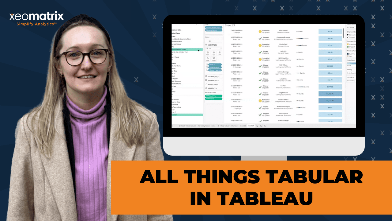
The session, titled All Things Tabular in Tableau, provided a detailed walkthrough of creating advanced tables and tabular visualizations in Tableau. Lauren Cristaldi led the live demonstration, highlighting best practices for transforming basic tables into visually engaging and functional reports.
Session Outline
- Out-of-the-box Tableau Tables
- Conditional Formatting
- Dynamic Sorting with Viz in Tooltip
- Chart Tables
- Best Practices and Final Tips
Out-of-the-box Tableau Tables
The presentation began by showcasing out-of-the-box tables in Tableau, which resemble familiar table structures from Excel. Lauren walked through creating a basic table using the default settings, then quickly moved into customizing it by leveraging Tableau’s built-in capabilities, such as grouping by folders to organize data sources.
Lauren emphasized the importance of starting with critical parameters and precise date filters and shared a pro tip: always create a “today” parameter to allow for dynamic filtering based on the current date.
Conditional Formatting
Lauren then dove into conditional formatting, one of the most powerful ways to visually enhance Tableau tables. She demonstrated how to apply conditional coloring based on column values using measure values and a color legend to represent different ranges. This approach was particularly effective for identifying profitability, where rows turned red for negative values and green for positive.
Lauren highlighted a practical trick: setting custom diverging color scales for specific columns (such as profit) to focus only on whether values are positive or negative, eliminating unnecessary noise from the full range of data.
Dynamic Sorting with Viz in Tooltip
Next, the focus shifted to dynamic sorting. Here, Lauren showcased how to utilize index calculations in Tableau for custom sorting. By creating a sort by parameter and linking it to the index field, she allowed the table to dynamically change the sort order based on user input. This method is more flexible than traditional field-based sorting, especially when dealing with multiple fields like profit, quantity, and orders.
A key takeaway from this section was how sorting via parameters offers more control, making it easier for end-users to navigate the data.
Lauren also demonstrated how to enhance the usability of tables by incorporating viz in tooltips. Users can access deeper insights without overwhelming the primary dashboard by embedding small visualizations within tooltips.
Chart Tables
Lauren introduced chart tables in the final segment, a hybrid of tabular data and visual elements. These tables combine KPIs, bar charts, and even shapes, all within the confines of a traditional table format.
Lauren walked through creating these chart tables step by step, starting with simple order ID information and then layering in more complex elements like rounded bars for tracking quantities. She also demonstrated how to combine shapes and colors to represent different shipment statuses visually.
A standout example in this section was the use of dynamic labels, which adjusted based on the value, offering more context, such as showing “1 day” versus “multiple days” since an order was placed.
Best Practices and Final Tips
Throughout the session, Lauren emphasized key best practices for working with tables in Tableau:
- Use parameters for dynamic, user-driven sorting.
- Index calculations simplify custom sorting and rankings.
- Conditional formatting draws attention to critical values.
- Viz in tooltips reduces dashboard clutter while providing extra details.
- Clean formatting (e.g., removing gridlines, customizing labels) improves readability and user experience.
Lauren wrapped up by answering questions from the audience, reiterating the importance of practice, experimenting with Tableau Public’s Workout Wednesdays, and reverse-engineering other users’ workbooks to improve Tableau skills.