
The Data-Driven Community Meetup holds monthly webinars on business analytics and big data. Webinars are held on the second Wednesday of the month at noon (12:00 PM) central time via Zoom Webinars and will cover topics related to enterprise data management. Our goal with each webinar is to provide meaningful insights and actionable takeaways to simplify analytics so you can make better decisions.
We cover topics such as data strategy, data management, data warehousing, BI modernization, embedded analytics, and cloud migration and strategy. Learn how to build reporting solutions that drive your business demand based on your needs.
About the Topic
In this webinar, we explored new features in the latest Tableau Desktop version and learned how to create dynamic and detailed geographic visualizations. We demonstrated how to:
- Visualize relationships through spider maps and dynamic radii around points.
- Design zoomed-in and zoomed-out views for various levels of geo detail.
- Map the U.S. without displaying all of North America.
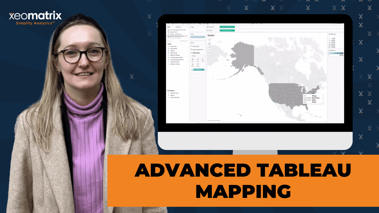
This article includes a recording, transcript, and written overview of the presentation on Advanced Tableau Mapping (On-Demand Webinar).
Advanced Tableau Mapping Presentation Video
Tableau Dashboard Makeover Summarized Presentation
Lauren Cristaldi, a Tableau expert at XeoMatrix with over seven years of experience, led an in-depth session on advanced Tableau mapping techniques.
The session focused on advanced Tableau mapping techniques, including leveraging spatial files, creating custom map layers, using spatial calculations, and building unique visualizations like hexbin maps and custom gauges. Lauren went over practical demonstrations, showing how to apply these techniques directly in Tableau to solve real-world mapping challenges.
Session Outline
- Standard Mapping Techniques
- Utilizing Spatial Files and Custom Geographies
- Advanced Spatial Calculations
- Hexbin Maps
- Building Custom Gauges in Tableau
- Key Takeaways
Standard Mapping Techniques
Basic Maps
You can create basic maps by dragging geographic fields, such as state and city, into the view. Even when datasets lack explicit latitude and longitude data, you can assign geographic roles to fields, allowing Tableau to recognize them as mappable data.
For example, you can convert a generic field into a geographic field by changing its data type, enabling the creation of maps without needing pre-existing spatial coordinates.
Handling Mixed Geographies
One common issue addressed was handling datasets that include mixed geographies, such as United States and Canada records. Tableau sometimes struggles to map these correctly due to overlapping geographic names.
Using the “Edit Locations” feature, you can resolve these mapping errors, guiding attendees through setting geographic roles that account for country-level distinctions. This step ensured that Tableau accurately mapped all regions, even when names overlapped across different countries.
Filtering & Custom Views
You can use filters to create separate, zoomed-in views for regions like Alaska and Hawaii. When mapping the United States, Alaska often appears disproportionately large, distorting the overall map. To address this, you can create individual map sheets for Alaska, Hawaii, and the continental U.S., then combine them into a single dashboard.
This approach allowed for better scaling and a more visually balanced layout. Filters could be applied to focus on specific regions, and how users could utilize map layers to add additional data points, such as sales figures, directly onto the maps.
Utilizing Spatial Files and Custom Geographies
Connecting Spatial Files
You can connect Tableau to external spatial files, such as census shapefiles, to create custom map layers like Core-Based Statistical Areas (CBSAs) and Designated Market Areas (DMAs).
This is the process of importing spatial ZIP files directly into Tableau to effectively utilize spatial data. You can navigate to the ‘Add Data’ option in Tableau, select the appropriate spatial ZIP file, and establish the connection. These ZIP files typically contain shapefiles, which include polygon data representing geographic boundaries such as states, counties, or custom-defined areas. Once imported, Tableau automatically reads the geometry data and makes it available for mapping.
You can verify if the correct fields were recognized, ensuring the geometry fields were adequately identified for use in creating map visualizations.
For this step, it’s essential to use clean and accurate spatial files to avoid mapping errors. You can overlay these polygons onto existing maps to create layered, informative visualizations that could simultaneously display multiple levels of geographic data.
Connecting spatial files is straightforward—users simply need to connect to the ZIP file, and Tableau automatically recognizes the embedded geographic data.
Creating Custom Geo Fields
For cases where external spatial files aren’t available, you can create geographic roles from existing data fields, like ZIP codes. You can build custom geographies by aggregating lower-level geographic data into higher-level regions. For instance, by grouping ZIP codes into DMAs, you can create new map layers that reflect unique business areas or market segments.
This technique allows for significant flexibility, enabling users to map non-standard geographies, such as school districts or custom sales territories, without needing to rely on pre-made spatial files.
Spatial Joins
You can use the “Intersects” join logic to combine multiple spatial files. This powerful feature allows you to analyze overlapping geographies, such as identifying which Metropolitan Statistical Areas (MSAs) fall within specific CBSAs.
The process of joining two spatial files includes using the geometry field and leveraging Tableau’s spatial join capabilities to visualize complex geographic relationships. Using both left and inner joins, you could control the granularity and scope of their spatial analyses.
Advanced Spatial Calculations
Origin-Destination Mapping
You can use the MAKEPOINT and MAKELINE functions to create maps that visualize connections between two locations, such as shipping routes or flight paths. By creating calculated fields for both the origin and destination points, you can draw lines on the map that represent these connections. It’s important to have precise latitude and longitude data for these calculations, and you can use tools like Geocodio to geocode addresses when such data isn’t readily available.
Calculating Distances
The DISTANCE function calculates the space between two points on a map. This calculation is especially useful for logistics and route planning. You can use the DISTANCE function alongside MAKEPOINT to dynamically calculate distances between origin and destination points, allowing you to visualize and quantify distances directly within Tableau. By adding distance metrics to tooltips, you could provide contextual information to map viewers, enhancing the interactivity and usefulness of the visualization.
Calculating Area
You can use the AREA function to calculate the total square mileage of a geographic region, such as a CBSA. By leveraging the geometry fields from spatial files, Tableau can compute the area of complex polygons. This capability is particularly useful for understanding the scale and size of mapped regions, providing additional context for spatial analyses. These area calculations could be used with other metrics, such as population density or sales per square mile.
Hexbin Maps
Hexbin Visualization
You can create hexbin maps using precomputed spatial files. Hexbin maps display data using uniform hexagonal shapes, providing an alternative way to visualize density without the distortion caused by irregular geographic boundaries. Hexbin maps are particularly effective for visualizing dense datasets, such as population data, where traditional maps might become cluttered or misleading.
Use Cases & Benefits
The benefits of hexbin maps, especially for visualizing data that spans irregular geographic regions. By using uniform hexagons, hexbin maps allow viewers to focus on data density and patterns without being influenced by the varying sizes of geographic regions. While hexbin maps can simplify complex datasets and highlight trends, they may lack the flexibility of traditional maps for dynamic grouping or detailed geographic analysis. Hexbin maps could be used in different industries, from retail sales analysis to population studies.
Building Custom Gauges in Tableau
Scaffolding for Gauges
The foundational concept of scaffolding is a technique where a supporting dataset serves as a structural backbone to plot points for the gauge’s dial, needle, and indicators. You can create a simple scaffold dataset, typically consisting of sequential numbers or placeholder data points, that would define the coordinates necessary for plotting the circular dial and other gauge elements.
Using Tableau’s calculated fields, you can convert these placeholder points into meaningful geometric components representing the gauge dial, such as arcs and lines. You can use trigonometric functions like sine and cosine to calculate X and Y coordinates for plotting points along a circular path, creating a smooth, curved gauge dial. You can layer these components accurately within Tableau using dual-axis charts and synchronized axes to maintain proper alignment.
To enhance interactivity, we have dynamic calculated fields that could adjust the gauge needle based on real-time data inputs. You can create parameters and use them in calculations to control the position of the needle, enabling users to visualize performance metrics dynamically. It’s essential to adjust the gauge’s scale and formatting to match the desired range, this ensures that the visual accurately represents the data being analyzed.
Some best practices for making the gauges visually appealing and functional include using color gradients to represent different performance ranges and adding labels or tooltips for clarity.
By combining scaffolding techniques with advanced Tableau calculations, users could create highly customized and interactive gauges tailored to their specific data visualization needs.
Creating Geometric Components
Using the MAKEPOINT spatial calculation, you can create the geometric components of the gauge, including dials, needles, and tick marks. You can use X and Y coordinates instead of traditional latitude and longitude values, allowing users to create custom shapes and designs within Tableau.
These techniques could be adapted for various visualizations beyond gauges, allowing you to think creatively about using spatial calculations.
Integrating Live Data
One of the standout features of the gauge-building technique was the ability to integrate live data into the visualization. By using dynamic calculations and data blending, you can create gauges that adjust based on user-selected filters or changing data inputs.
This approach allows users to build highly interactive dashboards where gauges reflect real-time performance metrics. You can customize the appearance of the gauges, including adjusting colors, sizes, and labels to match specific design requirements.
Key Takeaways
The session showcased the flexibility and depth of Tableau’s mapping capabilities. From basic maps to complex spatial joins and custom visualizations, Lauren demonstrated various techniques for enhancing geographic analysis. Understanding Tableau’s spatial features and experimenting with different approaches is essential to finding the best solutions for your specific needs.
Spatial calculations like MAKEPOINT, MAKELINE, and DISTANCE provide powerful tools for visualizing connections and measuring distances. At the same time, creative approaches like hexbin maps and custom gauges offer alternative ways to present data. These examples highlighted how these techniques can be applied across industries and use cases, from logistics and transportation to marketing and sales.
Lauren shared her workbook and examples on Tableau Public so you can explore these techniques further and apply them to your own projects. Learning from the Tableau community and recommended resources like Makeover Monday and Workout Wednesday for continued practice and inspiration is valuable.
Transcript
>> STUART TINSLEY: Just a reminder, we do these every month, middle of the month. Tell your colleagues, tell your friends, anyone interested in Tableau content that we are doing these sessions. I think this year will be really exciting, especially with what’s coming with the Tableau platform. We’ll have a lot of good content to share as Tableau is developing newer features in the product. Just a reminder and, again, every session is on YouTube as you know.
We also have on our YouTube channel, just a quick reference. We also do tips and tricks videos and other contents and not just the session, so good material there. Your host today, I should say, your main contact, the main speaker today is Lauren. I’ll be here to emcee, but Lauren has had a ton of experience in Tableau, works a multitude of projects. She’s led, Lauren, with the last four or five sessions, I think.
>> LAUREN CRISTALDI: Yes.
>> STUART: Yes.
>> LAUREN: Has it been that many? Wow.
>> STUART: I know. Time does fly. We’re in February. All right, so today’s session, again, is Tableau, advanced Tableau mapping, right? At the end, we will have a Q&A as we always do. We’ll try to leave five, 10 minutes for Q&A. If anyone has questions following this session, feel free to reach out to us if something didn’t get answered on today’s webinar. Just a reminder, this is a Zoom meeting. I have, for the last handful of sessions, allowed people to come off of mute. If you want to engage, if you want to come off of mute and ask questions, please feel free to.
Otherwise, you can use the chat window. That’s totally fine. If you’re not talking, if you could stay on mute, that would be helpful for Lauren and myself. If you have a question, you could definitely come off of mute. We’re more than welcome to take questions that way, or the chat window, which I will be monitoring. Lauren, do you want to tell the folks here, most folks know you, but just a little bit about your background so that they have an idea of your experience in Tableau?
>> LAUREN: Yes, so I’m Lauren Cristaldi. I’ve been with Xeo for two and a half years now. I have about seven years of experience with Tableau and analytics. I come from a state government background, so I used to work for the state of South Carolina using Tableau and everything else.
>> STUART: Cool. Lauren’s very big in design. She has a really great artistic eye for Tableau. There’ve been some past sessions on design that I’m sure will be more. Lauren, I think you also entered into the Iron Viz contest recently for Tableau.
>> LAUREN: Yes, last year. I like to participate in the other community events too. If Iron Viz is too daunting, I like to do Iron Quest as a monthly one and Makeover Monday or Workout Wednesday. Highly recommend those.
>> STUART: Yes, they’re good practice. Really good practice. You’re right. All right, let’s get into it. I don’t like to bore people with slides, although your intro is very important, Lauren. Let’s get into the topic today, advanced Tableau mapping. Lauren, what are you going to cover at a high level so that the folks on the call know what we’re going to get into?
>> LAUREN: Today, we’re going to go through some of the base features of mapping, so we’ll start out with your standard maps. Then we’ll get into some of the new version updates and everything, so using spatial files and shapefiles and even creating things that aren’t maps with map layers, which is really exciting.
>> STUART: Okay. Well, I’m going to give you plenty of time. Live demo. I’ll flip it to you, Lauren, if you’re ready.
>> LAUREN: Yes, sounds good. Thank you.
>> STUART: You are welcome. Again, yes, Lauren’s getting set up here. If you have any questions, ask them in the chat. Come off of mute. Yes, let’s get into it.
>> LAUREN: Sweet. Yes, just to start out, these are some of the different types of maps that we’re going to cover today. We have our spatial files, how we’re going to connect them. I’m primarily going to be using census shapefiles. I’m going to share this workbook or I’m going to publish it on the Xeo Tableau Public after this. I’ll have some links to where you can find those shapefiles if you want to use them.
We’re going to concentrate on core-based statistical areas, and then I have another one that’s the DMAs as well. We’ll go through what those mean and how you can use them. Then I think we’ve all probably seen a lot of these hexbins. I’m not going to go through exactly how to create them from scratch because I found a better solution, so you’re not having to recreate the wheel. That dataset will also be available, so you can just plug in your actual data to this spatial file.
Then we’ll get into some spatial calcs, especially the lines are really cool if you have any data that you want to connect one point to the other, maybe shipping routes or flights or anything like that, and then combining those with the spatial files as well. You can see from a high level, “Oh, this is coming from the Cincinnati CBSA and going into Illinois.” Last week, I gave a presentation on this, but I’m going to get into more detail today, using map layers to create not just maps. The mapping in Tableau is also drawing in Tableau, which is kind of cool.
We can dive in to the first. Let’s start out with a standard map. I’m just using Superstore. If you have any data that has geographic references, even if you don’t have latitude and longitude, you can just have the region. If your data comes in and it’s not geographic but you need it to be, you can go over here and change that data type so that it has that geographic reference depending on your field, which is a good thing to call out.
Let’s just bring out state and province and I think– Okay, yes, we’re good. We have this unknown down here. We actually want to select that so that we can edit the locations. In this case, it’s getting confused because we have Canada and the US mixed together. When this error comes up, it’s good to go in, edit locations. We’ll do this dropdown. Right now, it’s fixed, the United States, but we actually want it to reference a field.
If you have several countries or say you have a lot of counties and you need to reference the state that those counties are in, then you would come here and you’d say “From field.” Now, when we hit Okay, that indicator goes away, and we’ve mapped out all of our regions or, yes, regions in Canada as well. Let’s say I just want to focus on the US. If we bring countries to filter, let’s just do the US. In the Superstore data, we don’t have any Alaska or Hawaii. Sometimes, you bring in and you do have Alaska and Hawaii, and then you realize, “Wow, Alaska is really big.” [chuckles]
It looks almost as big as the entire continental United States. That’s where filters are handy too. I like to make two versions of the same map, just duplicating the same sheet. Then I’ll have one that’s just Alaska, one that’s just the continental US, and then duplicate the sheet again if you want Hawaii or Puerto Rico. Then we bring those all in together in the dashboard. Then you have the common maps that you see where you have Alaska and Hawaii in the bottom left so that it’s more scaled so you get a better view of everything instead of it all being zoomed out.
The default automatic for this is just that circle. If we go down and change our mark type to map, now, we have those states filled out. This is just our basic map. In older versions of Tableau, if you wanted to put a layer on there for– let’s say I want to see some circles to show the different categories or something to do with the orders, you’d have to make that dual access in order to do that. With the map layers, which has been around for a little while now, sometimes it’s fun to think about all the hacks you had to go through, and then they do updates and it’s a lot easier now, which is nice.
If we want to bring in sales, we need to add a layer that has a geographic reference again. We can use the same one or we could take it down to the city. City will need those other references so that it maps correctly. One thing to call out here is you’ll see this hierarchy. This helps just bring all of those together and then you can just drill down. If I just brought in state, then I could drill down to the city or the ZIP code.
It’s nice to have those so that it knows the hierarchy in which those regions are connected or those fields that are geographic fields are connected. Now, we have these circles and we can change– Let’s see. We can do size and then also color for sales. Based on the scale and the size, at a glance, you can see which areas or which cities have the largest sales value overall compared to the other cities. Yes, that’s just our basic map. I guess, are there any questions before I move on to the next part of this?
>> STUART: Let me check. No, no questions, at least in the chat.
>> LAUREN: Cool, okay. Next, let’s get into using these spatial files, which is really cool. Say you have a custom geographic region like a CBSA that when you go over here, if we go back to our standard map and we do that dropdown for changing the field type and the geographic role, technically, CBSA and MSA already exist in here. Say they didn’t exist, well, how do we draw those shapes for those geographic regions?
School districts is a good example. I want to just show the shape of the school districts on the map. Then that’s where a spatial file can come in and already have those polygons pre-computed basically. It’s always a ZIP file, so you’ll download that ZIP, then you literally just connect to the ZIP. You’d go to add connection up here. You’d add that new data source and you just select that ZIP file that you want it to reference. That’s pretty straightforward.
Another option, though. Let’s say you don’t have a spatial file, then if we go to– There it is. If you just want to create a custom geo field. In this example, I’m going to use those DMAs, which are designated market areas. DMAs don’t exist as an option in that geographic role. Then I can go up to the DMA name or the code. I would change that type to a geographic role and we’d say “Create from.” As long as you have another geographic field like ZIP code, really ZIP code is the best because if you use county, it could get funky. The ZIP codes are granular enough that it’s going to more accurately draw those DMAs or the custom geographic shapes.
If we hit ZIP code, now, it automatically creates this hierarchy. When I bring out DMA and I change that mark to a map, now, we have all of these DMAs drawn across state borders and everything using those ZIP codes, which is pretty cool. I think that is a very new feature. That’s nice because I know spatial files can be difficult to find sometimes. Then maybe you don’t want to have to connect your data to that spatial file as well. This is a good option because you can just use the data that you have as long as you have a geographic field that already exists and create that custom geocoded field.
>> STUART: Lauren, there was a question. I guess, “Can the spatial file be used without having geographic details?” if I’m reading that correctly. Yes, “Can the spatial file be used without having geographic details?”
>> LAUREN: The spatial file inherently has geographic details, but do you mean the data that you’re connecting to, it doesn’t have any geographical details?
>> STUART: Yes, Anushka, I don’t know if you want to clarify or we can take it offline, either way. We’ll come back to that question, Lauren. Keep going.
>> LAUREN: Okay, yes, and I think I might be able to explain it better. I’ll show how I have the data sources connected after we connect these two. In this example, we’re going to connect two spatial files. We want to combine them. Say I have a layer that’s our CBSAs and then I have another layer that’s our MSAs. I want to see, “Oh, well, which MSAs fall into which CBSAs?” This is where we can map both of those together by bringing out the geometry fields, which is always baked in to your spatial file ZIP.
Just basically, it tells Tableau how to draw those polygons. We go up here to edit data source and show you how that join is working. Here, if we open this up, I’m just telling it the geometry field from this file, the CBSAs. I’m doing a left join because I want to show all CBSAs regardless if they have a metro area within them. That’s where we put this intersects instead of equals or your normal join logic. This is really cool that you can do this.
Intersects basically is asking, “Okay, within these polygons, is there anything that overlaps within the same space?” It’s taking a collection of all the points that exist in that polygon from this geometry field and comparing it against the geometry fields that’s drawing the polygon in the other dataset. That’s how you would connect the two spatial files. If you want to just see things that you only want to map that shows both of it, you want to see, “Okay, I only want to see CBSAs that also have MSAs,” then we would change this to an inner join. Now, if I go back to that map I was just showing, now, it’s only displaying those CBSAs with MSAs.
[silence]
>> LAUREN: Another thing with this. If you have data, let’s say, in our first map where we don’t have Alaska and Hawaii data, I like to use this scaffold. It’s basically a scaffold where it’s just a standard list of all the states in the United States and we connect it. In this case, we’re connecting that CBSA to the CBSA name that I have in my states list. Let’s say you just wanted to connect it with your existing data. You can add it as a layer and not have to connect them. Sometimes that’s better, especially if you have a large dataset. I can actually show that.
If I go up to data, we’ll add a new data source. I’ll just go into my US states list, bring that out. We’ll go back to this map. Now, even though these aren’t connected, they’re both being drawn on the same map. If I just bring out a state name and add it to the marks layer, now, we have every state. You can see, “Oh, I may not have data for Alaska, but Alaska exists.” It helps you pinpoint like, “Oh, maybe I should be paying more attention to this state that’s not getting– I don’t have any data for that state, but maybe it’s an emerging market,” or something like that.
This is also nice if you don’t like the standard out-of-the-box view and you want more of a custom background without having to load any custom images or anything. I’m going to change this to a map. I’ll move this all the way down to the bottom because depending on your layer order, that’s how close to the top it is. When that was back on the top, I wouldn’t be able to see the tooltips for any of these circles that we have for the sales.
[silence]
>> LAUREN: For the state? Yes, we have all our states out here. Now, if I go to background layers, I’m just going to remove all of these background layers. We have more of this customized map. You can change the color and you don’t lose any of the different states even if you don’t have the data in it. It’s still that same scale. Also, this is where we could filter by the state name, take out Alaska and Hawaii. We can leave Puerto Rico down there for now. We would just duplicate and go back up here. We only want Alaska.
In this case, we don’t have– so the filters, which is also good to note, the filters for when you’re just layering and you don’t actually have those two data sources blended or connected, this filter is not going to work on these other layers. You can tell by if it’s grayed out or not because that can get confusing if you’re applying a filter and you’re like, “Why isn’t it applying to the whole sheet?” Yes, that’s just one of those funky things to remember. We’d actually have to go up here to this field and we’d say Alaska because maybe this will be a part of the data later.
[silence]
>> LAUREN: Now, we have Alaska in its own area. If we create a dashboard, bring out a container, we can bring in our standard continental map, plus Puerto Rico. We’ll bring out Alaska. We just hide that title and we can play with the sizing and whatnot. If you had another one for Hawaii over here, we’d have that view of like, “Here’s this little zoomed in area over here within this little box.” It would be like, “Oh, Alaska’s being included,” but we’re not losing the level of zoom that we have with the continental US that we normally would have. Usually, I’m against floating, but sometimes it is easier to adjust, especially in cases like this where we’re just demoing. Move that over. We’ll bring this guy to the front.
>> [PAUSE 00:25:29]
>> LAUREN: Now, it’s really looking like some of those common maps you’ll see online sometimes. I think, visually, this is a lot more appealing, especially if you’re doing a high-level executive dashboard or something and you just want to show like– you really want to highlight the sales per city like in this case. Then you want it to be this level of zoomed in to the places we care about and still not lose any of the other states that may not be a part of the continental US.
Plus, without those background layers, you’re only seeing the US. You’re not seeing part of Mexico. You’re not seeing part of Canada. If you’re in Europe, I’m sure it would get even crazier because there’s a lot more countries bordering you potentially. It cuts down that noise of the other default backgrounds. Going back to our spatial files, we went through connecting those spatial files together, but now– and I’ll get to the hex ones as well.
In this view, we have that spatial file and real data. We go to edit this data source. Now, I think I understand the question a little better. You do need a geographic field that connects to the spatial file in some way. Let’s say this is CBSAs, so we would need something that would also have something in common with that spatial file. I’m just using my states list that I made that has CBSAs already.
Let’s say my base data has state-level geographic detail, but it doesn’t have CBSA. I can just connect, I just create a relationship between those CBSAs, my custom state file. We’ll say the name equals CBSA name. Then the end of that relationship river, if you will, would be that state name connected to one of the state names from my actual data. Yes, you do need at least one geographic field or data point so that you can relate it back to that spatial file.
[silence]
>> LAUREN: That’s how we’re connecting our actual data with a spatial file. To get into drawing like these lines or let’s say you hover over here and you’ll notice I have the size, well, that’s not included in the file. It’s actually a calculation. Let’s build that out real fast. What’s important to note is if you want to draw a line, you need to have a start or an origin, a point of origin, and then a point for the destination.
To make those points, you can’t use the generated latitude and longitude. You have to actually have latitude and longitude in your dataset already that’s mapped per row. I found it’s not very common for datasets, at least that I’ve seen, to have the latitude and longitude. There’s a really good tool that I use a lot. It’s called Geocodio. Every month, you get a free so many rows, and then it’s very inexpensive.
I think the other day, I loaded 10,000 or, no, it was 500,000 rows. It only costs 75¢ or something. Basically, what it does is if you have, let’s say, city and state, but you don’t have latitude and longitude, you can use Geocodio to upload your cities and states. As long as it’s in the US or Canada, it’ll find the exact latitude and longitude for that city on that level. Yes, you have to have latitude and longitude in order to do a lot of these spatial calcs.
I have my end latitude and my start latitude and the longitudes. Then I would make this calculated field if we edit this. We use MAKEPOINT. If we expand this, there’s actually a whole section for just the spatial calcs. What MAKEPOINT is doing is it’s making a point out of that start latitude and longitude. We get a precise location to start from. That’s how we create that point of origin.
Then we would do the same thing for our destination. It would just be that end latitude and longitude. Let’s bring out those points. Okay, I’m going to just change the color so it stands out and then we’ll add our origin. A lot of times, they overlap, but that’s because we need another level of detail. In here, I just have some order IDs if we bring that to detail and do the same for the other one.
[silence]
>> LAUREN: Then the next step after we’ve made our points of origin and the destination, we’d go and create the line. It’s literally MAKELINE and we’d use that shipping origin, shipping destination. That way, Tableau knows which point to start with to draw the line and which point to actually draw the line to. If we just look at the MAKELINE, yes, just the start and the end points that you want.
We’ll bring that out as a map layer or mark layer. Again, we need that order ID or whatever level of granularity you want to add in there just so that those lines we can differentiate because, right now, they just are crazy. [chuckles] It’s like a spider web. We’ll bring out that order ID to detail. Now, we can see the individual lines. We can also add in for the tooltip where it’s coming from and where it’s going to.
[silence]
>> LAUREN: Oh, sorry, I used the wrong field. Don’t use the points for that. You would actually use the state it started in or other location reference for where it started and then the state it ended in. Now, we know that it’s going from Washington to Wisconsin for this particular order. Let’s say we want to start filtering. I want to see, depending on the state, where things are starting and then everywhere that it’s ending. Let’s do Colorado. Yes, we can see that Colorado is, in this case, shipping to Georgia, South Carolina, and North Carolina and not the other states.
Another cool feature or another cool spatial calc, especially if you’re looking at logistics and transportation and whatnot, we can use distance. Distance is using those points that we made to create the line. It’s calculating how many miles or kilometers or meters there are between those two points. If we take that distance and we put it on our route in detail, now, we can see in miles how far this point in Colorado is to, let’s say, this point in South Carolina.
[silence]
>> LAUREN: If we go back to one of our CBSA ones, so like here where we have size of the CBSA, so it’s actually able to calculate the total area of that polygon. To do that, we look at the CBSA size. It’s just taking the area of that geometry field that was in our spatial file. I’m saying just in miles. Now, we can see the square miles of the total area of that CBSA, which also might be relevant depending on what you’re looking to get out of like these maps. It’s just good to know all of the different options.
[silence]
>> LAUREN: Any questions? Then I’ll get into hexbins and that gauge.
>> STUART: Yes. Xavier, do you want to elaborate on your question that you had?
>> XAVIER: Absolutely. My thinking is we have these things set the areas on the map by ZIP code. In theory, it would be possible for us to group some of the ZIP codes together. Let’s say I’m running an enterprise and I have different markets that I’m trying to manage and I have all the ZIP codes for each market. I’m trying to see how they’re doing at scale, but I’ll just get within the map. I could assign those ZIP codes by the market to have that be part of the overall granularity?
>> LAUREN: Yes. No, you can make a custom geo field. Say one of your other dimensions, you could just drop it down. As long as you have those ZIP codes assigned on a road level, then you can draw all kinds of custom area borders and outlines. That’s a really good use case. You don’t even have to download a spatial file, which is even nicer. [chuckles] You can just use the data you have. [chuckles]
>> XAVIER: I think the answer to that is super, super helpful.
>> STUART: Good question.
>> LAUREN: Yes, good question.
>> STUART: I think we’re good, Lauren. Yes, let’s keep rolling. We have about 15 minutes or so, yes.
>> LAUREN: Sweet, so hexbins. I think data guide needs to chill. Okay. [chuckles] I’ve seen a few different ways that people have done this. There’s a calculation that you can create. If you have latitude and longitude– where is that one? Yes, HEXBINY or HEXBINX. It needs the X and Y coordinate. In which case, the latitude and longitude, but it doesn’t have to be latitude and longitude. It gets confusing, though, because then you have all these calculations. You have to make sure that you put them in the right order.
Then a lot of times, the radius around it, right now, we have everything perfectly buffered. You have to play with it and adjust it a lot. It doesn’t automatically scale when you bring this sheet into a dashboard and you want it to be smaller or bigger. I think, overall, this is just a lot easier if we go to the data source. There’s something I found on public. I love Tableau because you can just go to public and the community is awesome. They’ll let you download stuff.
I always make all my dashboards downloadable, trying to pay it forward. I know when I was starting out, that’s how I learned everything was just downloading workbooks and trying to figure out what was going on in them. Here, I just have this. I took some population data from the census. I connected on state so that I could have some actual data. This extract, it was just a Tableau data source that already had all of the US states and then the geometry.
It’s a spatial file, but it was already packaged. I didn’t have to download the ZIP and everything like that. Technically, this is using a spatial file. This way, all of our shapes are already pre-computed. Now, it’s drawn out. We get all these cool hexbins. I like these and I wish they were used more. I know it can be confusing because your brain is looking for that traditional map of the US. Here, it’s just all states created equal because it’s all laid out.
The Northeast can get kind of crazy because you want to see New Jersey, or Delaware is a good one where it’s always getting cut off because it’s so much smaller than the states around it. Alaska is massive and it starts to mess with the scale of the overall map when we have all of those in the view. I just think this is nice if you just want to see a heat-map look at all of the states. Now, we can see who has the largest population. Not surprised it’s California. [chuckles]
We could address this with other data as well as long as you connect those and you have a geographic field that exists in both. In this case, you would need– Let’s see. What does that have out of the box? In this case, we just have state available for that hexbin. As long as your data has state, you can use this to just create those hexbins really easily. Just create that relationship between your actual data and this spatial file that’s already packaged. Okay, I think we’re good there. I want to make sure that I do a quick run-through for these gauges.
A couple of months ago or maybe a month ago, I’d seen a lot of things on public and other blogs and whatnot about creating gauges. It all just seemed a little too involved honestly. We’d have this gauge, but it would actually be an image behind your actual data, or you could only control these different target slices by parameters. I was like, “Well, if we can use parameters, why can’t we have fixed calcs in the place of parameters that are using actual data so that our targets are adjustable, depending on the region or the quarter or any other levels of detail that you’d want incorporated into those target values?”
I actually made a better version of the one that I have on my Tableau Public because this is just some Superstore data that I had just preloaded. You can connect any data you want here in place of the sheet one. We’re doing scaffolding. With scaffolding, we bring in these two placeholders. This is basically almost like the spatial file where it’s giving a lot of different points to map to. It’s just not packaged the same way. In the general placeholder, we have point, point radius.
We map all of these by using this 1 = 1 in the scaffold. To do that, those fields don’t actually exist in either datasets. If you go to the relationship calculation and you just put one and we have 1 = 1, your scaffold is ready to go. By saying “1 = 1,” we are assigning every single row in this table to every single row in our main table. Because we’re using relationships, they’re loading independent of each other. It’s a lot more performing.
I know that sounds like, “Oh, wow, your data is going to explode. It’s going to be crazy.” That would happen if we did traditional joins like what was available a long time ago. Thankfully, with relationships, scaffolding is a lot more performant than it used to be. If I come here, I think I can do this in five minutes. Let’s see. To start off our gauge, we need– Let’s see. Okay, so we’re going to take out this dial. You’ll notice that these are actually geographic fields, but they’re not how you would think of geographic fields.
This MAKEPOINT, that spatial calc that we used earlier with the latitude and longitude. In this case, it’s using X, Y coordinates in place of any kind of typical geographic field that we would think of. This is using dial radius, dial degrees, which we can look into. Dial radius is just referring back to that gauge model data that I was showing, so those different values. It’s using those values that are in the model, but it’s also referring how we make it relate and adjust accordingly to our actual data.
We use this depth calculation, which I know it looks scary, but feel free to download this. You never even have to open the calcs if you don’t want to. Just replace all these. If you do want to download this and make your own gauge using my calculations, if you just replace Target 1, Target 2, like these fields with your actual data, and I think all of these are calculated fields and they’re just referring to sales. Really, all you’d have to do is go to whatever field you want to replace sales with and it would use that instead. If you had cost or quantity, then you just change it, and then all these targets would update.
If we bring out the dial, we can see it starting to take shape, but we don’t want it to be a map even though we’re using those mark layers. We want it to be a polygon. Right now, it needs a level and then it needs the value. Value is going to be put into path. We don’t want it to be aggregated. We’re just going to make it dimension. Still looking funky. That’s why we need level. We’ll put that on color. Now, it’s drawn the way that we expect. Before I do the text, I’ll do the gauge. For the gauge, we need the one that says “gauge.” Yes, here we go. All of these are working in a similar way to this dial calculation.
We’ll bring that out. We actually want this one to be a line. Then we use point on detail, but we don’t want it to be aggregated. That’s cool because it looks like that needle. If we really want it to have that needle shape, we actually need to bring point size to the size of the line and it’ll give us that needle look. This is a cool calc because you can adjust it. Depending on how thick or thin you want that needle, we can adjust these points. You could even replace these with parameters and then adjust it on the fly. That didn’t do very much, I think, because it’s starting at 10. This got a little bit skinnier.
[silence]
>> LAUREN: Then if I want, let’s see, the tick labels. For those tick labels like you’d see in your car on the speedometer, we’ll come up to here. We’ll use another geographic field, bring that up. We’ll create a line. This one, you really got to be committed to it to the end because it looks really weird the more stuff you put out there until everything you need is out there. With those ticks, we need the tick degree. We’ll put that on detail. Make it a dimension, a continuous dimension. Then we take value, put that on detail as well. Oh, sorry, put that on path, make that a dimension. It’s funny that it went from that crazy, chaotic line to these perfectly lined-up tick marks, but magic of map layers at work.
Now, if we want labels, just one last thing, so I know we only have about five minutes left. Our tick labels are going to refer back to the same geographic field. It’s slightly different because we want it to adjust and not overlap those tick marks. We’re going to find, let’s see, yes, tick labels. Add that layer. Change this to text. We need the point on detail. Make that a dimension. Now, all of those are lining up. Then I made just some label metrics that are already formatted.
Now, we have all of these labeled. It does get weird with that halo. To remove that, you just go up to color and then none instead of automatic. They’ll get rid of those. There are some other layers we can add onto this, but maybe in a future session, we can get deeper into how to create these gauges and how to make them more customizable. Yes, I know we only have three minutes left. Any questions?
>> STUART: That was really cool, Lauren.
>> LAUREN: I love gauges. It took me forever to figure that out. Once I did, it was just the best.
>> STUART: Well, we can maybe have a continued session on that, knowing that it’s a bit more complicated.
>> LAUREN: Yes, for sure.
>> STUART: Cool. We have a few minutes. We can definitely take questions. Again, feel free to reach out offline if we can’t get to it. Yes, any questions from the group?
>> LISTENER 1: With the hexagon map, it’s worked similarly as far as grouping. In theory, one could group some of the states together?
>> LAUREN: With the hexagon, because it’s coming from that pre-computed file for those shapes, you couldn’t group them together like you could over here. You don’t have that flexibility as much. You could add a layer and then it would try to do that, but that would be interesting to try. I think when you’re drawing custom shapes, it’s better just to use a basic map.
[silence]
>> STUART: All right, good question. All right. Well, I think that takes us right to time. Lauren, great session. We’ll have it posted, recording sent out, and I think you’ll have these examples on Tableau Public if I’m–
>> ANU: This is Anu. I have a question before we wrap up.
>> STUART: Yes. Hi, Anu.
>> ANU: Yes, hello. I just wanted to ask. I know this is great. Sometimes we may be able to use this on our project and sometimes not. I just wanted to ask. For the project that I’m currently working on whenever I need help or something, whom should I reach out to just to get some help when I’m stuck or couldn’t figure out? Is there any Tableau help that I could get? Any help is really appreciated.
>> STUART: Yes, Anu, we could talk offline. We might have some ideas or some packages that might support you.
>> ANU: Okay.
>> STUART: Yes, we’re happy to talk and look at maybe what that would look like for you.
>> ANU: Okay, so sounds good. Whom should I reach out to?
>> STUART: You can reach out to me. Yes, we can talk.
>> ANU: Your name is Chris, is it?
>> STUART: No, my name is Stuart. I’ll put my email right here, Anu, in the chat window.
>> ANU: Okay, sounds good. Thank you so much.
>> STUART: That’s stinsley@xeomatrix. Yes, reach out. We’ll have a conversation about it.
>> ANU: Yes, thank you.
>> STUART: Thanks, Anu. Yes, thanks, everyone, for hopping on. We’ll see you in a month on the next Wednesday and we’ll have a new topic. Thank you, Lauren.
>> LAUREN: Yes, thank you.