
The Data-Driven Community Meetup holds monthly webinars on business analytics and big data. Webinars are held on the second Wednesday of the month at noon (12:00 PM) central time via Zoom Webinars and will cover topics related to enterprise data management. Our goal with each webinar is to provide meaningful insights and actionable takeaways to simplify analytics so you can make better decisions.
We cover topics such as data strategy, data management, data warehousing, BI modernization, embedded analytics, and cloud migration and strategy. Learn how to build reporting solutions that drive your business demand based on your needs.
About the Topic
This webinar explored advanced techniques for transforming your dashboards into polished, professional-grade tools.
In this session, we covered:
- Mastering Layout Containers: Learn how to effectively use layout containers to create structured, responsive designs that adapt seamlessly to different screen sizes.
- Gradient Backgrounds: Discover how to apply gradient backgrounds to give your dashboards a modern, polished look while enhancing the overall user experience.
- Custom Icons and Shapes: Unlock the potential of using custom icons and shapes to personalize your dashboards and make your data visuals more engaging and intuitive.
We showcased real-world examples and provided practical tips on integrating these features for maximum impact.
This webinar recap is ideal for Tableau users who want to continue refining their dashboards with more advanced formatting techniques and advance their skills.
This article includes a recording, transcript, and written overview of the Advanced Formatting for Tableau Dashboards Part II presentation.
Presentation Video
Summarized Presentation
In this session, Lauren and Stuart explore various advanced formatting techniques for Tableau dashboards, focusing on making dashboards visually appealing, organized, and easy to maintain. The session begins by discussing default formatting options, such as consistent font settings, currency formats, and color palettes, which help save time and ensure uniformity across multiple dashboards.
The presentation then covers custom transparent shapes and custom color palettes, demonstrating how to create unique shapes and colors using tools like PowerPoint and Tableau’s Preferences file. These customizations allow for more flexibility in design and can enhance the visual impact of a dashboard without cluttering the layout.
The next topic is the use of containers and gradient backgrounds, where Lauren shows how to structure dashboard elements and apply high-quality background images to add depth to the dashboard. Floating containers are highlighted as an effective way to maintain background visibility while organizing dashboard components efficiently.
The session also dives into creating reusable layout templates, showing how users can save time by building templates for commonly used dashboard structures. A key feature highlighted is Tableau’s swap feature, which allows users to replace sheets without losing formatting, making it easier to maintain consistency across dashboards.
Additional advanced techniques include creating rounded legends, managing layout using the item hierarchy, and formatting all filters at once to ensure consistency. These techniques provide users with powerful tools to streamline the development of clean, well-organized, and aesthetically pleasing dashboards.
Session Outline
- Default Formatting Options
- Custom Transparent Shapes & Color Palettes
- Containers and Gradient Backgrounds
- Create Your Own Layout Template
- Rounded Legends for a Polished Look
- Using the Item Hierarchy to Manage Layout
- Swapping Sheets to Preserve Formatting
- Preserving Formatting Across Duplicate Dashboards
- Formatting All Filters at Once
Default Formatting Options
The session begins with a deep dive into Tableau’s default formatting options for fields, particularly emphasizing the importance of keeping fonts consistent across the workbook. Lauren demonstrates the process of configuring default field properties, such as color and number formatting for measures like sales. The session covers how setting defaults allows Tableau to remember specific configurations across multiple sheets, saving time when building dashboards. She highlights the ability to adjust currency formats, decimal precision, and aggregation methods, all of which enhance the speed and consistency of building multiple views.
Lauren also explains how to apply consistent fonts throughout a workbook, noting the significance of using a company style guide for choosing font families, colors, and weights. She walks through changing fonts for different elements such as grand totals and sheet titles, and shows how the “Format Workbook” feature helps in applying consistent fonts across all sheets, although manual adjustments may be necessary for individual labels.
Custom Transparent Shapes & Color Palettes
Lauren introduces custom transparent shapes and shares a practical trick for creating them using PowerPoint, which offers a large catalog of free icons with transparent backgrounds. She demonstrates how to customize shapes, change their colors using PowerPoint’s graphic formatting tools, and then import them into Tableau to use in dashboards. These shapes help convey information without taking up much space, especially when paired with tooltips for additional context.
On custom color palettes, Lauren dives into Tableau’s Preferences file, explaining how users can create custom color palettes by editing hex codes in the Preferences file. She walks through setting up regular, categorical, and sequential palettes, which allow users to save time by avoiding manual color adjustments for each measure or dimension. Custom color palettes can be especially helpful when working on multiple dashboards with the same branding guidelines.
Containers and Gradient Backgrounds
In the next section, Lauren discusses containers and gradient backgrounds, popular features for enhancing dashboard design. She shows how to download high-quality gradient images, import them into Tableau, and use them as background images to make dashboards visually appealing without being too distracting. To create a more refined layout, Lauren recommends using floating containers, which maintain the background’s visibility while allowing greater control over object placement. She explains that floating containers simplify layout adjustments and improve the dashboard’s consistency when resizing or repositioning elements.
Lauren also touches on using containers for structuring dashboard elements like filters, legends, and charts. She shows how to adjust padding and layout settings within containers to ensure a clean, organized look. By using containers to group elements like filters and charts, users can easily manage the dashboard layout and ensure that each section is well-defined.
Create Your Own Layout Template
The session concludes with an in-depth look at creating reusable dashboard layout templates. Lauren demonstrates how to build a template by combining horizontal and vertical containers for different dashboard sections, including titles, logos, filters, and charts. She emphasizes the value of templates in ensuring consistency across multiple dashboards while saving time during the design process.
Lauren provides a useful trick for duplicating dashboards and swapping sheets, allowing users to maintain consistent layouts without needing to manually adjust padding and formatting for new charts. She explains the item hierarchy in Tableau, which helps organize containers and elements, and makes it easier to apply hide/show functionality when needed. Naming containers in the hierarchy is a best practice for clarity, especially when creating templates for repeated use.
Rounded Legends for a Polished Look
Lauren introduces the idea of using rounded legends to give dashboards a more polished, modern appearance. While Tableau’s default legends are square, she explains how to create rounded legends by leveraging custom shapes. She walks through the process step by step, demonstrating how to create a new sheet, change the mark type to a circle, and map categories or dimensions to the color and label fields. This technique allows users to display rounded legends on dashboards instead of the default square ones.
Lauren also advises users to hide unnecessary elements like headers and borders to keep the layout clean. She emphasizes that this approach makes dashboards more visually appealing, especially when there’s a focus on design and aesthetics. She further explains that any changes made to the regular legend’s color will automatically reflect on the rounded legend sheet, ensuring consistency across the dashboard.
Using the Item Hierarchy to Manage Layout
Lauren explains how Tableau’s item hierarchy is essential for managing complex layouts, especially when working with multiple containers and sheets. The item hierarchy, available in the layout tab, allows users to see the full structure of the dashboard and how individual elements are nested within containers. She emphasizes that organizing containers properly not only makes it easier to manage the layout but also simplifies the use of hide/show functionality.
By renaming containers in the item hierarchy, Lauren shows how users can avoid confusion when hiding or showing different elements on the dashboard. This is particularly helpful for templates or dashboards with multiple layers of containers. For example, if you have a container that holds filters and another that holds charts, renaming them makes it much easier to apply hide/show buttons correctly.
Lauren also demonstrates how to highlight an entire container using the item hierarchy, which helps when adjusting or formatting groups of objects.
Swapping Sheets to Preserve Formatting
One of the most useful tricks Lauren shares is Tableau’s swap feature, which allows users to replace a sheet in a dashboard without losing formatting or padding. Instead of manually adjusting the padding, borders, and other formatting settings when adding a new sheet, users can simply highlight the existing sheet, select the new sheet, and use the swap feature to maintain the original settings.
Lauren explains how this feature is particularly helpful when working with templates. Once a template is set up with the desired layout and formatting, new sheets can be swapped in and out, making it easier to reuse templates for different projects without redoing the layout every time. She also demonstrates how this feature preserves the padding and size of the container, saving significant time.
She provides an example by swapping two sheets that have different levels of padding applied to show how the swap feature retains the original formatting.
Preserving Formatting Across Duplicate Dashboards
Lauren expands on how Tableau preserves formatting across duplicate dashboards, providing more flexibility when working on large projects with multiple dashboard variations. She notes that when you duplicate a dashboard and add new filters, the formatting (such as font, color, and padding) applied to filters in the original dashboard is preserved in the duplicate. This is especially useful when creating different versions of a dashboard that share similar elements.
Lauren demonstrates this by adding new filters to a duplicated dashboard and showing how they automatically inherit the same formatting as the filters in the original dashboard. She also explains that while this feature works well for filters, other dashboard elements may still require manual adjustment.
Formatting All Filters at Once
Lauren highlights a useful feature for those working with multiple filters on a dashboard—formatting all filters at once. Rather than adjusting the formatting for each filter individually, Tableau allows users to format all filters and sets simultaneously. This saves time and ensures that all filters maintain a consistent look across the dashboard.
She demonstrates how to access this option by selecting “Format All Filters” from the dropdown menu, which opens the formatting options for all filters tied to a particular data source. By adjusting font, color, and padding settings, Lauren shows how users can ensure consistency without needing to format each filter manually.
This feature is especially valuable when working with dashboards that have numerous filters or when filters are being added frequently, as it eliminates the need to format each one separately.
Transcript
>> STUART TINSLEY: Today, I’ll lay out the agenda that we’re going to cover. Just a reminder that if you want to tell your friends, colleagues about us, they can join these meetups through this link. It’s meetup.com, data-driven. Tell anyone and everyone because Lauren is going to be a regular on these sessions, so we’re really excited to have her. All right. The presentation today, guys, is all on advanced formatting, Part 2.
What you’re going to see in the next couple of months is that, there’s a lot of really good stuff in some of the topic areas that we’ve covered over the last few months, and we’re going to revisit those and be adding additional layers to that, so Lauren had a really good idea to incorporate some new concepts for advanced formatting in this session. All of our recordings are on YouTube, XeoMatrix, and you’ll see some Part 2, probably Part 3, Lauren, potentially, just to continue that learning, that loop of information. You’ll hear from Lauren today.
Meeting format, guys, this is a webinar. We have opened this up so people can come off mute. If at any time, if you want to come off mute, if you want to ask a question, you are absolutely open to do that. Otherwise, you can use the chat window to ask questions. I will be monitoring that. We’ll have Q&A at the very end, and then we typically send a survey. I always say this on these calls, if you have ideas, if you have topic areas that you want us to cover, we are obviously open to hearing that from you guys.
You guys know me, I’m Stuart Tinsley. I lead our sales team at XeoMatrix. I’ve been in Tableau 10 years. Love data, used to work at Tableau as well, but more importantly, Lauren Cristaldi, she is an expert in this product. She is a remarkable consultant for the customers that she serves. She has dedicated her time to be here with you today to cover today’s topic, advanced formatting. This is I think a topic that’s very near and dear to your heart, Lauren, making things beautiful and pretty. Team, it’s really special we have Lauren, and we’re going to have her for future sessions.
If you didn’t see her last session, it was all things tabular. That was really great content. Go back and look at that, okay? Topic today, advanced formatting, Part 2. Part 2, here’s what we’re going to cover. We’re going to cover some default formatting options that are just standard. You got to know them, you should know them. We’re going to get into custom transparent shapes and color palettes. We’re going to talk more about containers and gradient backgrounds, it sounds like, Lauren. Then I think at the end, you’re going to talk about creating your own layout template. Anything I missed, Lauren, on the topic areas?
>> LAUREN CRISTALDI: No, we’re all good. There’s a lot to unpack within this.
>> STUART: It is, okay. Like I said before, if you have any questions, feel free to use the chat. Blah. Feel free to come off of mute, can’t talk, or reach out to us separately. If you have any questions, we’re always open to have conversations and talk through data challenges. Again, everything will be published and posted to YouTube if you want to go back and look at this, which I highly recommend because if you’re like me, I need to watch that video a few times. Lauren, I’m going to pass it to you. I will stop sharing.
>> LAUREN: Yes, sounds good. Thank you.
>> STUART: Floor is yours.
>> LAUREN: Thank you. I’m sorry, I had to get a new computer, so let me adjust that.
>> STUART: Helen is saying that, Helen, I appreciate that, you’ve been following the YouTube recordings. That is great. They’re really good and we’ll have more and more coming. All right, I think Lauren had to drop off for getting her computer squared away. We’ll give her one second. We’re trying. Like and subscribe the YouTube channel. I’ll drop it. Let me put that in the link right now. We’re trying to be YouTube famous, right? Like and subscribe this video.
>> LAUREN: Yes, like and subscribe.
>> STUART: I’m joking. I’m totally kidding but it doesn’t matter. I will get that link right now and put it in the chat window. Lauren, are you good to go on?
>> LAUREN: Yes, sorry about that.
>> STUART: That’s all right. I’m good.
>> LAUREN: Like last time, I made a workbook. I’m going to publish it on our Xeo Tableau public page after this, so you can use all the custom shapes that I’m making. Even some of my templates that I’ve made, you can reuse them. To start, we’ll start with the basics. We’re going to talk about default field formatting and keeping fonts consistent. Right here, I just have some examples. I always suggest, if you can, or if your company doesn’t already have one to create a guide so that you can look and say, “This is the font we should be using. This is the weight of the font, the color of the font, everything just going in.”
Because if we go over here and we start bringing out, you can just bring out anything like customer name, maybe some sales. You can see, as soon as I dropped Sales in, we already had it in the dollar format. Sometimes it doesn’t do that though, or the currency format. When we do the dropdown for sales, we go to Default properties, this is where we can determine the color for sales.
If we had it on the measures, on the columns and some bars coming out, it would always default to this automatic palette, but we could tell it, “Do the blue teal,” say, “Okay.” Bring sales up here. You also have to bring Sales to color, but now it defaults to that sequential color palette. This way, when you create multiple sheets using the same measure, it’ll just remember to use that color every time.
The other part of that is this number format. I’ve already done this, but you go in, you say, “Currency custom,” or whatever it might be, and then the number of decimals, and you even change units. Now it’s going to be in the thousands. Last part of that default properties is to use aggregation. I have it defaulted at some, but we could say for some values, you want it to be an average every time you bring it out, so it’s that little thing to save you some time. When you’re trying to build a bunch of views, it’ll always default to that aggregation or color or format.
Of course, if you want to change fonts or anything, you right-click on a value or in the dropdown here, takes you to a formatting window. Here, here you can change the font for the default, the totals, grand totals, depending, but say because everything is out of the box, it’s going to be the Tableau fonts or font family, but if you have a certain font that you want to use and you don’t want to go through a 100 worksheets or something to change the font everywhere.
If you go to Format up here, you say Workbook, now you can change that font everywhere. Sometimes it doesn’t work if you have a label and you’ve gone in and custom changed the font from a certain label. For the most part, this is a good or an easier way, more time efficient way to do this. It’s like PT Mono. Now everything is formatted. We’ll do that for the whole workbook. That’s it for that part. Are there any questions?
>> STUART: I think we’re good.
>> LAUREN: Awesome. Let me change back to the Tableau font. Next, we’re going to get in to custom transparent shapes and color palettes. This one is one of my favorite things. I know sometimes it can be hard to find cool shapes. Here, we have info icons. Shapes are really powerful because they don’t take up a lot of space, and if you make a sheet with that shape, like an info icon, you can put in the tool tip what info you want to convey instead of putting it in a text field that’s going to take up room on your dashboard. The easiest way to make the custom shapes is actually in PowerPoint. Stuart knows I love PowerPoint.
>> STUART: Yes.
>> LAUREN: In here, you’re going to just go to PowerPoint. You have a blank slide. You do Insert, and they have all these free icons. They’re already transparent, which is another part of the battle is when you look up on Google or something, which I’ve done in the past, and you just say like, “Find an info icon.” Sometimes it’s transparent, sometimes it’s not, but these are always transparent. They have a lot. They have a pretty big catalog of different shapes and icons you can find. You just pull that out. You can make it any color you want. Go to Graphics format. You can use any of these colors, or if you have a certain color that you want to use, you can go for more fill and use the Eyedropper.
From there, you just right-click on that icon or shape, say, “Save as picture,” and then make sure that you put it from my Tableau repository, you go to Shapes, and then I have another sub folder, but you can make a new folder for them if you want to group them, or just put them anywhere in that shapes folder. Now when we go back to Tableau, we’ll go to Shape. We’ll change that mark to shape, more shapes, and you can see all of these shapes in here now. You can use them just by themselves or in different charts if you want to use different shapes. Any questions?
>> STUART: That’s really cool, Lauren. You could have all kinds of logos at different parts of the journey in dashboards and worksheets?
>> LAUREN: Yes, exactly. Next, color palette. I don’t know if anyone has ever looked up their Preferences file, but if you go and you open, you have to open this with Other. You look up a Text editor or Notepad. If you open this, this has all of the hex codes that make up the different color palettes that are in your Tableau desktop, so here, you would just copy from this line color palette all the way down, and you paste, and you can put new hex codes in. I have a few of these that I’ve made that were custom. Basically, it just makes it so it’s an option to have that custom.
You don’t have to go and use the color dropper every time and manually change each color for each measure or dimension. This is a good example. Instead of going in here and having to use the color dropper for these different categories, you can see some of my custom palettes where I can tell it, “I want it to be this color,” or any of those custom colors that I already have in there. That’s a good time saver too. That actually brings us to the next part.
>> STUART: Lauren, very quickly, Patricia just requested, could you show that one more time?
>> LAUREN: Oh, yes, I feel like I’m going really fast. Maybe I should not be drinking a Celsius while I’m trying to do this much. With the Preferences file?
>> STUART: Patricia, would it be helpful to start there at the preferences part? Yes, why don’t we start there?
>> LAUREN: Yes, so this is your Preferences file and actually I’ll make– What I do is I go up here. I would copy from where it says, “Color palette to color palette,” make a new line, Paste it. Then you’d say where it says, “Name equals,” you’d change this to– I’m just going to call it the DDC. The type, you can do either regular, which would just be your regular colors, like what I was showing, or categorical, which is also, it’s similar to regular, or sequential, which is when we have a continuous measure and you want to say like, Sales from 0 to 1,000, and it has that color range based on that, that would be your sequential. You just go in and you change the hex codes to whatever hex codes you’d want.
If you do File, Save, it’ll save that new color palette that you added. You do have to close Tableau and then reopen for it to render. It’s not like the shapes where you just say, “Reload shapes,” and it’ll show up. That’s a good thing to know. Just if you’re not seeing it, it’s not you, you just need to close Tableau and reopen. Any questions?
>> STUART: I think that was good.
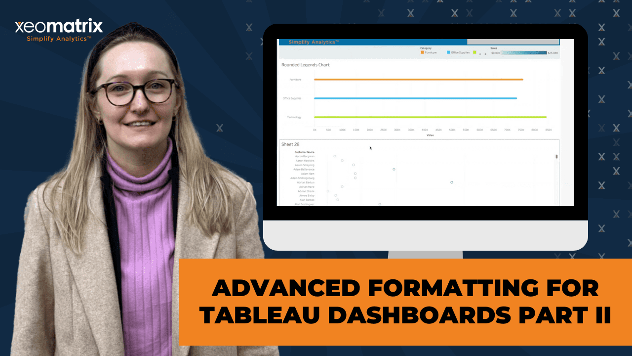
>> LAUREN: Sweet. After going from the colors, so legends are really useful, but you know the default legends, when you add them to your dashboard, they can be, I don’t know, just kind of– Sometimes you want a rounded legend. I’ve seen those a lot where you don’t want that square. It looks a little more polished when you have it as a circle. Unfortunately, you can’t change it just by clicking on the Legend and telling it, “I want it to be a circle instead of a square.” Instead, what I do is I make a new sheet. I would just put Category up here.
Actually, let’s do this from scratch. You take category, I put it on columns. I changed the marked circle. Take category again, put it on Color. Category again, put it on Label. We say, “Entire view.” Now we have those rounded legends, but we don’t want to see all this other detail, so I just do the dropdown. Don’t show the header. Do some format. When you right-click in the View, do Format.
Now, I always take out my borders just because I think it looks cleaner. I wish I knew an easier hack to remove all the borders at once, but unfortunately, you just have to go into Sheet and then select None. Now all of our divider lines are gone. They look big right now, but once you put them in the dashboard like over here, depending on how big the sheet is, they get smaller, which looks a little better.
Then if you want it to be more centered or you want to change how the legend is positioned, I always use padding. We could say, “I don’t want it to be so far to the right.” You take it over a bit. Now it looks a little more centered. The other good thing about this, that if you make any changes over here to the regular legend, so I want furniture to be orange now, it’ll change on this sheet and the other one where we’re using category as the color. Any questions?
>> STUART: I don’t see any questions there.
>> LAUREN: Awesome. Now that we’re on this page, we can get into some cool gradient backgrounds. I think those are really popular right now, but they make your dashboard stand out a little more without being distracting. Right here, I have a gradient background. It’s not as gradient as some of the other ones out there. I have a really good site to use for high quality or high res background images, and they just have all kinds of different gradients and colors that you can use. You would just download this. Let’s download this one. Save image. I’ll just put it on my desktop. We go back to Tableau and create a new dashboard.
Now we pull this image out, or image object out, and we tile it. You would choose that one that we just saved. Sometimes it doesn’t quite fit depending on how big the dashboard is, or maybe it’s too small, so I would just always, oh, sorry, not fit the image. Center it so that that gradient looks a little bit better, but yes, you can always play with it. I also remove the padding. Four is the default outer padding anytime you bring a new object in.
Now we have that gradient background. In order to keep that showing, you can’t continue to just regular tile things, so if we brought in a blank, it’s not going to overlay. I’m usually really against floating, but I found a way to have a more consistent controllable floating. If you bring out a horizontal container or vertical container, and we just make it the same size, roughly as the background, now you can start bringing in other sheets or objects. We’ll get rid of the default one.
Now we have this laid out to where you can keep putting things in there and we can control. Whereas sometimes you use floating and you change the size of the dashboard and everything gets crazy and you have to go through and reposition and size all of your different floating objects, here, you just have to reposition or resize one object. Another part of this is I like to change the color of that container. Maybe you want things to stand out more, like on here, where I already have it set up.
This is a container where I changed the background to be a certain color. It could even be white or something, and then you change that opacity so our gradient background comes through still, but you’re highlighting this chart or view. I feel like I went through that really fast. Are there any questions on that?
>> STUART: Any questions from the group? I think we’re good.
>> LAUREN: Awesome. We started covering those containers and this is how we would lay out different templates. If I make another dashboard, I’ll call this Template 4. It’s funny because actually, this workbook was a DDC template that I used. Those of you that were here last month, that you’ll notice that it’s the same layout and really everything that the last one was because I just used the same template. It saves a lot of time, and that way everything’s consistent.
If we make that new dashboard, we go to Size. My default size, and it really just depends on the project that you’re working on, but I usually go with 1300 by 900 or 1300 by 1000. just it seems to fit most screens better. Then I start with a horizontal container floating. Right here, I’m going to have a Title section. Let’s say you have your title in that floating container, just bring out that text, we’ll call it Title. Change this to be semi-bold. Change the font.
Now, I usually center them. Now we have the title. You can also add some navigation or other objects in the same container. The other object I think I’d go with is our logo, which I could go and find on my computer and bring it in, but what else is nice is that you can come back to where you already have it, so right here. You click on that and then do Control, Copy or command Copy or C, and I can paste it over here instead of trying to go and look through different folders.
If you already have a floating object that you want to put into a container on a dashboard, so this is a floating object, if you highlight this object, then hit Shift and click it again and drag, you can drop it in that container. Also, if you double-click once it’s in the container, it will highlight the container as a whole, and we do this dropdown to distribute evenly. Now you have everything evenly spaced, so that title is always perfectly in the center.
Now we can’t really see our logo right now, but if we go to layout and change the background of our horizontal container, we’ll do dark blue, so now you can see that image that we didn’t see before. Maybe change our title to be white. Now that’s popping out. That would be our title container. You can go right here in this item hierarchy, and this is helpful if you have a lot of containers and you want to start using the Show, Hide buttons, and you don’t know which container it’s actually showing and hiding. I like to rename them, so I would call this Title container, and then Okay.
I’m not going to lie, I don’t always have time to do that, so I don’t always do that, but it’s definitely is the best practice. If you’re planning on making templates, then that’s going to save you time when you’re bringing sheets into the view that you’re actually using for presentations. You always have that nicely organized and everything in the future. Our next section would be our filters. This is just one example of a layout. We could do either vertical or horizontal layouts.
Sometimes you have one section with your title and then all your filters below it to the left. Then other times you might have a filter going from top to bottom instead of left to right. It really just depends on what you’re laying out. If you’re going to have a bunch of KPIs or smaller graphs, then I’d say go with the horizontal layout, or go with the vertical layout, but if you’re going to have really long or wide charts that need a lot of room, like tables with different headers and names that are long, then you want to put a premium on the horizontal space that you have available, so I would put it at the top.
Our next section, we’ll do another horizontal. Make it floating. Right now we don’t have anything in it. When I don’t have sheets in it yet or filters, I just fill it with blanks so it doesn’t get absorbed. Eventually, we’re going to put all of these into a parent container and then actually tile them in the overall layout, but sometimes you put a container within a container and it loses itself within the other container. Yes, just putting those blank objects help define that this isn’t just empty, that we want to keep it as a separate container.
A lot of times I like to highlight the filter container, so I’ll change the color. We can do a lighter color or a darker color. Now we have our filter container, so we’ll just bring out vertical or horizontal of the final container that you want a sheet to be in. I’ll put that in there. Now we have this worksheet, but we can bring in other worksheets as well so that they’re laid out together. We see our legends are already populating up here in our filters, which is nice that they know where to go if you want legends to be with the filters.
I like to think of it as three main containers or container groups, so we have our title with our logos and our navigation and everything. Then the next one would be our filters or legends, and finally, the actual views. With all those, take out a vertical container. Before I start putting in these other containers into it, like I was saying before, where sometimes it forgets what it’s doing and absorbs it, just put a blank in there for now. We’ll highlight these different containers, do that Shift again, Click and Drag, Highlight, Shift and Drag. Now they’re starting to look how you would expect.
That one at the top, we can remove that blank container that we don’t need, Highlight. Now we’re going to take that overall container, Shift again and Drag it in. Now we have everything within their proper containers and their sections and laid out how we want. I think this one’s doing it already, but if we do the dropdown, no. You can see like these aren’t perfectly symmetrical. If you want everything to always be distributed evenly, you would just go to this dropdown within the container where you want it distributed evenly and you select Distribute contents evenly.
Now every time, regardless of which sheet you’re putting in, it’ll always be distributed evenly, so even if we bring in another one, all three of these are going to be even in their spacing. This title container is a little bit too tall,so we can change that. We can change the height. I like 100 would be fun. Do the same to the filter one. I usually make filters about 70. Our last one, we don’t really need to fix the height of because it has all of our charts in it, and it defaults that padding again, so that’s another thing to keep in mind. If we go to layout, we can remove that padding, and it gives you a little more space. Do the same for the title.
Now it’s calling out these two. Then we have all of our charts down here. I usually leave a little bit of padding on the charts just because visually we have the title, the filters, and then everything below it is what those things are applying to. Now, if you want to use the same template, or you want to lay it out a little differently down here, you would just duplicate, and here we can change how these are laid out. Maybe I want this chart to be on top of the other chart, so now it turned into a vertical instead of a horizontal container. Any questions?
>> STUART: Lauren, it seems like the item hierarchy, like the way you’ve arranged this, it is pretty straightforward to go back and look at the order of things here, which I wonder if people are doing, like looking at this item hierarchy. I know that can be useful.
>> LAUREN: No, definitely. I don’t always, like I was saying, do that, but it is nice, especially for templates to have that.
>> STUART: When you think about templates, and I know this question comes up a lot because you have these projects, is it you build that initial branded template, and then you simply duplicate and add additional worksheets for the other requirements that are separate to the first one?
>> LAUREN: Yes, exactly. We just have a general layout that I would use, and then I could change the colors that I’m using, the font, or this logo. We would change that to a customer logo.
>> STUART: I’m curious–
>> LAUREN: It’s a lot easier. Is that good?
>> STUART: No, I’m curious here from the group, are people using containers like this? A thumbs up if you’re using containers right now in your workflow. Okay, Phil, Yes?
>> LAUREN: Nice.
>> STUART: That’s definitely a best practice. I forget about the item hierarchy as well, to know where things are, and this is a great kind of one-on-one on creating a template too with customization.
>> LAUREN: The other part to add to the item hierarchy, so you know when you want to sometimes– Let’s see, like on this one, from last month. I have this filter icon, which is actually a hide show filters, so I hit Option, it’ll hide or show. If we edit that button, it’s asking you, “What do you want to hide and show” Let’s say I had a certain container with different elements in it for one template, but didn’t want another one, but I did want to apply that hide show and not have to go and find this icon again to a different container, down here where I haven’t named all my containers, which horizontal container do I want to actually hide and show?
That’s where that item hierarchy is nice. You rename and you know exactly which one to select for those buttons.
>> STUART: Interesting. You’ve got that created beforehand and you can just reference it back?
>> LAUREN: Yes, exactly. You just change that around. Then also it’s not going to freak out when you delete whatever it was hiding and showing before-
>> STUART: Yes, makes sense.
>> LAUREN: -because it already knows where to look.
>> STUART: That’s great. Lauren, where does that put you on the presentation? Anything else to share?
>> LAUREN: Yes, I went through that really fast.
>> STUART: That’s okay.
>> LAUREN: It takes longer.
>> STUART: That’s good that it was recorded, recorded so people can look back. I guess maybe we can open up for any questions. Maybe have a shorter session today and we can– I’ve got an idea of maybe where we can take a little bit of the time, but yes, anyone in the group, if you have questions, feel free to come up mute or use the chat window if there are any specific formatting questions for Lauren. All right, Phil’s got one. You can’t move things within the item hierarchy, correct? Example, to move an object from one to another.
>> LAUREN: Actually, I don’t know. Can you know? It’s a good question. I’ve never tried it.
>> STUART: Looks like you can’t move.
>> LAUREN: Yes, you can’t. You can copy them or make them floating or just select them, so if you have something hidden, you can’t find it. You just come over here and you can see it’s going to highlight, or if you want to highlight the object, the entire container that something’s in, then you just come over here. That’s a good question though. I didn’t think about that. That would be nice if you could just move stuff around over here.
>> STUART: Okay, Phil, I think that’s your answer. Prove us wrong though. You find out a different way. Any other questions from the group?
>> LAUREN: Oh, there’s one thing I forgot to mention actually. We create a new sheet. I’m just going to put something random. We go back here. You have your template, but of course you’re going to have new sheets that you’re adding in with a new data source and everything. You don’t want to have to drag it in, Delete, and then have to reapply all the padding and other formatting you did. If you just highlight the rounded legends chart object or sheet, you come over here and you highlight the new sheet that you want to add, and there’s these little arrows, you hit those, and it’ll just switch, and it remembers all the padding and the size and everything that you already had applied, which is nice.
>> STUART: That is really helpful. That is to say, I’m going to simplify that, if you go through the process of creating these templates, you’ve applied padding and a hierarchy of containers and you’ve duplicated that initial template and you have new sheets, if you were to drag in that new worksheet, it would not preserve the formatting?
>> LAUREN: Right, exactly. Let me apply some crazy padding to this and then– Let’s say I wanted this chart to have 20 padding, and I always want this chart to have 20 padding, of course, it’s a different one, so now if I add in accessories, this also has 20 padding since I swapped it, but if I just bring in the subcategory, you’ll see that that padding isn’t there.
>> STUART: You have to go back and apply the padding?
>> LAUREN: Yes, exactly. Say, you want to add in we have 10 different charts that you have on this dashboard, and you’re going to have to add that padding 10 times.
>> STUART: I’ve never even seen that little icon. It’s funny. I’ve never even noticed that icon. That is really cool.
>> LAUREN: I think it was in one of the more recent, like in the last year, they added that, which is so nice.
>> STUART: Make sure you have a more recent version of Tableau.
>> LAUREN: Yes, Inch.
>> STUART: Helen had a good question. She’s asking if you could show what your favorite template looks like. I think she’s just a little unclear about the workbook format. How do we save and apply it to all? Maybe I can take some of this for you, Lauren. Actually, why don’t you answer because this is definitely more of your wheelhouse, but do you have a favorite template that you use that doesn’t have data that’s proprietary, I guess?
>> LAUREN: I have these that I made that I was playing around in Sigma and made this background. This would be like, I’m using Superstore right now. Let’s say I wanted to change to another data source, like for an actual customer, then I would just add in the connection. I would swap everything to only use that one, close Superstore, and I would start creating sheets to swap like we did on the other page, and I would just swap it here.
Like this is a good KPI template, so I just have all of my current month sale or different KPIs from Superstore right here. You use a grand total calc. I can actually open one of these. I use this calculation where we’re saying the total of this measure. In this case, orders placed is just the count of orders. Now you can display it in your title instead of having to have separate cards with trend lines attached to them.
>> STUART: Makes sense. Lauren, Helen asked more specifically, if I want my filter title to be orange size 10, could I make that a default? Is it possible through the preference file? Do you want the filter title to be–
>> LAUREN: Oh, so the preference file only controls which colors you have access to, so we pop open this edit legends. It’s only controlling these for your options. It can’t because if you change the data source you’re using, it’s going to forget a lot of the colors, and it’s just an easier way to say, “Aassign this palette,” and then you’ll always use that palette, but if on your dashboard, you want the filter like actual object or box to always be orange, the best way to do that would be to change this background container because our filters will change and inevitably we’re going to have to go back and say, “Format all filters,” when you have new sources of data coming in or new sheets and new filters that you’re adding.
If you just change this background of the container then it’ll make sure that behind your filters they’ll always have that background, if that makes sense.
>> STUART: That makes sense to me. I think it’s another approach to learn that if you’re using a specific color, you add that to your preferences file so it’s always there, you make a filter and you apply that color every time.
>> LAUREN: Right. I will say when you’re formatting the filters though, if you go, say we added a new filter, we shouldn’t say, “Drop down.” You go to this drop down, Customize, or no, sorry, Format, and always do the all filters and set controls. That means all the filters and sets that are tied to that data source will be formatted at once. Say we had five different filters up here, it’s going to format all of these. Actually, let me bring in another filter. Now when we go Format all filters, and it changed both of these titles at the same time.
>> STUART: That is helpful, yes. I could have used that in the past.
[laughter]
>> STUART: I’m saying go through every single run and then–
>> PARTICIPANT 1: Can I ask, does that only apply to that one dashboard or the whole, I guess one worksheet or one dashboard or the whole workbook?
>> LAUREN: This would only apply to this dashboard.
>> PARTICIPANT 1: Okay, thank you.
>> STUART: Lauren, if you duplicated that dashboard though, and then subbed in additional filters, would it preserve that?
>> LAUREN: Oh, that’s a good question.
>> STUART: If you’re working on your second report and–
>> LAUREN: Oh, yes, it does. That’s something I hadn’t noticed before. That’s cool.
>> STUART: Interesting. Cool. Good questions. Does anyone else have any other questions? Otherwise, we can wrap a little early. Lauren, thank you for this. We’ll have it up. We’ll have it recorded on the XeoMatrix YouTube channel. If there are no more questions, we’ll see you next month.