
The Data-Driven Community Meetup holds monthly webinars on business analytics and big data. Webinars are held on the second Wednesday of the month at noon (12:00 PM) central time via Zoom Webinars and will cover topics related to enterprise data management. Our goal with each webinar is to provide meaningful insights and actionable takeaways to simplify analytics so you can make better decisions.
We cover topics such as data strategy, data management, data warehousing, BI modernization, embedded analytics, and cloud migration and strategy. Learn how to build reporting solutions that drive your business demand based on your needs.
About the Topic
Take your Tableau dashboards to the next level with our recorded webinar on “Advanced Formatting for Tableau Dashboards.” This session is designed for Tableau users who want to enhance their dashboards’ visual appeal and usability. In this webinar, we covered:
- Polishing techniques: Discover advanced techniques to refine the look of your dashboards, making them more engaging and visually appealing.
- Formatting tips: Explore the most effective ways to format your dashboards for clarity and impact. Learn how to use color, typography, and layout to communicate your data more effectively.
- Best practices: Gain insights into best practices for dashboard design, ensuring your dashboards are both aesthetically pleasing and functionally powerful.
- Practical examples: See real-world examples and practical demonstrations of advanced formatting techniques.
This article includes a recording, transcript, and written overview of the Advanced Formatting for Tableau Dashboards presentation.
Presentation Video
Summarized Presentation
At our latest Data-Driven Community meetup, hosted by Xeomatrix, we delved into the topic of Advanced Tableau Formatting. This session featured insights and live demonstrations by our lead consultant, Jared Schulman, with contributions from Stuart Tinsley, and addressed various advanced formatting techniques to enhance your Tableau dashboards. Below is a comprehensive summary of the session, highlighting key takeaways and practical tips.
Session Outline
- Dashboard sizing: fixed vs. automatic
- Customizing maps and filters
- Creating custom color palettes
- Handling addresses in maps
- Applying dark mode and formatting enhancements
- Enhancing interactivity
- Formatting fundamentals
- Customizing and polishing dashboards
- Advanced techniques
Dashboard sizing: fixed vs. automatic
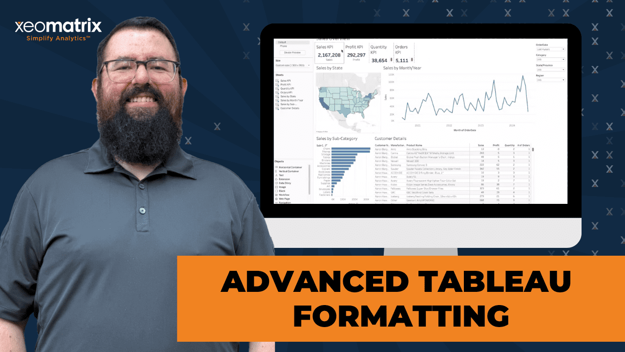
Jared Schulman advised against using automatic sizing due to the risk of inconsistent display across different devices. It’s recommended that a fixed size, typically 1,300 by 900 or 1,300 by 800, be used, which ensures that dashboards display well on most screens and reduces the likelihood of user complaints.
Customizing maps and filters
Jared demonstrated how to customize map layers and background options, making maps cleaner or more detailed based on user needs. He also showed how to change color schemes, add data points, and enable drill-downs by city. This level of customization allows for more precise and user-friendly data presentations.
Creating custom color palettes
A significant portion of the session focused on creating custom color palettes in Tableau. Jared explained how to edit the preferences.tps file in the Tableau repository to add company-specific brand colors. This ensures consistency across dashboards and aligns with corporate branding guidelines. He also showed how to manually pick colors using the color picker tool in Tableau for those who might not have a predefined color palette.
Handling addresses in maps
Riley raised an important question about converting addresses to latitude and longitude for mapping purposes. Jared and Stuart acknowledged that while Tableau does not natively support this feature, third-party tools can be used for this conversion. They mentioned that Tableau is working on adding this functionality and promised to follow up with more information as it becomes available.
Applying dark mode and formatting enhancements
Preston inquired about applying dark mode to entire workbooks. While Tableau does not have a default dark mode setting, Jared demonstrated how users can manually create dark-themed dashboards. By adjusting backgrounds and color schemes, users can achieve a dark mode effect. He also discussed setting opacity levels and changing sheet backgrounds to enhance the visual appeal of dashboards.
Enhancing interactivity
James asked about ways to highlight interactive elements within dashboards. Jared suggested using icons, such as a mouse icon, to indicate clickable elements. He also recommended using text labels like “click to filter” to guide users. These visual cues help users understand where they can interact with the dashboard, improving overall usability.
Formatting fundamentals
Jared proceeded with a live demonstration, starting with a provided workbook containing KPIs, sales over time, sales by state, and subcategory details. He emphasized the importance of logical organization, starting from the top left, ensuring key information is readily accessible. Initial steps involved distributing KPIs evenly and making minor adjustments for visual clarity. Jared also explained the use of containers for better alignment and spacing, showcasing how to manage content distribution within Tableau effectively.
Customizing and polishing dashboards
The session delved into customizations, such as using fit options to manage content layout and hiding redundant titles to streamline appearance. Jared illustrated how to utilize containers and show/hide buttons for filters, saving space and enhancing user experience. He also demonstrated adding navigation buttons for seamless movement between dashboards, promoting a cleaner, more user-friendly interface.
Advanced techniques
The session covered advanced techniques such as using dashboard actions for drill-down capabilities, creating a more interactive experience. Jared provided insights into handling detailed data efficiently, recommending separate detailed views instead of cluttering high-level dashboards. He also addressed common formatting issues like grid lines, font consistency, and label management, ensuring a polished and professional presentation.
Conclusion
The session concluded with an open floor for additional questions. Jared and Stuart addressed various queries, emphasizing practical tips and tricks for advanced formatting in Tableau. Stuart thanked everyone for their participation and encouraged attendees to continue exploring Tableau’s capabilities. He also invited participants to suggest future topics for the data-driven meetups.
This session provided valuable insights into advanced Tableau formatting, balancing technical skills with practical advice to enhance data visualization and user experience. The interactive format and live demonstrations offered a comprehensive understanding of how to create polished and effective dashboards.
Transcript
>> STUART TINSLEY: Our topic today is Advanced Formatting. We’ve had a few sessions over the last year that have covered formatting. There might be some overlap. We’ve got some new techniques that we haven’t shared that we want to talk about today so that’s what this session will be on. A reminder that we do the data-driven meetup once a month. It’s normally kind of middle of the month on Wednesday and all of the sessions are recorded on our YouTube page so just on YouTube’s Xeomatrix channel.
Following this session, that’ll be posted there. Tell colleagues, tell anyone that’s just interested in learning more about Tableau. We’ll build this community up. What we’ll do first off is just discuss the meeting format, which is really simple. We’ll get into that. Featured speakers really is Jared. I’ll be chiming in as usual but, Jared, you’ll be leading the show. The topic is Advanced Formatting and then we’ll leave time for a Q&A if there are questions following what Jared is going to share.
Let me let a couple people in here. Give me one sec. The meeting format, just a reminder, we’ve made these meetings completely open so if you have questions throughout, you can definitely come off mute. If you want to use the chat window, you can do that too. If you’re not speaking, if you can stay on mute, that would be awesome. We’ll be sending out a survey post session and a formal Q&A at the end. We want to make this interactive so if you have questions about something, you can type in the chat or you can come off mute and ask a question. Jared is talented enough to answer that on the fly.
>> JARED SCHULMAN: [laughs] I promise this, Stuart.
>> STUART: All right, our featured speaker. I’m Stuart. I have been in the Tableau product for 10 years now in consulting at Xeomatrix for 5 years. I lead our sales team so I’m mostly working with clients on their projects. Jared, most importantly, is our lead consultant. He’s been in the product right about 10 years, I think, Jared, that’s correct, 9 or 10 years.
>> JARED: About nine years. I try to ignore the time that I spend in IBM Cognos as much as I can.
>> STUART: For everyone who doesn’t know, Jared’s day-to-day job is working with Tableau, working with customers on their projects, their engagements, the puzzles that they have so he’s seen so many things in the product and he is really at the center of these sessions that we hold once a month so really excited that you are here again, Jared. Our topic today is Advanced Formatting. This is a taste of what we’re going to cover. We’re going to help you understand a bit more of the right way to build a dashboard and some ideas for how you can format your dashboards and really polish them up.
We’ll talk about how you could implement, if you wanted to, custom color palettes, how you could bring in some customized branding and using logos or download buttons or using the show hide feature that Tableau has. Hopefully, you’ll learn a few things, a few tips and tricks today on how you can produce and publish really nice looking reports. That’s our goal with this session because there’s a lot of formatting that you can do in Tableau, as you’ve probably noticed. That is our goal. With that, Jared, unless I missed anything, I think we are ready for a live demo and I won’t share any more slides.
>> JARED: That sounds good. We can go ahead and jump in. Stuart, I want to start at a high level. We spend a lot of these sessions talking about the tips and tricks, the technical how-tos, but when it comes to formatting, a lot of this is, it’s psychological and it’s philosophical. We’re trying to take the data, the actual hard numbers and present them in ways that clients or for the case of the folks on this call, their internal stakeholders and end users will be able to quickly see the data, interpret it, digest it, and then make an actionable decision based on that data.
This advanced formatting is really everything that comes between building the views and validating the data in Tableau and then getting to that place where we have a final presentable product, whether that’s for us, for a client, or for you guys, for your internal stakeholders, external stakeholders, what have you. I spent a lot of time before I was in consulting treating the jobs that I was in like I was in consulting. The way that I used to explain it to people is that if you have like a three-star Michelin restaurant with just the best steak, the best steak in the world, but your waiter trips on the way to the table and dumps that steak in your customer’s lap, it does not matter how good that steak tastes, the customer is not going to have a good dinner.
With data presentation and formatting, it’s the same thing. If you have all of the numbers that your stakeholders need to run the business better, to make the decisions they need to make, but it’s presented in a way that doesn’t allow them to quickly get to those answers and use that data, they’re just not going to have a good time. Does that make sense, Stuart?
>> STUART: That does. That makes a lot of sense. I also wanted to make it clear to the folks here that Jared received this workbook that I put together, what, a couple hours ago? Part of what’s going to be fun today is to see how you work with– At this stage in Tableau, how you make something more presentable and follow your point there. Jared has not had much time to prep what he’s going to do, but you’ll see him in real action here make this dashboard really polished and formatted well.
>> JARED: I hopped off a call about 15 minutes ago and I pulled down these files and we’re going to be diving into this for the first time altogether. This is part of the fun. I’m sure that this is not too unlike what a lot of y’all probably run into where you get a last minute request for a report or for a dashboard that the C-suite needs for a board presentation on Friday and it’s Wednesday afternoon. You’ve got to pull something together really quickly. What are the ways that we can take some raw data or some raw visualizations and just clean it up a little bit and make it look a little bit more presentable?
Stuart, you sent over this workbook and I see we’ve got some sheets with some KPIs here at the top. We’ve got sales over time. We’ve got sales by state, by subcategory. Let’s say a detail sheet of all of our customers and the different products that they’ve ordered across a number of orders. We’ve got some filters over here on the right. This is all the basic elements of a Tableau dashboard. We just want to start cleaning it up a little bit and making it look nicer.
When I look at a dashboard like this, I’m going to start the same place that we instinctually start as human beings. We’re used to reading in the US at least. That means we typically start top left. If you’re from a country where your language starts at top right and you read right to left, then maybe you’re used to looking at dashboards starting in the top right. There’s some interesting psychology there behind how to organize dashboards but we’re based here in the US. As Xeomatrix, we’re going to start looking top left.
These KPIs are pretty much right where I’d want them. Top and center, nice bold numbers. They’re just cluttered over here on the left and they’re not really spaced out the way that we might want them to. First thing we’re going to do is just spread those out. We’re going to distribute the contents evenly as closer. These are also using the standard fit up here at the top. All of the actual canvas in these sheets, we’re not telling it where to go. It’s just going to wherever the default is, which is usually in the left as far as Tableau can make it.
If we change that from standard to fit entire view, that’s going to start centering those a little bit more. We might even get rid of that scroll bar. We’re getting closer. We could also center these titles for sales KPI, profit KPI, quantity KPI but I’m thinking we probably don’t need them. We have the marker underneath that tells us is it sales, profit, quantity, or orders so I’m almost thinking we just hide that and we let the number and the label speak for itself.
>> STUART: It’s also worth mentioning that I did help you a little bit and I put those KPIs in a container, which is why Jared was able to fit them evenly. If they weren’t in a container, that option would not be available. There are other sessions we’ve done where we cover containers more extensively, but that is an important detail here.
>> JARED: If you have a bunch of sheets in a container, you can click on this dropdown and it’ll tell you what container it’s in. This KPI for orders is in that horizontal container. The other way to get to that is if you just double-click on this little grab handle at the top, it’ll highlight the container that it’s in as well. A little bit of a quicker way to get there. If you’re brand new to Tableau, you’ll start picking up pretty quickly on– Let me go back a few steps here.
If you start to see four sheets like this, all grouped off to the side, you’re going to pick up and know that’s in a horizontal container. It’s just not distributed evenly. You can distribute them manually too, but that gets tedious. If you have visits that are different sizes, then manually setting the size can be really effective and we might do some of that down below. If we move down here to this next group, that’s in a horizontal container as well. You can see that here. If we distribute these evenly, that’s not bad. I’m trying to figure out how to describe this, Stuart. Let me know how this sits with you.
I feel like lines are taller than I want them. The distribution of numbers, those deltas from month to month, it’s a very spiky line. I’m wondering at the state level, if we can make that map. I’m going to undistribute them evenly. If we keep the map a little bit smaller, it spreads that line out a little more and just makes it look less jagged so I’m almost thinking we leave it how it was. Just because visually, it’s not as claustrophobic over here. We’ve got a little more space between those peaks and valleys. I think that makes it easier to see what’s going on. It’s a little bit less cluttered visually. Does that make sense?
>> STUART: It does.
>> JARED: Then on the map, this is something where it kind of comes down to knowing your business or your company, what data you’re using. If you are a company or organization that operates a lot in the New England area, up in the Northeast, you probably do not want this map view because to get down into the Rhode Island, Massachusetts, New Jersey area, there’s some real small marks and it gets really tight up there. If you’re a West Coast company, if you’re operating out in mountain time zone, you can totally see what’s going on in a lot of the states where you do most of your business at this size.
That just comes down to knowing what your end users are going to be looking for and where they’re going to be using the business most frequently. From there, there are a few things that we’re going to come back to as well. I’m not in love with the big text titles in the upper left, the fact that we have all white backgrounds on everything. I’m debating adding some labels to this line, but maybe not all labels. We’ll come back to some of that smaller stuff. I want to touch on this bottom third as well.
Stepping back at a high level, Stuart, what you’ve done here, I really like having three levels of this dashboard. We have our KPIs that get those immediate takeaways. What are our sales? What’s our profit? What’s our quantity? How many orders? That’s over the last four years according to the order date filter so that’s great. We can adjust that as needed. Then we step down a level when we start to see, “What is that breakdown of sales by state, by month, and year?”
Then we’re stepping down another level. What do those sales look like by subcategory? Then even a further level to customer details, what I’m wondering is, do we really want to scroll through this whole table of customer details on what’s looking like a pretty high level dashboard? I’m thinking, no. I see we have a customer detail overview tab already built out, and it looks like that’s the same sheet. This is a nicer place to view this data. We can see the full customer name. We can see a lot more of the product name.
Over here, we’re really crunched down so instead of having this on this high level sales overview dashboard, let’s keep the details on the detail tab. If we really want to get fancy with this, see how we can see all of our full labels here. Can we just build a drill down through here? How do you feel about that?
>> STUART: Yes, for sure. That’d be important to show.
>> JARED: If we use a dashboard action for that, and let’s build a filter action that runs off of this sales by subcategory, we could actually have it run off of all of these sheets. Let’s take the KPIs out because that’s going to be everything. That takes out our four KPIs, but then sales by month and year, by state, or by subcategory. Let’s have that filter, that customer details sheet. If we do that– Let me switch that from a menu to a select. The menu is just a little bit clunky. It shows up in the tool tips.
Now, if we want to see all of the phones, we can click on phones. If we want to see everything in Missouri, we can see our two purchases in Missouri. Is that giving us a weird glitch? There we go. Same thing if we wanted to see what was this big spike in June ’23? That one does not want to work well. Is that all of our June ’23? We may have had too many. There we go. Too many different overlapping filters there. That should give us everything that we’re looking for with those so we have a drill through.
When we publish this, we have the option of having these tabs available at the top but a lot of what we’d like to do when we’re building out client dashboards is we’ll build in inline navigation. What I mean by that is instead of having the tabs up at the top in Tableau Cloud or Tableau Server, we can drop a navigation button in and use that navigation button to go back to the sales overview page. Let’s see. This is in just an overall vertical container. What I’m going to do here, I’m going to remove this title because that’s redundant. We already have customer detail overview up top.
Then I want to drop in a horizontal container. Let me undo that real quick. That almost dropped just here in the middle of the sheet and it wouldn’t be in that vertical container if I did that. When it’s just the gray box, it’s not landing in the container, which is not what we want. If I move it up a little bit and I get that blue dashed line, that’s how I know it’s going inside of that vertical container. Then I can drop in a navigation button. I’ll come back to that. I want to put this title next to it.
Here we have the same thing we had with the KPIs. I don’t really want to distribute it evenly because I don’t want that navigation button to take up half of the sheet so instead, I’m going to put a blank in. Maybe I click that image instead. A blank object is exactly what it sounds like. It’s just white space that you can use to pad or buffer different objects. We can make this shorter to get our title to fit all on one line. Our navigation button, we can format as well. A square button is fine, but we also have the option to use an image. For the image, I saw in the files that you sent over, you have a back button.
>> STUART: I use that one a lot.
>> JARED: Go ahead.
>> STUART: I use that one a lot. Let’s see how it looks when we pull it out. [laughs]
>> JARED: I’m going to pick that back button for the image and then let’s navigate back to sales overview. It looks huge. Oh my goodness. We’ll just make this blank bigger and help shrink down that button a little bit. Then we’ll pull this back up. There we go. That’s a little bit more manageable of a size. Then because we’re in desktop and not in cloud, we alt-click and it takes us right back.
That’s a really easy way to just, instead of making your end users go and look for the tabs up at the top and know which dashboard they want to go back to, we can just have them click and they go right back. Makes it a little bit cleaner looking. You can do the same thing. I think on our advanced dashboarding session, we walked through a left-hand menu button, or maybe it was across the top, but just having different buttons for different sheets that would highlight to show which sheet you’re on. That inline navigation for dashboards is really clean. It’s a great end user experience.
When we work with clients to embed dashboards in a custom portal, that’s what we tend to go with because it just makes it look like it’s all seamless. It makes a really, really comfortable user experience for the end users. That is really helpful there. Getting rid of that detail sheet on the dashboard here, by the way, does the opposite of what we were trying to do on that sales by month and year. On sales by month and year, we wanted to stretch the view out because it was too cluttered and there was too much variation in that month to month. It was too spiky.
In sales by subcategory, I almost want the opposite. I want to see those big spikes because if we made this sheet super small, it makes it a little bit tougher to see the variation between some of these subcategories that are similar. Whereas when we let this breathe a little bit and stretch out along the bottom, now we can see there’s a difference between bookcases and appliances and there’s a difference between envelopes and labels. That helps just give a little bit more visibility to the more small differences between the values there. Little things like that.
>> STUART: Diego had a question. Diego, I don’t know if you want to come off the mute.
>> JARED: Sure.
>> DIEGO: Thank you, Jared. By the way, big fan here just of these sessions. I’ve already attended a few, so I’m happy to know that you’ve got a few of them. Just I wanted your perspective on something here. Let’s say that the sales by category section, let’s say that you only want to include the top 10. Just based on your experience, would it make sense to have zero as the lowest benchmark on that or would you do something that fits the actual trend and values for the charts?
>> JARED: That’s a great question because that gets back to the psychology and the philosophy behind the visual design that we do when we dashboard. If we look at the top 10 here, we come down to maybe around bookcases between 100K and 120K. If we include zero, then what that means is– Actually, let me just exclude everything beyond that to illustrate what that would look like. If we include zero, all of the space to the left of 100K looks like dead space because there’s nothing lower than this 115K.
If we go in and we set that axis to start at like 110, the thing that I don’t love about this is that it makes it look like bookcases is super small. It makes it look like bookcases sold practically nothing next to even copiers. When in reality, there’s only about 35K of difference there and bookcases has 100K more that’s behind the line of where we cut off our axis. It’s one of those things that comes down to who are your end users and what do they expect to see? How are they used to digesting this data?
If they’re okay with seeing that axis cut off and they’re going to instinctually look for the axis and see what that number is, then it can be a really effective way of like we were talking about spreading out the marks and being able to see the variations between them. What we tend to run into is that end users aren’t used to seeing that. They’re very, very used to seeing an axis that starts at zero. If they see that really tiny bar, they’re going to think it’s practically zero. Does that help?
>> DIEGO: Yes, thank you, Jared.
>> JARED: Absolutely. That’s a great question. We run into that a lot when we’re showing labels on charts and the marks will be so close that they’ll either overlap or they’ll hide. If you have labels that are getting hidden because they would be overlapping or you have labels that are overlapping that you don’t want to, a lot of times we get this when people want to put dashboards into PowerPoint slides, we’ll get asked to do things like start an axis at 100K or change an axis into a logarithmic scale, things like that, or just change all of the marks to a value of one and just put the labels on it.
When you start messing with the scale of an axis like that, it can be really confusing to end users so we caution our clients to just be mindful of that. If you want to go that route and change the scale of an axis or set it to start at something other than zero, just be sure that that’s communicated effectively to the end users and they know what to expect. That’s going to help make sure that you don’t have any confusion or mix ups with misinterpretation of the data.
>> DIEGO: Thank you, Jared, for your perspective.
>> JARED: For sure. That was a really great question. I love talking about stuff like that because every company is different. Every data culture is different. Just the level of data literacy amongst end users, even within a company is super variable so these are great things to think about. All right. There’s a couple other things that I’m seeing, Stuart, that I want to try and knock out here. I’m seeing this subcategory header that’s cut off because we don’t have that much space over here left to the axis but we already have sales by subcategory in the title so we can hide that.
Makes it look a little bit cleaner. Month of order date on our axis here. We already know this is sales by month and year so I would probably just change this to say order date. That way we know that it’s by month and year of order date and if you hover over it, we could change that tool tip too to clean that up a little bit. We also have sales not formatted as numbers. It’s these little things that you start getting the dashboard pulled together, you put the Lego pieces in the right place, and then you start going back with a finer tooth comb and a finer tooth comb.
Let’s hit a couple more high level things. This filter box. I would like to not have this taking up horizontal space if at all possible. There’s a couple of ways that we can do that. One would be if we throw in a horizontal container and then drop this vertical container in it. If we then remove the vertical container when this filter box is in the horizontal container, that will automatically change the distribution from vertical to horizontal. Then we can go and distribute those contents evenly again.
That’s one option just to get them up at the top and not take up that horizontal space on the right, the horizontal space. The other thing we could do, I think you dropped a filter icon in that file as well so I’m going to add a show hide button here. Much like with the navigation button, we can use an image on this as opposed to text. When this filter box is hidden– Let me see if we have a filter icon here. Then when it’s shown, maybe we just leave it as this X. Let’s see what that’ll look like.
If we move this floating show hide button up to the top and make it a little bit bigger, and then we can hide that filter bar and show it at the clickable button. We can do that either with that container. This is in a horizontal. This is a vertical container inside of a horizontal. If we do it that way, it kind of pushes the content over to the left when it opens. Totally valid way to do it. We can also float this container, in which case the content is going to stay static. It’s going to stay where it is.
If we take this floating container, give it a white background, maybe a black border, then the whole dashboard doesn’t move around when we show and hide that filter box. It just pops up over the top so that is an alternative option there. We can do the same things that we talked about before. Little things like, this is really basic formatting, spaces in words and things like that but it’s hard to let that stuff fly when you see it. We’re getting closer though. We talked a little bit.
>> STUART: [inaudible] I feel like we saw recently on a project where a customer had a lot of filters, so they exposed a few at the top all the time. Like three, four, five, whatever. When they had more, that show hide button worked really nicely to expose even more options, but it didn’t take up a ton of space at the top so that was fairly practical in that way too.
>> JARED: You might have your order date filter just out at any given time. I would want to throw that in a horizontal container and throw blank next to it, so it’s not quite so large. Then maybe you have your category, subcategory, state, province, et cetera, in this pop-out box because those are less commonly used. You could absolutely run it like that where you have some filters exposed all the time and others that are only available if you click. You can even take that a step further. This is getting outside of formatting and into technical capabilities, but you could use dynamic zoning, which we’ve done a session on before, to control who can even view which filters based on their user group on Tableau Cloud.
If you had a group of managers that you want to give them the access to filter by a sales rep name, you could do that based on the manager’s group, but have the individual sales rep only able to see their own data or the overall team data. You can do that based on dynamic zoning. Totally off-topic formatting, but it’d be a cool use case. Stuart, what else are we thinking here? I want to do something with these titles. I want to change the background to get a little bit of padding here.
>> STUART: I got a few.
>> JARED: Mess with this map a little bit. You want to knock through a few?
>> STUART: Here’s one that we likely overlap. It covers another session, but at the dashboard level, putting that shading so that we have separation between sheets. Right now, it’s completely white background. That would be one that jumps out.
>> JARED: Then once we have that, we can switch the background on the individual sheets to include that title. That’s optional. Sometimes it’s neat to have the title hovering over the viz, but typically, we’ll background the sheets so that the titles look like they’re included in part of the sheets. A lot of times, we’ll also center stuff like this.
>> STUART: Make it a smaller font, maybe. It defaults to 15, so it’s quite large.
>> JARED: This is totally down to personal preference and your own organization’s branding and style guides. I tend to use 16 for dashboard titles, 12 for viz titles. Yeah. You could go larger or smaller, but 15 is a little bit in your face.
>> STUART: It’s probably worth calling out, Jared, that formatting tab at the top, you can format at the workbook level. You could format– This is going to default. Every time you open up Tableau, it defaults to Tableau Book and Light. You can see different variations of Tableau fonts. You can change a font across the whole workbook if you wanted to. If you have a font– We use Avenir a lot. There’s some really good fonts out there. You can change it across the whole workbook, which is really nice.
>> JARED: You’ll want to be mindful of making sure that the font that you pick is web-safe, particularly if you’re planning on embedding dashboards. There’s a relatively short list of web-safe fonts. Then there’s some more that are web-safe as long as you have the font installed on your machine, which is kind of like why bother? You can find those lists online. If you just Google Tableau Cloud web-safe fonts, you’ll get a blog post or something about it.
>> STUART: That’s a good point. Web-safe, for sure. There was another one I was thinking off the bat. Oh yeah, the grid lines. I learned this way late in the game, but right below where you are. These worksheets default to grid lines that you could turn off across the whole workbook, which could save you some time, just takes them off. That’s a good way to polish up and clean stuff up. If you don’t want grid lines, they’re always there on specific sheets. That’s at the format level at the top that Jared went to.
>> JARED: That’s up here at workbook. You could format the dashboard level as well. The grid lines, that’s another good point about just, again, visual design and how we interpret data. We tend to think if we’re going to use grid lines, we won’t use labels because we can already see where that point is relative to the axis. If we’re getting rid of grid lines, we probably want to also get rid of the axis and include some labels to be able to better get a feel for what those numbers are because if we just have just the marks and the axis, it’s a little bit tougher to trace over where some of those points are.
For the line charts, there’s a few different ways that we can go on line charts. If we just show all the mark labels, it’s a little bit crowded. There’s a lot of numbers there. We have some additional options though that we can pick through. The min and max is a fun one. This is just a good way to know what’s the range of values in the view. Our lowest month was 6,817 in August, 2020 and the best one so far was May, 2024 at 116K.
One of the things that we’ll do with spark lines a lot is we’ll do line ends and just label the end of the line. That tells us that currently for July ’24, we’re at 27K and that helps give some context to understand what some of those other numbers are. We know that this is pretty close to that. We know this is a lot higher. There again, it just depends on what’s the use case of the dashboard? What are the end users expecting? If this is going in a PowerPoint deck, maybe we don’t want to have all of this empty line with no context and just the one mark.
If this is going to be on Tableau Cloud and an operations or a sales team is using this every day, if they really need to know the specific numbers, they can always hover over and get the tool tip. There’s a balance there between providing some of that data upfront versus keeping it clean and allowing the end user to drill down or explore for that next level of insight on their own. Does that make sense?
>> STUART: It does. Jared, there were a few questions that came in that might be worth talking about. James, I’ll grab your question first. This is a really good topic. Jared, your thoughts on the fixed dashboard size versus automatic and what you pick.
>> JARED: I love it. Automatic dashboard sizing, this is totally my personal opinion, it’s a dangerous game because depending on someone’s screen resolution and the size of their monitor, you can have a dashboard that looks great to you when you publish it up and you’ve got an angry email from some VP two departments over Monday morning going, “I can’t read the heck out of this thing. This looks awful? What are you putting together?” Just because they tried to open it up on their 9 inch iPad instead of a 15 inch MacBook.
That’s where we tend to gravitate towards a fixed size. 1,300 by 900, 1,300 by 800 tends to look really good on most screens. If this looks a little bit small in the canvas for y’all on the screen share, I am on a 40 inch screen right now but if this was on a regular like 20, 22 inch monitor, it would fill it up pretty well. Especially in Tableau Cloud, we find that this size displays really well on what Stuart probably 9 out of 10, 19 out of 20 computers. We tend to gravitate towards fixed size when we’re building stuff out.
>> STUART: That’s good question. Brendan had a good question too, about maybe going into more detail on formatting the map and filters. Brendan, I don’t know if you want to elaborate a little bit more on your question so Jared can answer it effectively.
>> BRENDAN: Yes, just general stuff as far as if you want to change the color coding on it, or you want to add more data points or drill down by city rather than just state, stuff like that. As far as having a more in depth, less in depth.
>> STUART: I think it’s a really good question. Jared, probably a good segue to custom color palettes using some custom colors here. I’ll tee you up for that.
>> JARED: Man, that question just made me think, “Do we need a whole data driven community session on maps?” [inaudible] geospatial already?
>> STUART: No, we do not. We need topics. That’s a good one.
>> JARED: Brendan, you’re getting a cut of the YouTube ad revenue from the geospatial session. I don’t think we make any money on that. Map coloring, map formatting, there’s a ton of options. If we come up here to the map menu, this background layers and map options gives us a ton of opportunity to mess around. This is where, if I was going to be formatting this map, I’ve said this like three times already and I’m going to keep coming back to it. It kind of depends on your end users.
I’m looking at this and I’m saying, “I don’t really need the different countries and I don’t really even want the base layers or the state and province borders.” You might be able to turn off state and province names as well. There’s probably a way if you have only US data to not show Canada and Mexico when you do that as well but the reason that I hesitate on that is I’m thinking back to a client that we had that was in the real estate investment business.
Originally we had a really clean map for them like this and they said, “Actually a lot of our investors are international so if we could include the state letters or the state names on there, that would be really helpful for them because they don’t actually know where Tennessee is on the US map. They don’t know which one Florida is necessarily. They just know that they want their money to make money.”
We say, yes, that makes perfect sense. There’s a whole range from really detailed to really clean. You can go in those map layers to even get the satellite images somewhere. There’s just like– Here we go. You could see literally on a visual map of the earth, a globe shot, a ton of range from super detailed to super simple and clean. It depends on what your end users are looking for. If you want to mess with the colors, we can do that. We can change this from a blue to a green or what have you. You could do an orange, blue diverging. Anything you want to do is there.
Then if we just look at what that looks like, it’s a little bit more clean now. We don’t have a lot of that background showing Canada and Mexico. We don’t actually do sales there. There’s a lot of options for maps in the map options. You can turn off some of these features. If you want to not allow pan and zoom, you can lock the map to where it is. That’s really helpful for you using a map as a filter. You don’t want people to be able to zoom in and exclude half of the filter options by getting rid of half the map.
You can get rid of the search. You can basically get rid of that whole view toolbar and make it super clean if you don’t want people to be able to mess around with it or you can leave that stuff in. Totally up to you on that. Are there any other specific map questions that you wanted to touch on before we jump over into custom color palettes because that is a good segue into that?
>> RILEY: Hey Jared, real quick question for you. One issue or challenge we keep running into is trying to ingest addresses instead of LAT-LONGs. Is there a solution within Tableau that we’re not aware of or is there a good solution outside of Tableau that you would recommend than just addresses in the LAT-LONGs to be delivered into Tableau?
>> JARED: Are you talking specific street level addresses?
>> RILEY: Yes, we work with individual customers and we try to put a spot on the map, like a pin on the map on where they’re actually located at. A lot of that information comes in the form of an address.
>> JARED: I love it. I don’t know the way out of the box to convert street address into LAT-LONG in Tableau. I could have sworn that it’s like ringing a bell in my head that somebody mentioned something at Tableau conference in 2019 about it. [laughs] I swear that was a feature that was coming.
>> STUART: I think it is a feature. I will check with the Tableau team this week because I think they were going to add that function, Riley, natively in the product now. There are some other tools out there that are free that will custom geocode. You can just feed it data.
>> RILEY: That’s what we’ve been doing.
>> STUART: Let me follow up and see if that’s on the roadmap. I don’t think it’s out yet, but it was brought up recently, I believe.
>> JARED: I know they’ve talked about it. I agree, it would be a great feature to have. I was literally just working with someone on my team this morning, parsing out a full street address field into city, state, and zip because we don’t have LAT and LONG and we can’t just plug in the street address. It would be a great feature to have. I think it’s coming and if we can find some info on it, we’ll track you down and send you some info on it.
>> RILEY: That’d be fantastic. Thank you, guys.
>> JARED: Absolutely. A couple other things that we can talk about here, Stuart. I know we’ve got about 5, 10 minutes left. I want to touch on custom color palettes. That is something in Tableau where if you go into your documents folder and go into your Tableau repository, there is a file called preferences.tps. This is a text file in which you can enter in a custom color palette for your company’s brand colors and have that color palette available anytime you want it in Tableau.
I already have this open in text edit. I think notepad would be the equivalent on a Windows machine if I’m remembering correctly from those days. What this looks like, if you are opening it for the first time, it’s just going to have this XML version, workbook, preferences, and then /preferences/workbook. When you go to plug in a custom color palette, you can name that color palette. The type is typically going to be regular. There’s a few different options you can dig into and there’s some good articles on that.
Then you can take the hex codes for those colors and just plug them in with color hex code/color and when you do that and you go to edit the colors in your workbook, you’ll have those different colors available as their own separate palette. There’s all the different Tableau 20 and there’s some funny ones like superficial stone and the lightning colors. You’ll have that available as an option, your own company’s branding and style guide. I think I’ve got like 10 of them in mind right now. I haven’t found a limit yet, but [crosstalk].
>> STUART: I linked in the chat window to everyone. If you wanted to create custom color palette, that’s the steps to do it, documented from Tableau.
>> JARED: It’s something that once you do it once, you’re like, “Oh yeah, I could do that again anytime.” That can be a really nice way of just making your dashboards look again, clean in line with the rest of your company’s content, especially if it’s going in a PowerPoint for a presentation or if it’s an external facing dashboard, if it’s going up to the executive level, having it look like it’s from your company and part of your company’s standard suite of reporting is like one of those little things that psychologically makes people like it better and want to use it more, just helps drive adoption.
>> STUART: Let’s say you don’t have a custom palette, what would you take it if without that so not going down the steps of updating the XML workflow?
>> JARED: If you don’t have a custom color palette, you can still come in here and in like this color picker, you can actually use this eyedropper and go to your company’s website and just pick the color on the screen. If our company’s color was this blue, we can just pick that blue and now our dashboard looks like it belongs. It looks like it’s from our company. That’s a really easy way. When we have clients who are like, “Oh, we don’t really have a branding and style guide. We have a third party marketing agency that built our website. We don’t know what the colors are.” It’s like, “No problem. We’ll just go get them.” Just go grab that color with a little dropper.
>> STUART: You can drag it into that so it’s reusable, right, Jared? You can take that color and pop it in there and you can use it over and over again.
>> JARED: Yes. I’m pretty sure that that just crashed out of the desktop, I think.
[laughter]
>> STUART: Sorry.
>> JARED: Stuart my man, what are you doing to me?
>> STUART: We got that recorded.
>> JARED: Oh, that’s great.
>> STUART: Barely did that crash and stuff.
>> JARED: [laughs] That’s a really easy way. If you need an extra day on a dashboard, you just tell your boss, “Hey, Stuart and Jared crashed my workbook and I lost all of it.”
>> STUART: Let’s see if autosave works. Can you pop it in?
>> JARED: Oh my gosh, that’s hilarious.
>> STUART: I was wondering what happened.
>> JARED: [crosstalk] unexpectedly perhaps so for me. I’m sure that’s been fixed in the latest updated version I’m not on.
>> STUART: Right to Q&A. Preston had a good question. Preston, you asked about if you could set like auto-apply a dark mode to the whole workbook versus the default light. That’s a good question. I don’t know if I know the answer to that, Jared. Can you do a dark mode off the bat to a whole workbook?
>> JARED: I want to say no, simply because I think I have everything possible dark-moded on my computer and Tableau has not picked that up but man, that would be nice. Workbook themes, going modern, classic. I don’t see an option for a dark mode. That’d be really nice though. We’ve had a couple of dashboards that we’ve been able to build for clients in a pseudo-dark mode, dark gray backgrounds, like nice blue and purple and yellow colors on the views. It looks slick. They look really good.
>> STUART: I don’t know if anyone in the community has an answer to that. We’ll dig around. I don’t know that there is, Preston.
>> JARED: Not as a default, at least. You can still build it, but maps, there’s a pretty easy dark mode on maps.
>> STUART: All right, we got a couple of minutes. Any other questions? I could think of a couple other things we could show, but I want to leave the floor open if anyone has formatting or general questions here.
>> JARED: I’ll just be playing around with more questions.
>> STUART: Jared, what about– Is there anything else about formatting that, I don’t know, it jumps out at you?
>> JARED: There’s some small things.
>> STUART: Small things.
>> JARED: Like if we did want to build out a dark mode dashboard with a really simple, dark background, setting the opacity on these sheets to less than 100%, and then we’ll have to do the same with the actual sheet background, which is in this format menu. We set that to none. That can be an option just to make the dashboard look a little bit more, I don’t know, intentional. Maybe that’s not the best word for it, but that would be an option here.
>> STUART: This is a question that came in from James. Is there a clever way, from a formatting perspective, to focus the viewer on interactivity within the dashboard so they know where to click? This is a good question.
>> JARED: I really like this question. There are some things that you can do. One of the things– What did you send me in that folder, Stuart? Do we have an info button in there?
>> STUART: No, but that would be a good one. No info.
>> JARED: Long story short, there are some things that you can do. If you have an info button in the upper right of a viz, that’s going to make an end user go, “Oh, I can get some more information there. Let me click on that or let me hover over that.” You can add context about the visualization. If you wanted to grab an icon that’s a mouse with a little click starburst on it, that’s going to tell people just because we’re used to that iconography, I should click on this view.
In the two minutes that we have left, let me see if I can get PowerPoint pulled up because PowerPoint is the easiest, quickest way to get reusable icons for free. You can just go to insert and go to icons. Let me see if we have a click. There’s a mouse, we’ll use that for now because we’re a little bit pressed for time here. If I just insert that, I can right click and save it as a picture. I’m going to put that in my formatting files. Can I save that as a PNG or a JPEG?
Now that I’ve done that, I can come into here and grab an image. I’m going to float it. [silence] I choose that picture that I just saved. This comes into play with end user training too, where if you tell them, “Hey, when you see that little mouse icon, that tells you that you can click on this and it’s going to take you somewhere or it’s going to do something to your dashboard.” You can start to let them know this is something that’s interactive. This is something that you can click on. You can also do it with text. You can say sales by state and then–
>> STUART: We do that a lot. Click the filter. That’s really popular.
>> JARED: That’s a really easy way to do it too.
>> STUART: That used to get the point across, James. You can get fancy with it as you’re sure, which I really like, but anywhere that you have interactivity, you could have just click the filter. Something as simple as that usually gets the point across. Cool, all right. I know we’re right at time. I’m glad that we have your workbook crashing recorded. It’ll be up on YouTube.
>> JARED: I’m glad that it now looks really not much better than it did when we started because we got so much else going on here now.
>> STUART: A lot was covered. I hope this is helpful, everyone on. Thanks so much for the time. We’ll see you in a month. We’ll have more topics. If you have any requests on topic areas, I think we got one, mapping maybe. We’ll see you in one month. Enjoy your summer. Enjoy working with Tableau. Thank you, Jared, of course, for your time here.
>> JARED: Oh, thank you, Stuart.
>> STUART: Always a pleasure. All right. Bye, everyone.
[] [END OF AUDIO]